Blog Posts Website Mockups
-
-

-
-
-
-
-
-
-
-
-
-
-
-
-
-
-
-
-
-
-
Customize Any TemplateDownload
-
-
-
-
-
-
-
-
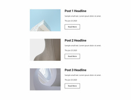
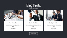
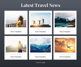
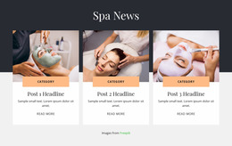
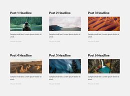
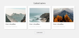
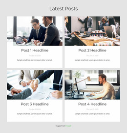
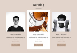

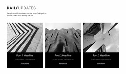
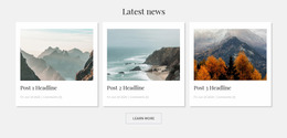
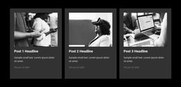
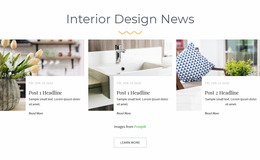
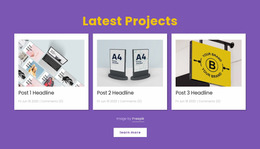
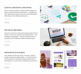
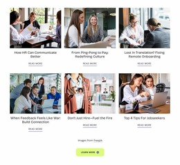
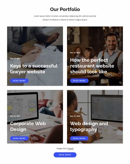

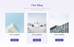
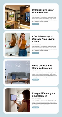
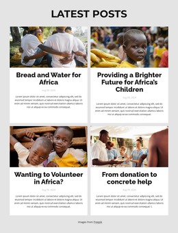
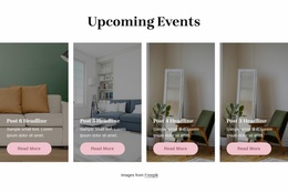
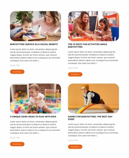
Responsive Blog Posts Website Mockup for Previewing Editorial Layouts Across Screens
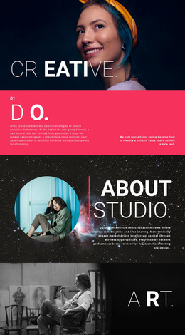
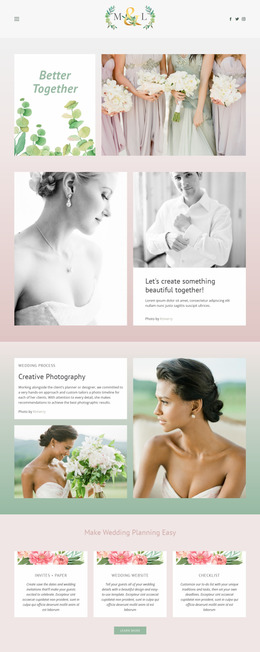
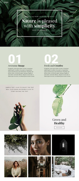
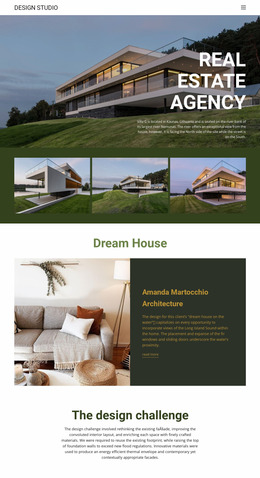
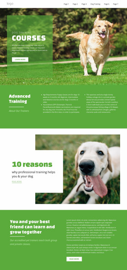
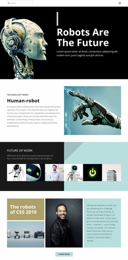
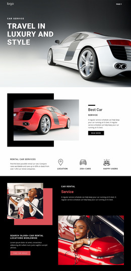
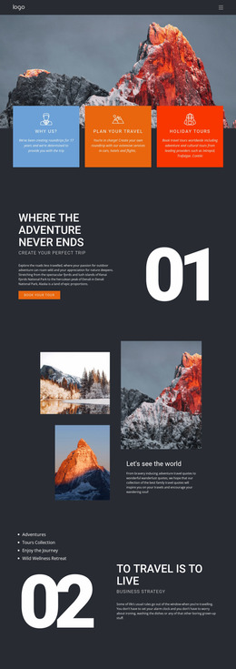
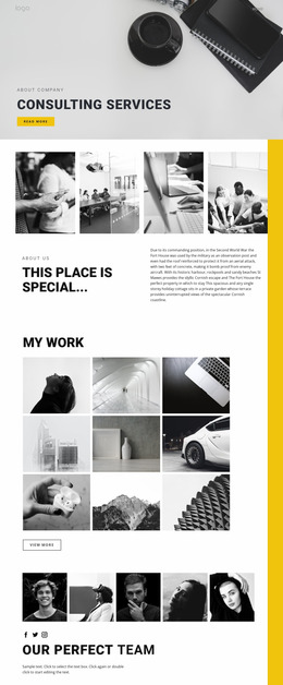
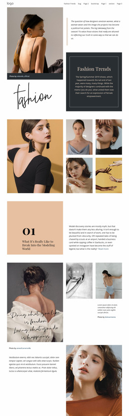
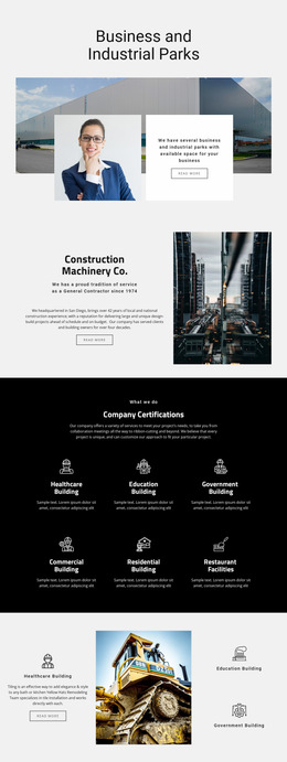
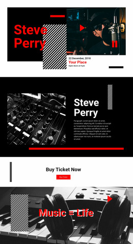
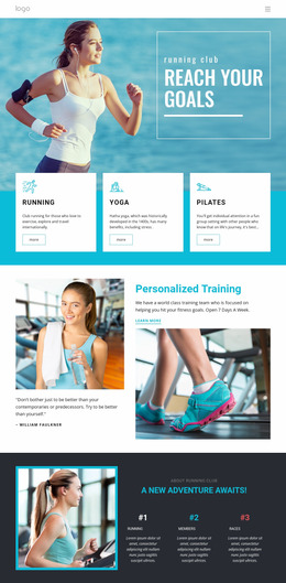
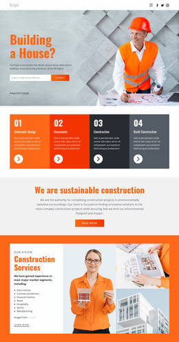
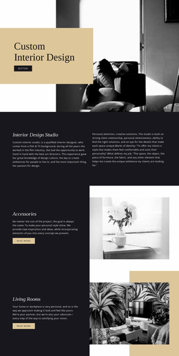
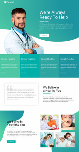
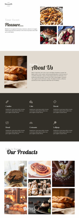
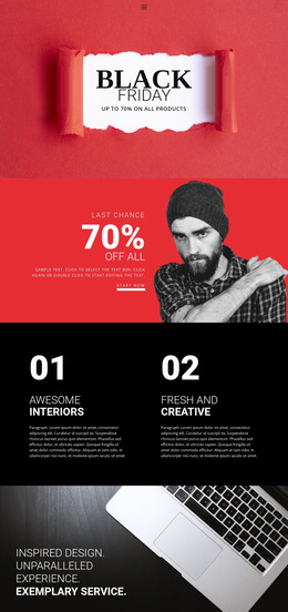
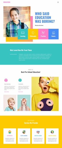
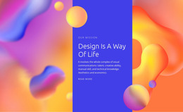
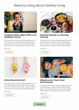
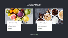
A Blog Posts Website Mockup helps evaluate how readers will see a collection of articles before the section's layout is finalized. By reviewing post titles, featured images, excerpts, and publication details together, you can identify problems with content density or visual hierarchy. The focus is on clearly presenting recurring editorial previews on wide screens and in narrower mobile layouts.
What Should a Blog Posts Mockup Show?
A Blog Posts mockup should represent the content and visual relationships of an editorial listing. Each article preview needs enough information for readers to recognize a story, understand its subject, and find the link to the complete post.
Use realistic headlines and excerpts when evaluating the arrangement. Short placeholder text can make every card look balanced, but real article titles often vary in length.
Featured images should also reflect the intended content. Their proportions affect how many posts fit in the section and how much attention each entry gets.
Unlike a general Grid mockup, which may present unrelated content cards, a Blog Posts mockup must preserve the relationship between article titles, publication metadata, summaries, and reading destinations.
Reviewing Article Preview Hierarchy and Content Density
A ready-made Blog Posts website mockup is a visual starting point for reviewing an article feed before implementation. Replace generic placeholder content with representative short and long headlines, excerpts, and image proportions. Use the mockup to discuss content density and agree on a layout, rather than treating it as a finished website design.
For layout approval, check title wrapping, card-height differences, the visibility of reading links, and whether publication details still belong clearly to the right story at mobile width. Nicepage's Blog Posts Element offers row, column, and spacing controls to explore such arrangements.
Compare Desktop and Mobile Blog Posts Mockups
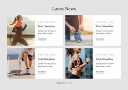
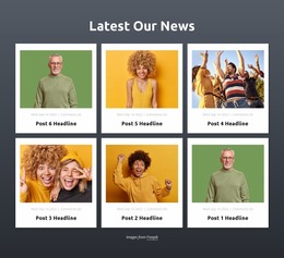
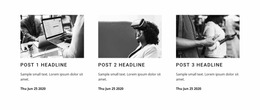
A desktop mockup might show three articles across a wide canvas, with a featured image above each headline. A mobile mockup of the same section may stack those stories in one column. Both should reflect the same editorial priorities, even as spacing and proportions differ.
Use realistic copy to test the design. Compare a short title such as Autumn Reading List with a longer one such as How Our Editorial Team Selects Stories for the Weekly Roundup. If the second headline pushes the reading link far below the neighboring cards, the mockup reveals a problem before the section is finalized.
Try at least two image shapes and multiple excerpt lengths as well. Perfectly identical placeholders hide the differences that real posts create. Check how the category label, date, and reading link remain associated with each story on a narrow screen.
Nicepage Responsive Modes allow you to inspect different screen widths, and the Blog Posts Element supports responsive column settings. The result is a reviewable visual layout for feedback and approval, not an automatic interactive prototype or a finished website design. Use the mockup to select a practical arrangement before committing to broader page styling.
Comparing Editorial Arrangements Before Finalizing the Section
Different article collections require different amounts of visual space.
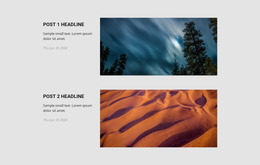
A recent-news section may benefit from compact entries that emphasize headlines and dates. Featured stories may require larger images and more generous excerpts. Related-reading previews often work best when they occupy less space than the main article content.
Compare these alternatives using the same representative article content. Changing both the layout and the sample stories makes it harder to tell which arrangement works best.
For additional editorial context, blog layouts can illustrate how article collections relate to surrounding content.
The final mockup should make it easy to identify individual posts, compare their subjects, and follow their reading links. Unlike broader website design, this evaluation concentrates on how the specific editorial section performs visually before or during implementation.
Frequently Asked Questions About Blog Posts Website Mockup
Can I preview Blog Posts layouts on different screen sizes in Nicepage?
Yes. Nicepage provides Responsive Modes for reviewing page layouts on desktop, tablet, and mobile screens. The Blog Posts Element supports different column settings in these views.
What should I check when evaluating a Blog Posts mockup?
Review the readability of article titles, featured image proportions, excerpt lengths, publication metadata, and reading links. Also check whether several post previews remain easy to distinguish when displayed together.
Can I adjust the spacing and columns of a Blog Posts section?
Yes. The Nicepage Blog Posts Element provides properties for columns, rows, and spacing. You can use these controls to compare different editorial arrangements before finalizing the section.
Does Nicepage automatically generate interactive prototypes from Blog Posts mockups?
The documented Nicepage workflow supports visual layout editing and responsive review. It does not establish automatic interactive prototype generation from Blog Posts mockups. You can evaluate the section directly in the editor.
What should I check before publishing this Blog Posts section?
Open a few article links, review real headline lengths, and check the layout on a narrow screen. Confirm that every preview leads to the intended complete story.
Review Your Blog Posts Layout Before Integration
Select a Blog Posts block and open it in the Nicepage editor. Use representative article titles, images, and excerpts to evaluate the layout, then compare the section in different Responsive Modes. Adjust the columns, spacing, and preview hierarchy until individual stories remain recognizable across screen sizes.