

Zero CSS Templates
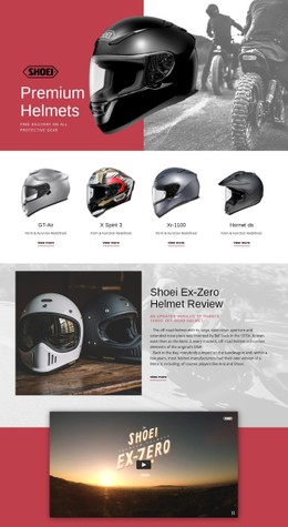
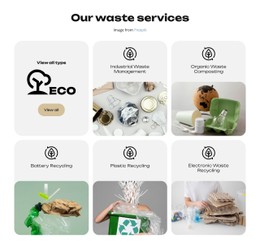
Refill stations and repair workshops need different visual cues, even within one zero-waste campaign. Zero CSS templates help organize program cards, action labels, and qualified emission statements through balanced color, spacing, and responsive styling.






More CSS Templates from Text On Image Category










Other Text On Image CSS Templates
Modifiable Zero CSS Templates
Color, type, and spacing set a zero design's mood before anyone reads a word. Zero CSS templates come with those styling rules already tuned, so you can browse by look and then adjust the palette and fonts without breaking the composition. Most entries lean green, yet the theme stretches beyond recycling. In the end, you are choosing a layout where the headline, main image, and content blocks already carry the right visual weight.
Visual Directions Across the Zero-Themed Set
Several titles show how differently one theme can be styled:
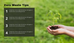
- Zero waste tips is built on a grid, so check how short tips read when each card holds a different amount of text.
- Zero waste courses leans toward selling classes, which puts the spotlight on course titles.
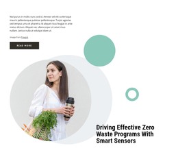
- Zero Waste, Clean Earth suits a campaign message, so watch how much room its headline gets next to the photo.
- From Zero To Victory has no environmental angle, and its title hints at a bolder, motivational tone.
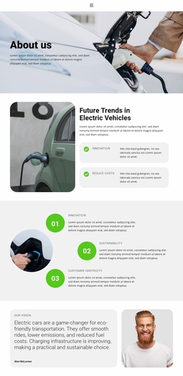
Related suggestions in the catalog come from the Text On Image category, so headlines over photographs are a likely pattern here. Contrast deserves an early look, since your own photo may be brighter or busier than the demo one.
Judging Typography and Palette
Once your text replaces the demo copy, three checks show whether the styling holds up:
- Size and weight still separate a heading from its description, even when a course title runs to three lines.
- Badges, dates, and secondary labels stay quieter than the main message.
- The accent color lands on what matters, such as a sign-up button, and stays off decorative shapes.
Nicepage Theme Colors let you change the palette across the design from one place instead of recoloring buttons one at a time. If headlines start overlapping images or cards end up uneven after you add real content, the design will cost more effort than it saves.
How Cards Behave on Phones
Open the design in Nicepage Responsive Modes early, because the phone view can change your mind faster than the desktop preview. Start with the headline and see whether it shrinks enough to avoid awkward breaks over the photo. Then check the cards, which restack on a narrow screen and should tighten their spacing too. One long course name can make its card taller than the rest and throw off the whole grid. Labels that appear only on hover will not help someone on a touchscreen.
Shortlist two or three Zero CSS templates, add your longest title and real photos to each, and keep the one that still looks balanced on a phone.