
Announcement Message CSS Templates
Urgent updates, promotions, and service notices need clear visual priority without disrupting the page. These CSS templates provide responsive announcement layouts with controllable spacing, color, emphasis, and message states.






























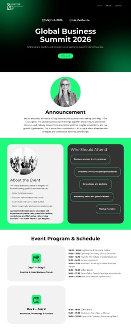



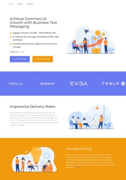



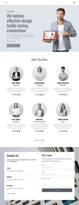





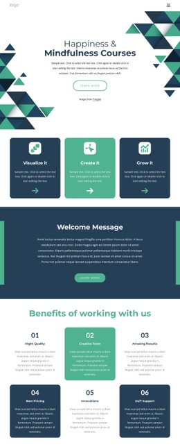

More Website & HTML Templates for Announcement Message













Other Text On Image CSS Templates
Creative Announcement Message CSS Templates
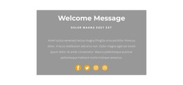
Teams that publish service updates, promotions, or urgent alerts need a notice that gets seen right away without covering the content people came for. Announcement message CSS templates provide these notices with a styled starting point, with adjustable colors, borders, and spacing.
Customizable Styling for Different Announcement States
The same announcement bar might carry a spring sale on Monday and an outage notice on Friday, so its styling changes with the job:
- a sale bar needs a CTA that reads as a button at a glance, with a clear hover state;
- a maintenance notice relies on high text contrast, a colored border accent, and compact vertical padding;
- a service alert stays pinned as a slim strip, its color stepping up from informational to warning to critical;
- a dismissible bar needs a close button with visible hover and focus states, plus a clickable area bigger than the icon.
Nicepage covers most of this with visual controls, leaving custom CSS for details like a red badge reserved for critical alerts. Keep that red for real emergencies, because once a flash sale borrows it, an actual outage has nothing louder left.
Responsive Emphasis Without Visual Noise
Announcement copy that fits one line on a desktop often wraps around buttons and icons on a phone. The headline has to stay readable and the CTA visible, and the status line shouldn't break in an awkward spot.
The usual fix is a flexbox row that switches to a column below a breakpoint, so the CTA drops below the text, and the horizontal padding shrinks. If the close icon is absolutely positioned, the text needs right padding as wide as the icon, or the last words of a long offer run under it. A max-width on the CTA keeps a long label from squeezing the copy on desktop.
Focus CSS on the Message Interface
With announcement bars, placement causes more trouble than color. A fixed bar breaks the normal flow and covers the top of the header unless something reserves space for it. A sticky bar keeps its space but competes with a sticky header for the top edge, with z-index determining which one stays on top.
Nicepage documents Export Minimal CSS Per Page as an export option that creates a separate stylesheet containing only the CSS required by an individual page. Pages without the sale bar then carry none of its rules.
When comparing templates, check the contrast of the most urgent state and the bar's height on a phone. Then see whether the CTA stands out and the bar stays pinned. Colors are the easiest part to change, which makes them the weakest reason to pick one.