
Speaker CSS Templates
Speaker sites often need different visual emphasis for expertise, keynote topics, testimonials, media proof, and inquiry actions. CSS-focused templates make those states easier to control while keeping the speaker brand consistent across responsive layouts.






More Website & HTML Templates for Speaker
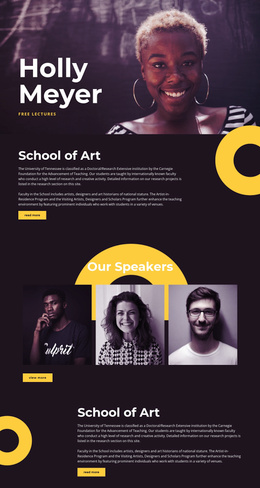
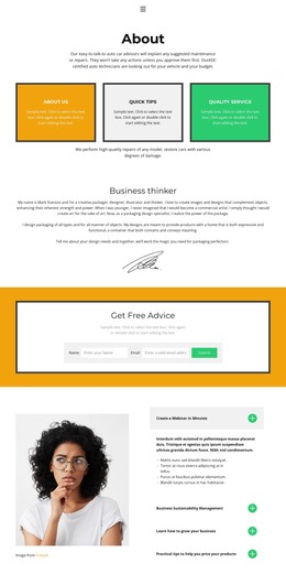
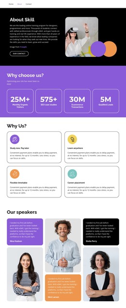
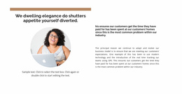







More CSS Templates from Team Page Category
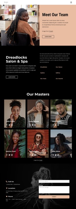
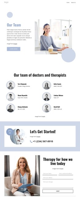
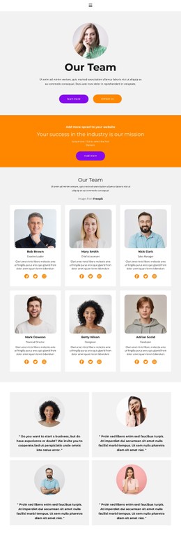
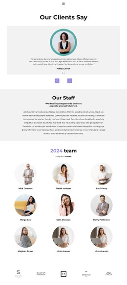
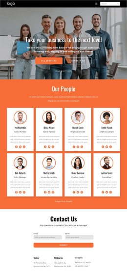
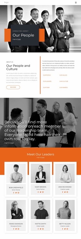
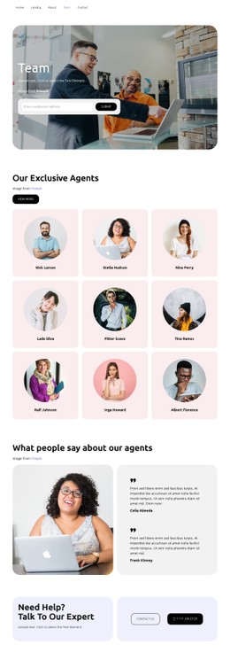
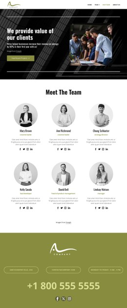
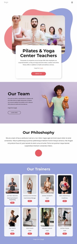
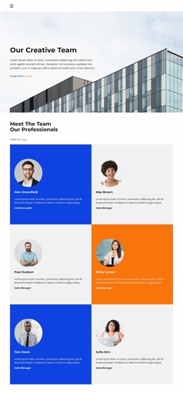
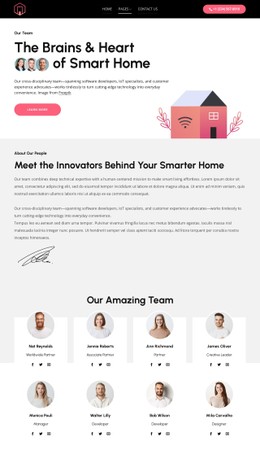
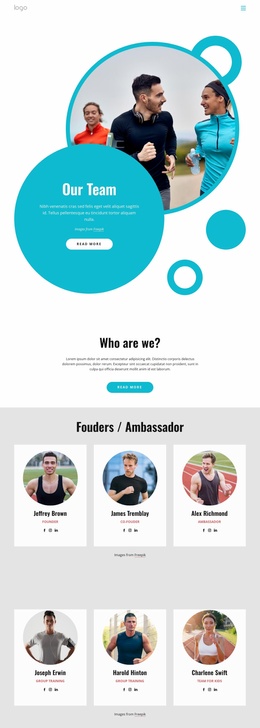
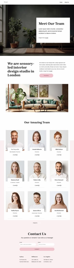
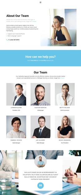
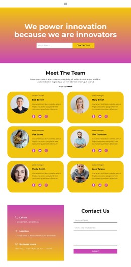
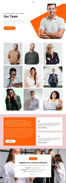
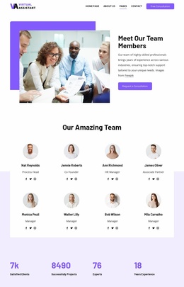
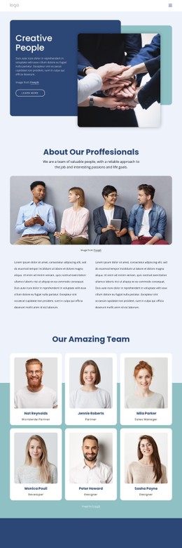
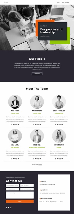
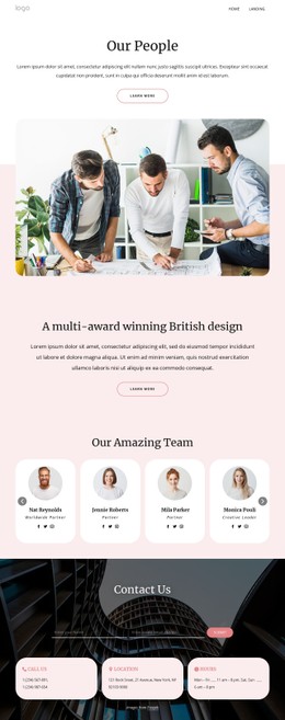
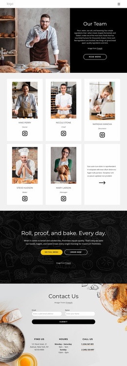
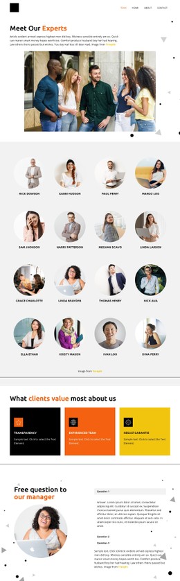
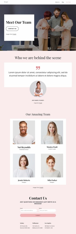
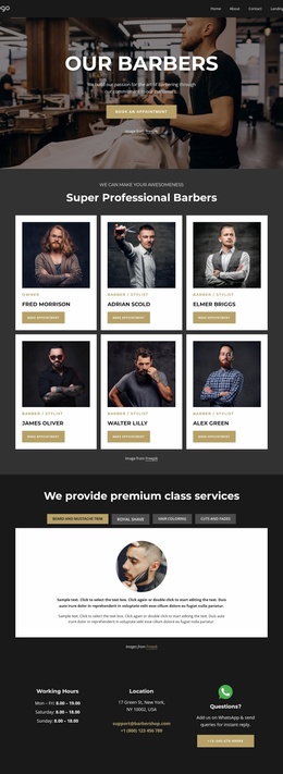
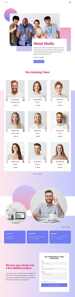
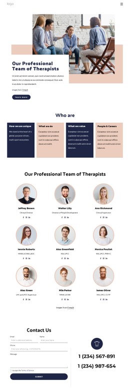
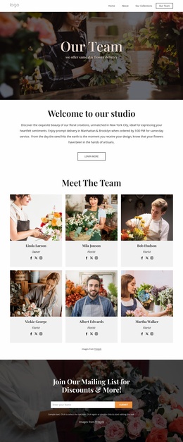
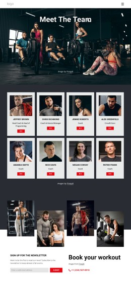
Other Team Page CSS Templates
Flexible Speaker CSS Templates
The challenge with styling a speaker's site is that nearly everything on it demands attention. Talk cards, organizer quotes, and a row of conference logos all compete, and once they carry equal weight, the booking button gets lost in the crowd. Speaker CSS Templates come with that weight already distributed, and the inquiry button usually owns an accent color that nothing else uses. Your job is to fit that system to your own talks and brand colors.
Visual Weight for Talk Cards
Most styling decisions here come down to a few speaker elements:
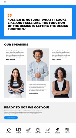
- Talk cards, which carry the heaviest headings and enough spacing between them that each keynote reads as a separate offer.
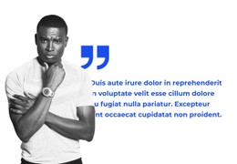
- Organizer feedback, set on a softer background with smaller type so quotes from past events back up the talks without competing with them.
- Conference logos, which look calmer in one muted tone, since they arrive in every color and shape.
Site typography covers most of this, so a new topic card picks up the right heading style as soon as you add it. A reel block that needs its own frame and shadow is another story. The Custom CSS documentation explains how CSS can apply at element, page, or site scope, so that one block can change without touching the rest.
What Changes on Narrow Screens
Speaker content is long and uneven, and a roomy laptop layout can become an endless scroll on a phone. Three adjustments usually matter most:
- Topic cards stack into a single column with smaller gaps.
- Keynote titles move to a smaller scale. Nicepage Typography Styles can be adjusted for separate Responsive Modes, which helps when a long title with a subtitle after a colon starts wrapping into an awkward block.
- The reel preview is held to the screen width, and the booking button keeps enough space around it to be tapped comfortably.
Accent Color as a Booking Signal
Theme Colors work best when each one has a task. Use a primary tone for content, nd a quieter one for proof, leaving the accent for booking actions, such as the hover state of the inquiry button. Once that accent spreads to a divider or a quote icon, it no longer points anywhere. The play button on a reel is a common temptation, so giving it a neutral color keeps the accent tied to a single meaning.
When comparing Speaker CSS Templates, find the booking button in the demo and picture it next to your own talks and logos. If it would still stand out, the visual rules around it are doing their job.