
Cards CSS Templates
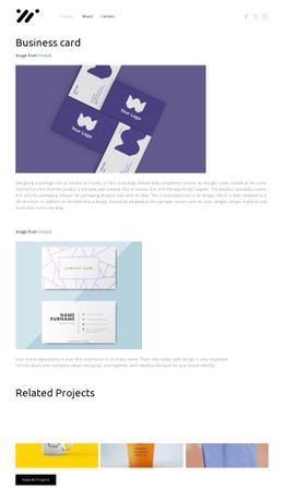
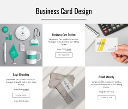



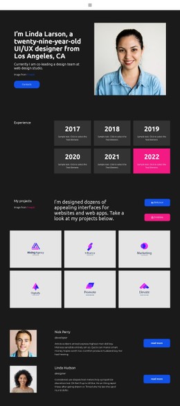




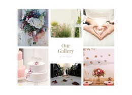
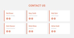

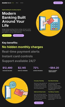




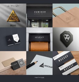





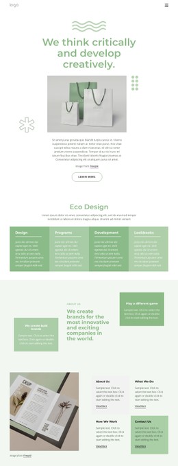




More Website & HTML Templates for Cards
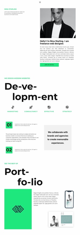
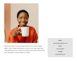











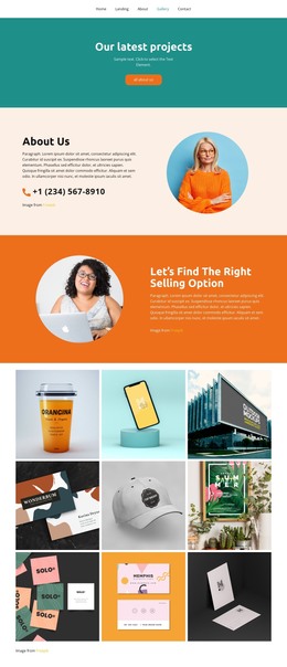




More CSS Templates from Wedding Category
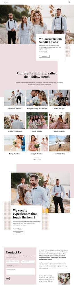







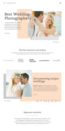
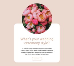

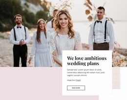

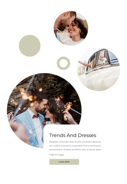





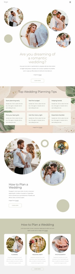

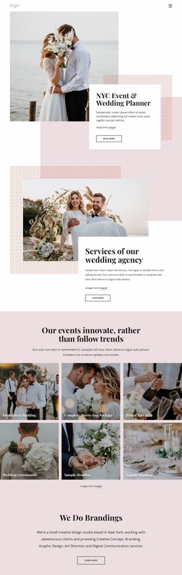
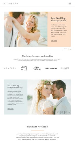
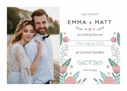
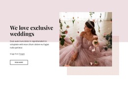
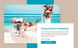

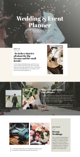
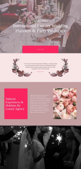
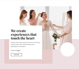
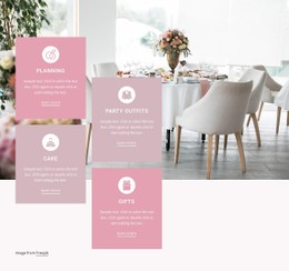


Other Wedding CSS Templates
Customizable Cards CSS Templates for Clear Content Presentation
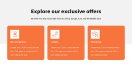
Cards CSS templates allow website owners to showcase products, services, posts, and deals on the web pages. CSS card layouts control the visual appearance of the cards by setting up fonts and colors, adding borders and spacing between items, defining the image size and buttons design. This type of presentation is suitable for online shops, agencies, blogs, portfolios, real estate sites, and education platforms.
The store owner could use cards to display prices and the advantages of the item. A travel website might use cards to demonstrate a tour with all the necessary information about the date and location.
An agency could break up its service offers into clear blocks with hyperlinks. It is vital for visitors to have clear cards to know where links will lead them. As statistics claim that 59% of mobile homepages do not indicate the extent and purpose of promotional links, users skip the useful offers or leave the page. Developers could rely on pre-designed business card CSS design instead of coding styles from scratch. Designers could adjust the template according to brand design and keep all cards uniform. Site owners would get a clean page and easy navigation for visitors.
Shape Visual Card Details With CSS
CSS handles the minute details that will either make a deck easy to navigate or challenging to use. It is best to set up a common framework in which to work before incorporating any ornamental design features.
Start with the visual rules that users notice first in the card grid styles:
- Balanced Spacing
- Clear Contrast
- Consistent Ratios
- Visible States
- Readable Typography
- Stable Gaps
These rules should apply to the entire collection, not to individual cards. Consistency will allow users to better understand how they can find the price, description, and possible actions related to a particular object. At the same time, a consistent design will make a responsive design simpler, since you can use the same rules for different device screen sizes.
Control Card Grids Across Screen Sizes
Card grid layouts need to be simple, clear, and convenient on any device used by a visitor. Key information and control actions must always be noticeable regardless of which one the user will pick. CSS break-points can decrease the quantity of columns, add space between elements, and crop images depending on the available screen width. However, it must be noted that responsive layout isn't just about squeezing content on a small screen. Its main task is preserving a good structure and making each card pleasant to study.
Test the layout with varying texts and images, even during the early stage of web design development. A layout that looks perfect with dummy data might turn out to be completely different once there will be some actual text, for example, two-line titles or several-line descriptions. Various images with different proportions, actions, and texts can also be helpful here.
Download a Cards CSS Layout and Refine It
Look through the Nicepage templates and choose one that suits your brand. Install the design and make any modifications you feel fit regarding the style guide. Also, go through all the cards on various-sized screens. Try the right cards CSS templates today.