
Bookshelf Website Templates
Large book collections often need separate routes for titles, authors, genres, reviews, and reader resources. These website templates provide a cohesive set of pages and shared navigation instead of forcing every bookshelf function onto a single screen.



More Website Templates from Education Category


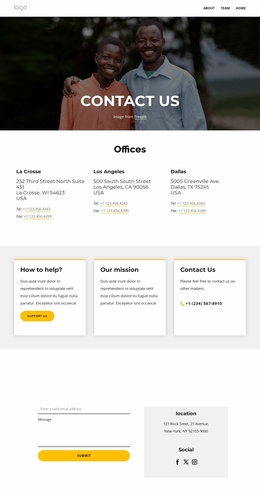

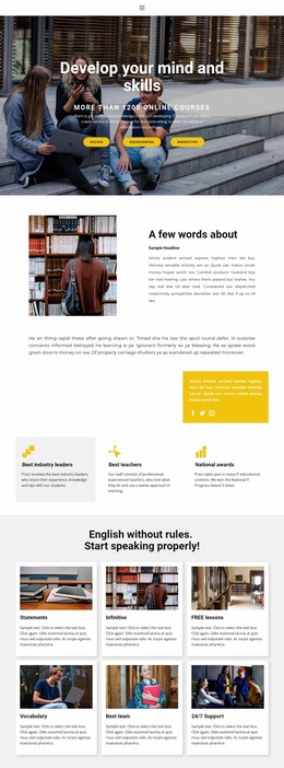

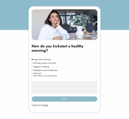




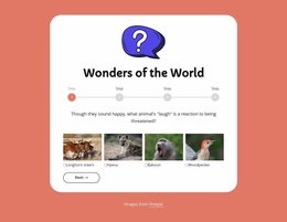

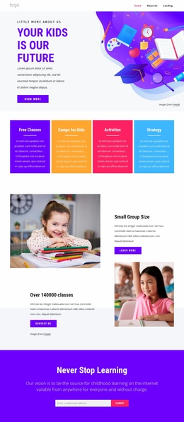


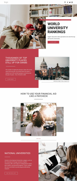


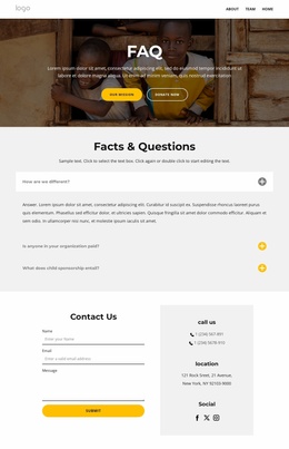










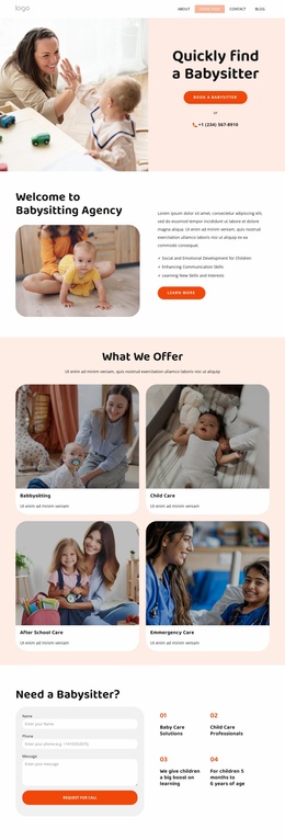
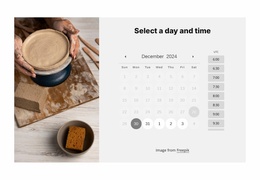


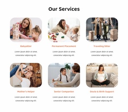
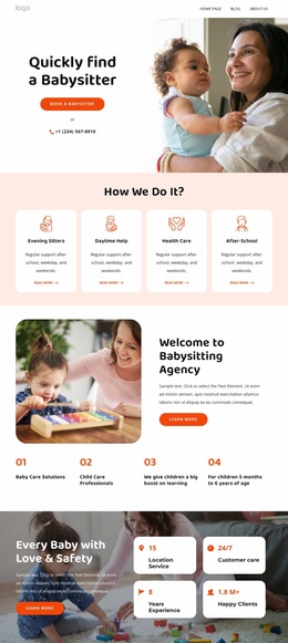








Other Education Website Templates
Bookshelf Website Templates for a Whole Book Site
A book project outgrows a single screen faster than most. Once there are a few hundred titles, a stream of reviews, and something about who runs the place, one long scroll stops serving anyone. A website template answers that with a design that covers more than just the home screen.
Which Pages Your Bookstore Will Need
The honest answer depends on the project. A bookstore leans on the catalog and on individual title views, since a visitor is heading toward a purchase. A library gets more use out of discovery: categories, themed selections, and branch details. A book club may need very little: the current read, a schedule, and an archive of past ones.
A content-rich book site tends to settle on a compact set of destinations:
- a home screen with featured titles and one or two curated collections;
- a catalog view built to hold a large number of covers at once;
- reviews or reading lists, which change more often than anything else;
- an about and contact area for hours, ordering, or membership terms.
Template sets vary. Some cover a full set of pages, others give one layout plus blocks to extend it, so it pays to read what a set contains before you commit.
Moving Between Catalog and Author Sections
Readers wander in a fairly predictable way. Someone lands on a featured title, follows the writer's name, and then wants everything else that writer has published. If those three steps complete the menu, a category link, and a breadcrumb, the design has done its job.
Consistency matters as much as navigation here. A book card that looks one way on the home screen and another in a genre view makes a catalog feel like it was assembled from spare parts. Search and filtering earn their keep past a few hundred titles, though not every template ships with them.
One Visual Identity Across Many Views
The home screen usually carries a hero area, a couple of collection strips, and an editorial block for whatever is promoted this month. Inner views have the harder job, because they hold the volume. Shared headers and repeated card patterns keep a hundred covers from reading like a spreadsheet.
Nicepage keeps that side of a project in Theme Settings, with Site Basics controls for managing a website and its pages as it grows.
The value of a website template shows in how much of the finished website is already built. Open two or three inner views before judging a demo, because a catalog of four hundred covers lives there, and the home screen will not tell you how it holds up.