
Options Website Templates
One-day rental requests and recurring memberships demand different information paths. Dedicated option pages, service policies, and contact destinations let customers follow the path that matches their needs across the site.



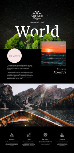
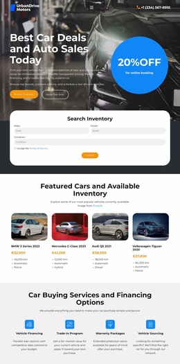
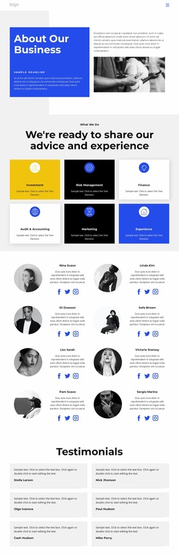
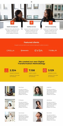


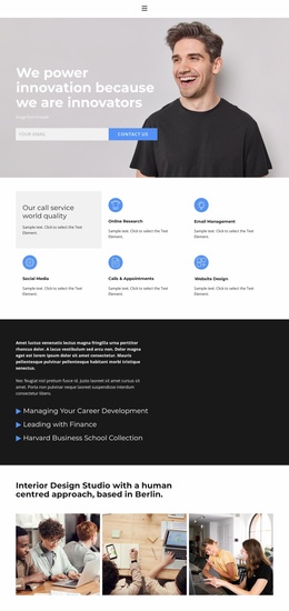
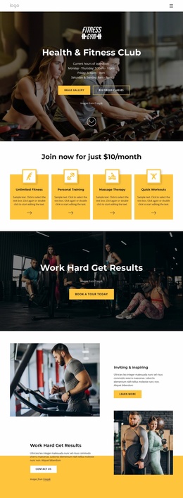
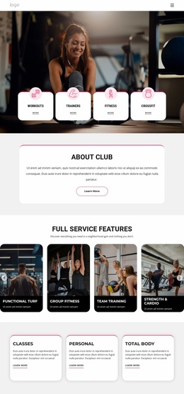
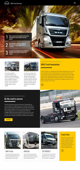

More Website Templates from Features Category
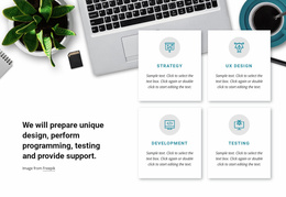
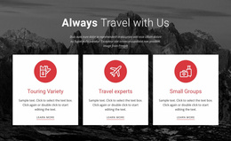
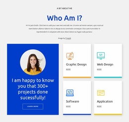
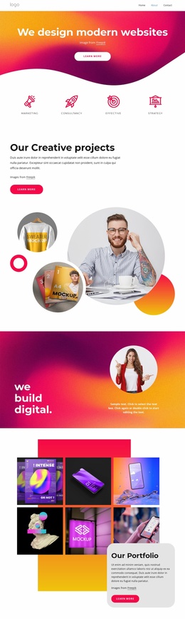

Other Features Website Templates
Contemporary Options Website Templates
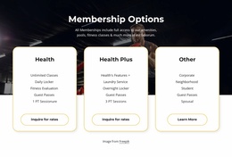
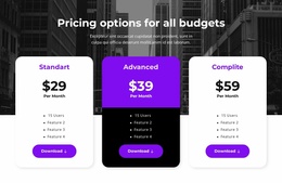
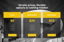
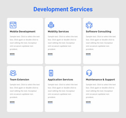
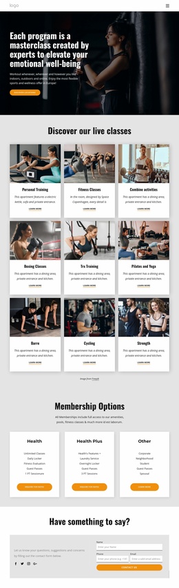
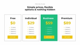
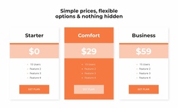
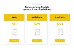
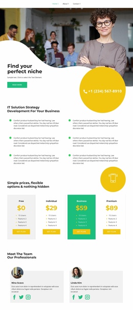
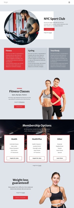
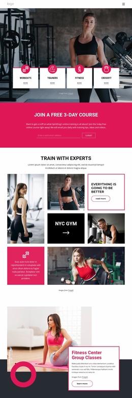
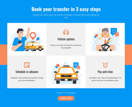
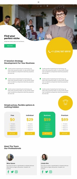
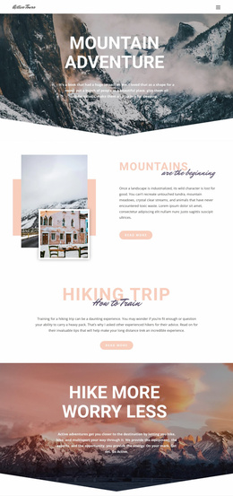
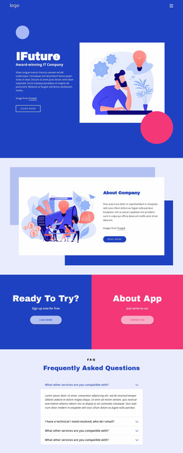
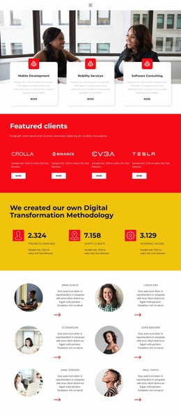
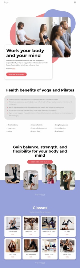
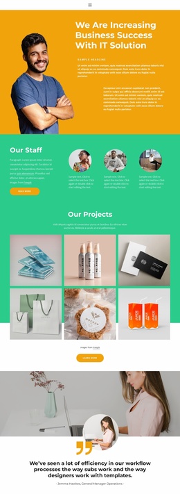
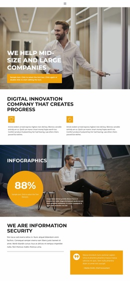
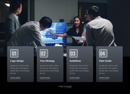
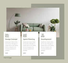
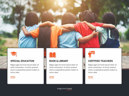
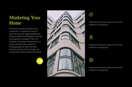
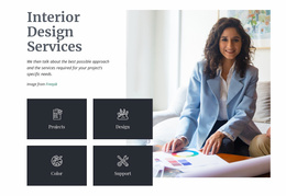
Options website templates are designs for pages where visitors compare several alternatives and pick one. In the catalog, layouts like "Membership Options" and "Pricing Options For All Budgets" handle tiered offers. Others, such as "Contact Options" or "Home Repair Options," cover choices where cost is not the main question. Each design opens in the Nicepage editor, where you can rework the text, images, and styling to fit your own offers.
How Much Room Every Option Needs
The category holds both pages and blocks, and the right one depends on how much each option has to say. A layout designed for three cards can look empty with two and cramped with eight, so review the demo with your actual number in mind.
Depending on the job, look for one of these formats:
- A block with a few cards, if you only need to add choices to a page you already run.
- A standalone page with a comparison layout, when your options differ across several features.
- A short overview linking out to detail pages, for offers that need more space than a card gives.
Swapping Demo Content for Real Offers
The position of each block, the heading size, and the spacing around it tell visitors which choices belong together. Highlighting a recommended option helps only when it suits most people. Offers from the same family compare best when they share typography and card shapes, while very different ones, like buying outright versus booking a consultation, benefit from greater visual contrast.
Adapting a template usually takes a few passes in the editor:
- Replace the demo cards with your real offers, keeping names short enough for one or two lines.
- Adjust headings, colors, and accents so the emphasis on screen follows your own priorities.
- Connect each button to the right section, page, or contact point.
Where Visitors Go Next
Nicepage's Button Element can lead to another page or to a specific block. It can also open an email address or a file. Labels such as "View Membership Options," "Explore Purchase Options," or "Contact Sales" tell people what happens after the click. A contact form belongs only where a choice needs a personal reply, such as a quote for a large group.
Take a company that offers support by phone, callback, or in-office. It picks a design in which the three blocks carry equal visual weight, swaps in its own text, and checks that nothing gets lost when the blocks stack on a phone. If you need the finished design as code, see the options HTML templates.