

Nice Website Designs
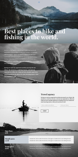
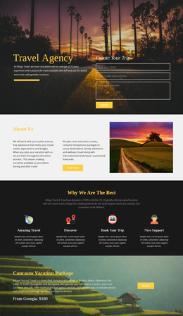
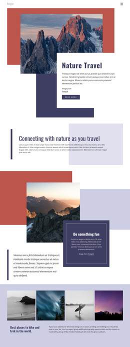
A lakeside cabin should feel quieter than a coastal cycling retreat. A nice website design uses photography, color, and spatial rhythm to express that difference while making everyday travel pleasures feel genuinely inviting.





More Website Designs from Fashion & Beauty Category




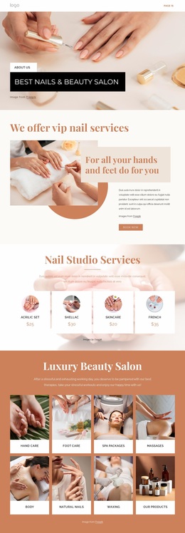

Other Fashion & Beauty Website Designs
Innovative Nice Website Designs
People browsing nice website designs react to the overall picture first and only later notice how readable the text is or how easy the navigation feels. A design can be nice in very different ways. Some are bold and high-contrast, while others stay restrained and leave most of the screen to photography. The good ones share that every color, font, and image feels like it belongs to the same site.
Where Attention Goes First
Hierarchy determines the visitor's reading order. A large headline beside the main image gets read first, and an accent button right below it becomes the obvious next step. A little space around that button often helps it stand out more than a brighter shade would. What counts as the right hierarchy also depends on the kind of site:
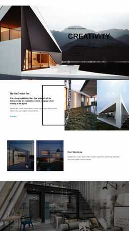
- An architecture firm's portfolio looks best when the interface stays quiet and wide margins let large project photos lead.
- An online shop needs a denser grid in which product photos share one shape so that shoppers can compare items at a glance.
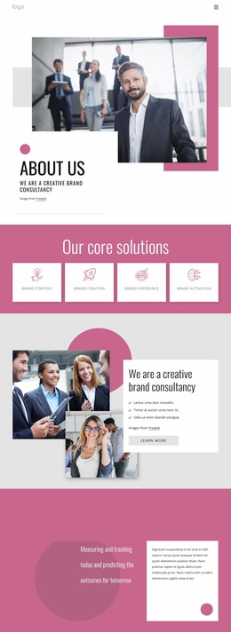
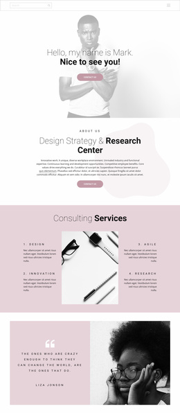
- A consulting service needs a headline that states the offer right at the top and one clear contact button.
Color Roles, Type Scale, Breathing Room
Color works best when each shade has a job. A neutral background carries the text, the main brand color appears in headings, and one accent is saved for buttons and links. Once the accent spreads to decorative shapes, it stops pointing anywhere. Headings should be clearly larger than body text, and too many type styles feel tiring even when each looks good alone.
Tightly packed cards are hard to scan, while overly generous padding pulls a heading away from the paragraph it introduces. A heading over a busy part of a photo loses contrast, and a person in the frame looking toward the text quietly leads the eye there. Nicepage Theme Colors and Font Schemes keep the palette and type pairing consistent as a project grows past the homepage.
How It Holds Together on Mobile
On a phone, a design's proportions change more than its content does. A wide hero photo gets cropped to a narrow strip, and cards that sat side by side stack into one long column. Better designs keep their hierarchy through all of that, so the headline still reads first, and the main button stays visible without much scrolling. Nice website design comes from small decisions that work together, like an accent color used only on one button or a headline that wraps neatly on a phone.