
Crazy Website Templates
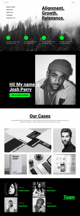
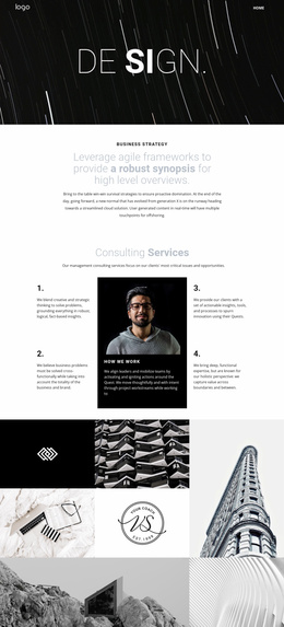
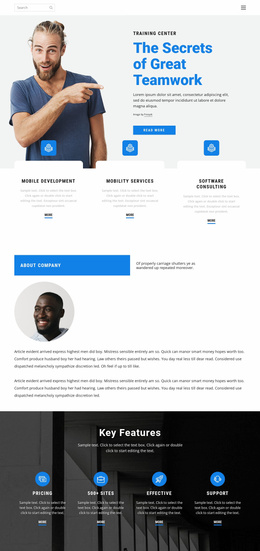
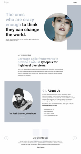
A strange visual identity can lose impact when every page feels unrelated. These complete website templates coordinate home, portfolio, story, event, and contact layouts around one navigation system, so the site stays expressive without becoming fragmented.
-
-

-
-
-
-
-
-
-
-
-
-
-
-
-
-
-
Customize Any TemplateDownload
-
-
-












More Website & HTML Templates for Crazy




More Website Templates from Medicine & Science Category






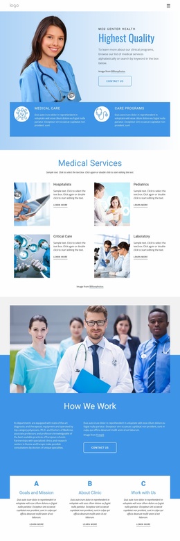

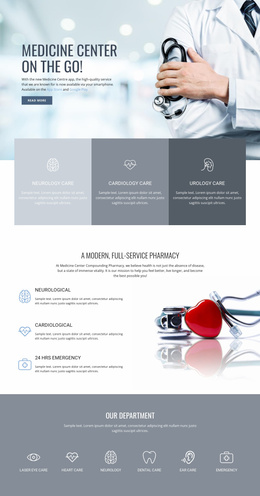


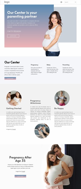
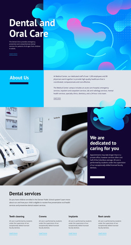








Other Medicine & Science Website Templates
Unique Crazy Website Templates
A wild design is easy to pull off on one screen but much harder to keep alive across an entire website. Crazy website templates give you a visual starting point for that longer job, with the typography, the color clashes, and the section rhythm already worked out. Instead of treating every screen as a separate design exercise, you adapt pages and blocks to the material the project actually has.
Plan Pages Around Your Project
Two projects with the same appetite for chaos rarely need the same set of screens:
- A club runs on a schedule, so events, ticket links, and directions come first;
- An experimental studio leads with selected work, individual case studies, and a short route to an inquiry;
- A small label lives around releases, an artist roster, and a shop or streaming links.
A bold home screen sets the visual direction, and everything that follows extends that style as the project grows. The screens that quietly break an experimental concept are the dull ones. A portfolio or event page looks spectacular, but then the contact form reverts to a generic layout that could belong to anyone.
Keep Navigation Findable
Whatever the composition gets up to, a visitor should be able to answer a few things on any screen:
- What is this one for;
- How to reach the next thing worth seeing;
- Which element is an action and which is decoration;
- Whether all of that still works on a phone.
A club site is the clearest case of that. The artwork can be as loud as the flyers pasted on the wall outside, yet visitors still have to find events, tickets, and the venue without first decoding the interface. Strange navigation is part of the appeal here, while invisible navigation just loses visitors.
One Style, Many Compositions
The stranger the individual screens become, the more useful a shared visual system is. Repeated fonts, button treatments, and site areas keep a project recognizable when one screen goes full collage, and the next one calms down into a plain editorial layout. Nicepage keeps that shared part in Theme Settings, so a color or a font is changed once and lands everywhere, while each page still gets its own composition.
Before publishing, walk the site the way a first-time visitor would, from the home screen down to the deepest one, and cut whatever slows that walk down. An unconventional design buys a little patience at the entry screen, and after that, it has to start answering questions.