

Spooky HTML Templates
Guests at a Halloween festival should know which attractions are suitable for children and which have timed entry. Spooky HTML templates give every zone its own structured description, timetable, and visitor notes.



More HTML Templates from Text On Image Category







Other Text On Image HTML Templates
Mobile-Friendly Spooky HTML Templates
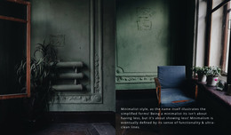
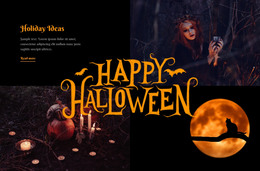
Spooky HTML templates give you a finished eerie composition with photos, headings, and spacing already in place. Dark Interior Style and Youth Fashion appear alongside the Halloween designs, so spooky here also covers moody projects with no holiday attached. A ready design means someone has planned where the main image goes and how the text reads over a dark picture. What remains is matching a composition to your purpose and swapping in your content.
Compositions Built Around Different Goals
Designs are easier to compare by the job each layout does:
- A haunted-house promo needs a dramatic first screen, where one large photo carries the title and a call to action.
- An art gallery puts images first and keeps text down to titles and short notes.
- A Halloween event needs room beside the imagery for the date, the place, and a short description.
- A moody portfolio relies on large photos and little text, so each image must hold attention alone.
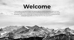
On Nicepage, the spooky category uses Text On Image, so many designs place the headline straight over a photo. Demo pictures usually leave a dark, empty patch for the words, and a busy daylight shot of your own attraction may not.
Full Pages or Single Blocks
Nicepage splits the category into Pages and Blocks. Page designs run from the first screen to the last section, while a block is one section you add to an existing layout. Several of the most visible spooky designs, including Preparing For Halloween and Youth Fashion, are gallery blocks with three tall photos and no text at all. This block fills a gap on a finished page, while a page design suits a project that starts empty.
Once a design is picked, real content goes in more smoothly in this order:
- Replace the demo images with pictures of a similar tone and shape.
- Rewrite headings at roughly the demo length, then check that each title still belongs to its image.
- Remove sections you have no use for, or add a block from the same category.
Narrow Screens Reveal Weak Spots
Responsive Modes in Nicepage let you check a design on everything from large screens down to vertical phones. On a phone, watch the first screen and how far text stretches across the hero shot, then scroll to see how sections stack. Three photos in a gallery row often turn into a tall column, pushing the next heading far down. If the haunted image and its headline still appear together at that width, the composition should hold up with real content too.