
Pipeline Website Designs
Steel fabrication websites can look imposing yet leave individual projects hard to identify. Pipeline website design uses deliberate photo composition, consistent typography, and restrained colors to make a contractor's actual work recognizable across screen sizes.
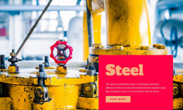

More Website Designs from Industrial Category


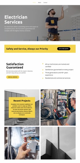

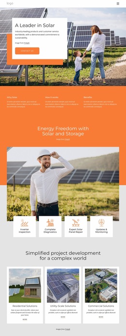
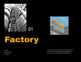
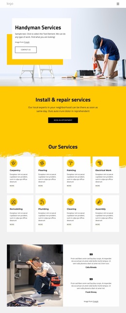
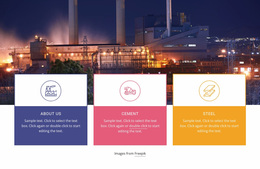
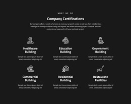
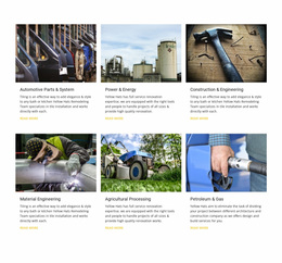
Other Industrial Website Designs
Premium Pipeline Website Design
A visitor should know whether a site belongs to a pipe manufacturer or an installation contractor before reading much of the copy. Pipeline website design settles that on the first screen through the hero photo, its crop, and the spot where the headline lands. Every inner page takes its cues from that screen.
Hero Shots That Tell Manufacturers From Installers
For a manufacturer, the workshop makes the strongest backdrop, since a close view of finished fittings leaves room beside it for a plain text column. An installation contractor needs the field instead, with a wide shot of a line going into the ground to convey scale and open sky above it for the headline. Each kind of photo suggests its own place for words:
- Rows of pipe on a rack form strong horizontal lines, and the title reads best above or below them.
- A dense plant scene needs a solid text panel, because small details show through even a dark overlay.
- Freshly coated or polished metal throws glare, and a gradient over the brightest area keeps white type legible.
Galleries Where Long Runs Stay Recognizable
A pipe rack squeezed into a square thumbnail turns into a gray stripe with no beginning or end. Captions and mobile-friendly columns come with Nicepage's Image Gallery Element, but the crop of each image is still your call. Projects read best in a simple order:
- A wide view of the line or rack in its setting.
- A medium shot of the pipe assembly or equipment involved.
- A close-up of a welded joint, framed loosely enough to stay recognizable.
Light causes trouble too, since pale galvanized pipe vanishes against white, and a heavy dark filter hides the equipment that shows what the company does. Captions should name the actual work, such as a tie-in or a coating repair.
Giving Each Color One Clear Job
With Nicepage Site Colors, one palette covers the whole project, so each shade keeps its role on every page. A light neutral suits the fact block beside a pipe assembly photo, deep blue handles headings and card borders, and one warm accent marks inquiry buttons. A second bright accent would leave visitors unsure which button matters. Compact bold headings need clean line breaks for long names like pre-insulated district heating pipe. Then compare two candidate first screens side by side on a laptop and a phone. Check how fast the headline reads, how much pipe survives the crop, and whether captions show up without hovering. The stronger version becomes the brief for finding a ready-made website in the same style.