The Button is the essential call-to-action Element that takes your site visitors to a Page, Block, File, Phone, Email, Modal Popup, or Post by clicking on it.
Add Button
You can add the Button Element from the Quick Access Panel by selecting the Button -> Button or pressing Alt+B.

You will see a tooltip helping new users set the destination for the Button Element added for the first time.

Button Presets
To add a button to your web page, you can use the Button Presets from the Quick Access -> Add Panel -> Button.

Convert Button To Hyperlink
You can quickly convert a Button to a Hyperlink and vice versa by clicking the Quick Presets in the Property Panel.

You can also convert a Button to a Hyperlink by removing the Fill and Border or adding the Hyperlink element and using its presets in the Add Panel -> Button section.
Link Button
You can set a button's destination link by clicking the Link icon on the Context Panel, which opens the Link Settings dialog.

Link To Setting
You can set the On-Click parameter in the Options on the Context Toolbar for the Button and Hyperlink Elements.
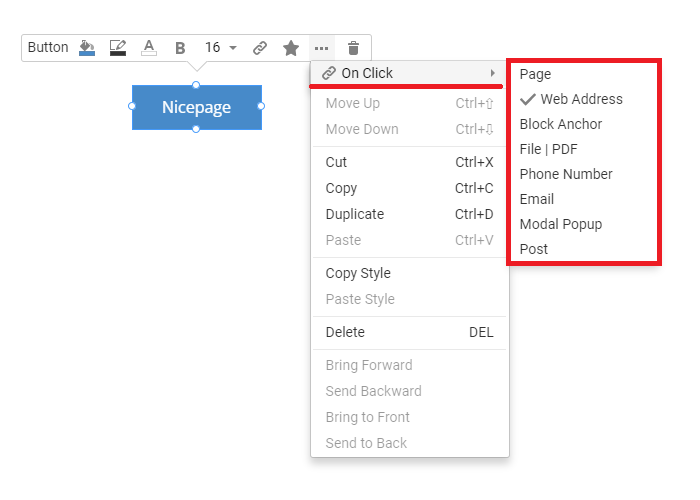
On-Click Link Property
You can also specify the On-Click property in the Property Panel to improve the usability of the Button and Hyperlink Elements' linking.

Button Link Settings
You can link a Button to a Page, Block Anchor, File or PDF, Phone Number, Email, Modal Popup, or Post.
NOTE: Use the Wed Address option to paste the web page's full URL copied from the browser address bar.

Button States
You can modify the Button Fill, Border, and Text Color for the three Button States: Default (Color), Hover, and Active.

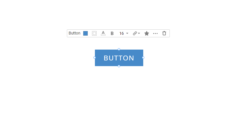
Button Properties
You can stylize the Button by editing the Properties in the Property Panel.
Button Style Options
You can apply, update, and edit the Theme Button using the Style Options.

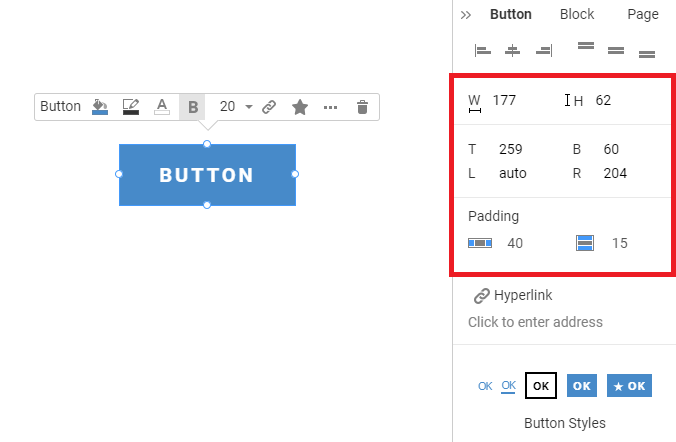
Resize And Position
You can manually resize and move the Button Element in the Editor by dragging the markers or the Element.

You can specify the Width and Height in the Property Panel by entering the values. You can also set the Left, Right, Top, and Bottom Padding values to change the Button size.
Button Styles
You can pick one of the five styles for your Button Element.

Button Background
You can customize the Background of your Button Element by setting Сolor, Hover, and Pressed Colors. If you do not specify the Hover and Pressed Colors, the primary Color is used for two other states.

Button Border
Similarly, you can add the Border to your Button Element, then change its Color and Width for all states: Color, Hover, and Pressed. If you do not specify the Hover and Pressed Colors, the primary Color is used for two other states.

No Color Option
You can set the No Color option in the Color Picker. You can also remove the Color in the Context Toolbar and the Property Panel for a Button.

Button Radius
Change the corner sharpness of the Button Element using the Radius property.

Button Text Style
Customize the text of the Button Element. Select the Font and make the text Bold, Italic, Underlined, or Uppercase. Select the Color of the text, Hover, and Pressed Colors. Adjust the Letter Spacing.

Button Shadow
Enable the Shadow by checking the Shadow checkbox in the Property Panel for the selected Button Element. You can choose the Shadow Preset or switch the Settings Tab to adjust the Shadow manually.

Button Icon
You can add a Button with an Icon by choosing the Style in the Property Panel. In the Icon section of the Property Panel, you can add and modify the button's icon.
You can also quickly use the Button With Icon Presets in the Add Panel.
Responsive Modes
You can modify the Button Element size and position for all available Mobile Views.
