
Urban Website Designs
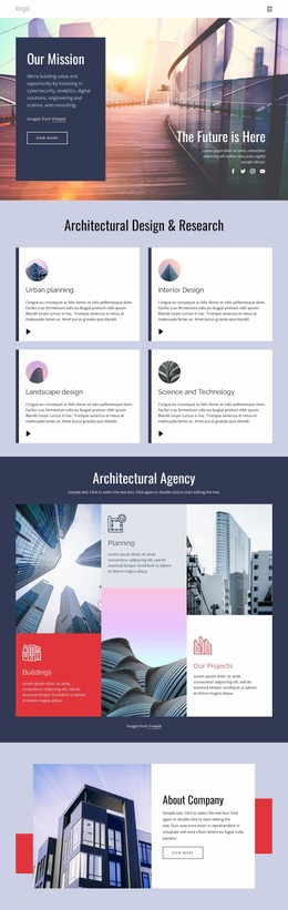
Dense city content needs hierarchy, not visual noise. Urban website design balances architectural imagery, event details, neighborhood stories, maps, and service information through a controlled palette, readable type, and repeatable page compositions.

















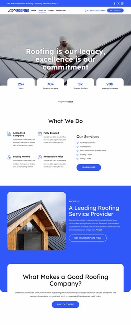
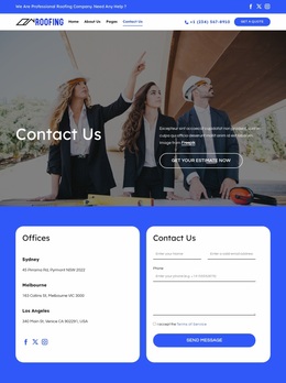
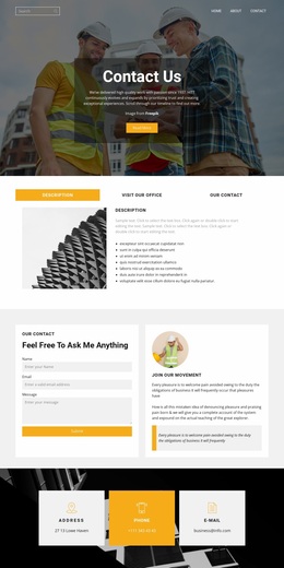
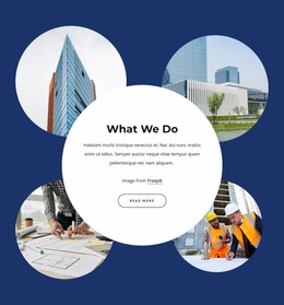
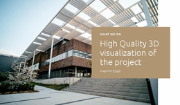
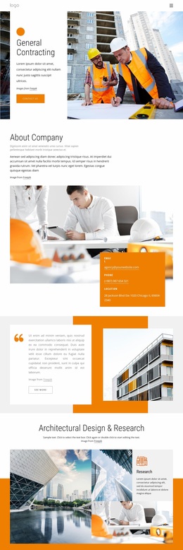

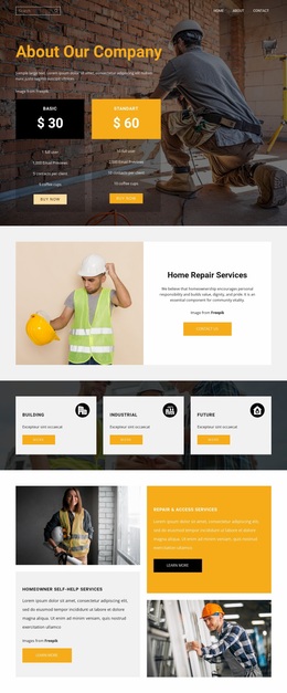
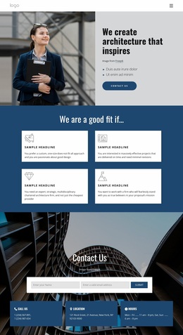
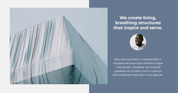
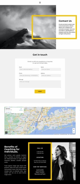

More Website & HTML Templates for Urban
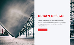


Other Architecture & Building Website Designs
Modern Urban Website Design Inspired by Streets and Skylines
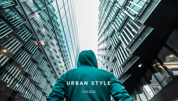
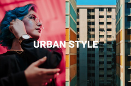
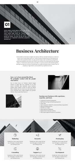
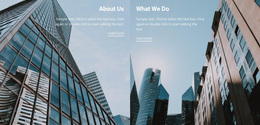
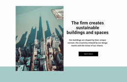
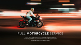
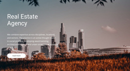
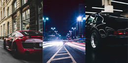
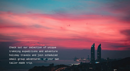
Put a photo of wet asphalt under streetlights next to a heavy, tightly set headline, and the page reads as urban before anyone scrolls. Urban website design works that way for an architecture practice and for a streetwear label that wants to look like it grew up downtown. Skyline photos alone will not carry it, though, because visitors still need to know what the place offers and where to go next.
Signals That Read as Metropolitan
A sense of place comes from a few choices repeated on every page:
- Photography of real surroundings, such as facades, crosswalks, or a busy market street, shot in natural light.
- Bold headlines over plain body text, like a storefront sign above the notices taped to its window.
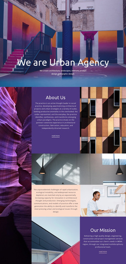
- A strict grid where photos and text panels share edges, the way windows line up across a building.
- A palette borrowed from the street, usually concrete gray and asphalt black plus one signal color for buttons.
That signal color tends to drift onto headings and icons until the palette looks noisy. With colors defined once for the site, a streetwear label can even swap its accent for each new drop in one place. The official Site Colors documentation explains how Nicepage applies one color scheme across all pages.
Photos Crowding Out Facts
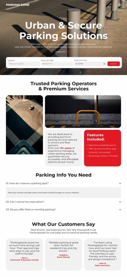
A wide photo of a building looks great until it shares the first screen with an address, opening hours, and a button. In urban website design, typography usually settles that conflict. A loud display face carries the project name, and a quieter text face keeps dates and addresses readable on the move. Nicepage stores these as site-wide typography styles, so adjusting a headline size once updates it on every page.
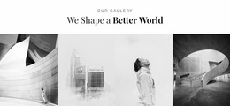
An architecture practice can let photography lead and keep captions short. A music festival does the opposite, putting dates and ticket links first and letting photos set the mood.
Outdoor Glare on Small Displays
On a phone, a skyline panorama gets cropped to a single tower, so hero photos work better when the main subject is near the center. Nicepage Responsive Modes let you adjust text size, spacing, and layout for narrower screens. Keep the photo of a place and its address on the same screen so people don't have to scroll back and forth.
In bright daylight, concrete gray and asphalt black can merge into a single dark mass on a phone screen, so buttons need more contrast than the mood board suggested. Before launch, show the homepage to someone for five seconds, then ask what the place is and where to click. If they only remember the photos, the layout needs another pass.