
Facade Website Designs
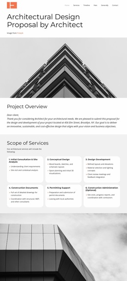
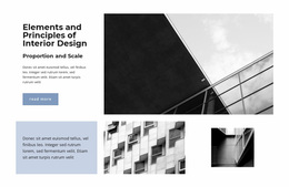
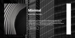
Strong facade presentation depends on more than large building photos. A controlled palette, architectural typography, material-focused imagery, and consistent composition can give technical services and completed projects one recognizable visual language.



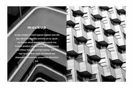
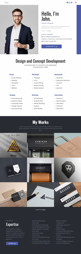

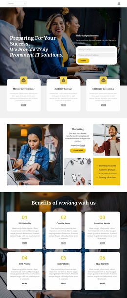
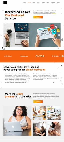
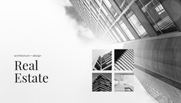
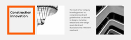
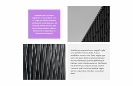


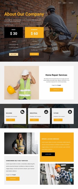
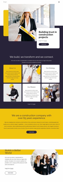
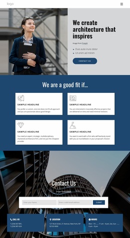

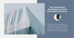






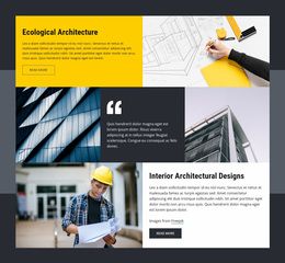
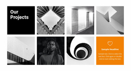
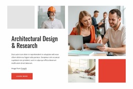



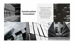

Other Architecture & Building Website Designs
Modern Facade Website Design
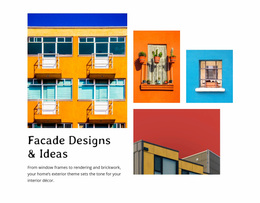
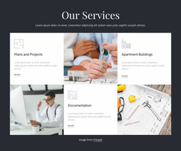
Visitors judge a facade company's website twice. First, they ask whether the finished buildings look worth commissioning. Then a specifier checks how quickly they can find systems, materials, and project facts. The facade website designs in this collection strike that balance in different ways.
Four Opening Screens Compared
Opening screens tend to follow one of four patterns, and each fits a different portfolio:
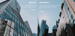
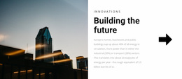
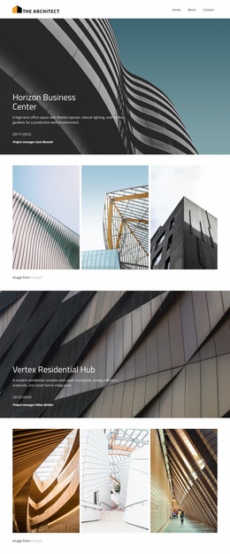
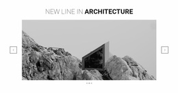
- A full-width photo of one landmark building, for firms whose signature project is already well known.
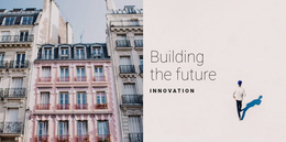
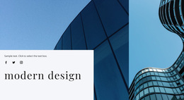
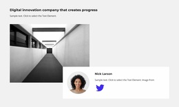
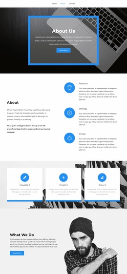
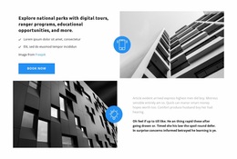
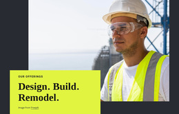
- A split screen pairing a building image with a short line about what you install, suited to firms known for breadth.
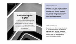
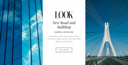
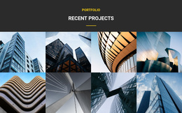
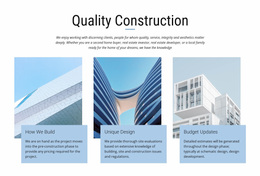
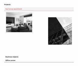
- A project-led opening that stacks several recent buildings, for portfolios with steady volume across offices, retail, and housing.
- A close-up of one detail, such as a terracotta joint or a glazing bracket, for specialists who lead with craftsmanship.
Preview each option on a phone before deciding. A wide elevation shrinks to a thin strip on a narrow screen, while a detail shot usually keeps its impact.
How Glass, Metal, and Stone Behave
The material a firm installs most should steer the other visual choices:
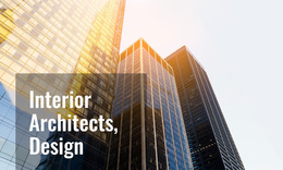
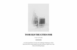
- Glass-heavy portfolios sit best on pale, quiet backgrounds, because a curtain wall photographs mostly as whatever it reflects.
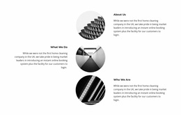
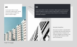
- Metal panel and industrial facades suit a strict grid whose cards and text columns echo the panel modules.
- Stone and terracotta work needs generous close-up photography, where texture, joints, and tight tolerances become visible.
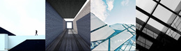
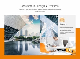
Across all three, photography does two jobs. Overview shots establish scale and show the building on its street. Detail shots prove assembly quality, down to panel alignment and sealant lines. Designs that frame the first type wide and the second type tightly look more considered than those that crop everything to a single ratio.
Grids or Alternating Stories
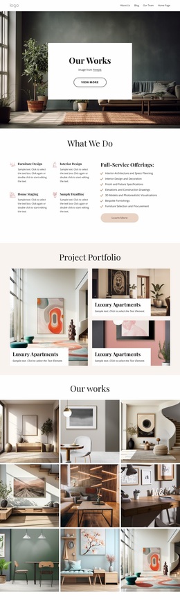
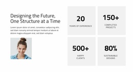
Most visitors decide whether to get in touch while looking at projects. Some designs use a grid of project cards, which works well for firms with many comparable commercial projects. Others alternate large images with short text blocks, which works better for a few complex buildings with a story behind each. Either way, consistency matters most across the cards, captions, and small blocks of technical figures. Nicepage Site Settings keep the color palette, font scheme, and typography styles consistent across the site, so those details match between a system overview and a case study.
A facade website design works when the buildings set the character and the specifications stay easy to read beside them. That combination tells an architect the firm cares about how a facade looks and how it is built.