
Swimming Website Designs
Swim schools and aquatic clubs need more than blue backgrounds and pool photos. A strong visual direction coordinates typography, color, athlete imagery, spacing, and repeated page styling so lessons, teams, and facilities feel like part of the same brand.
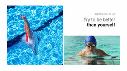

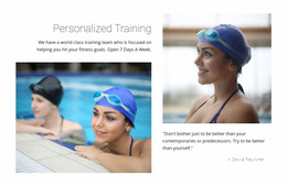
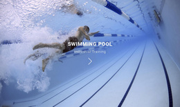
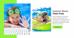


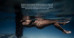
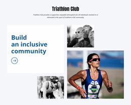
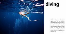
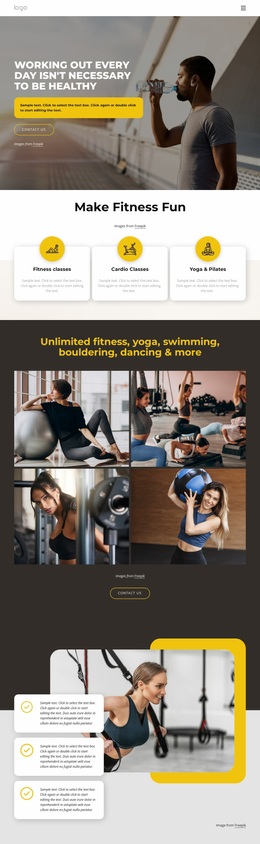
More Website & HTML Templates for Swimming



More Website Designs from Sports Category



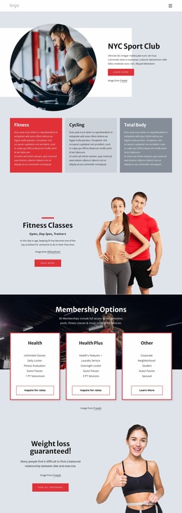



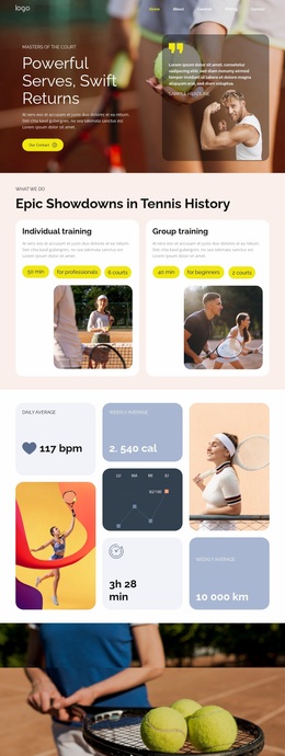


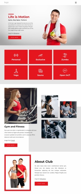
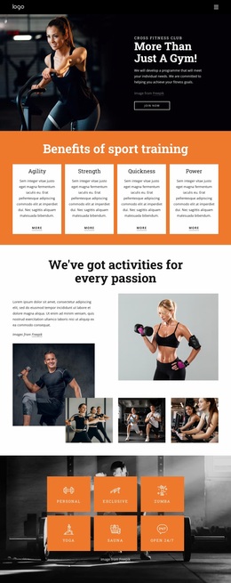


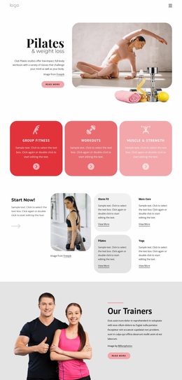

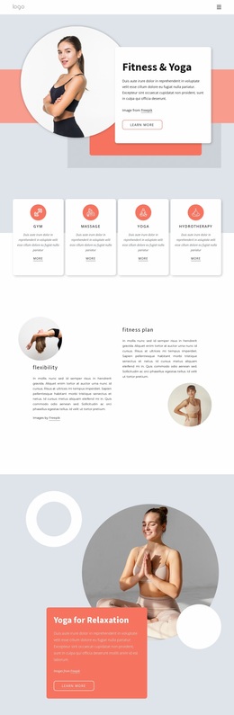



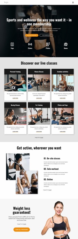

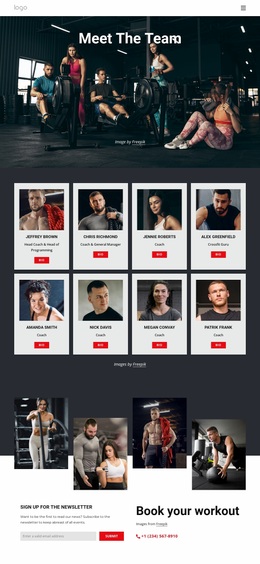
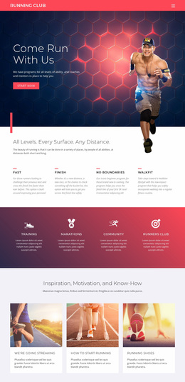
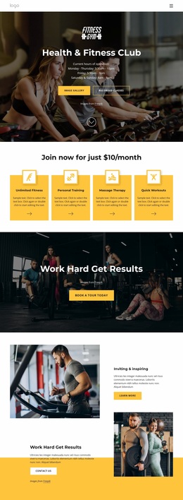
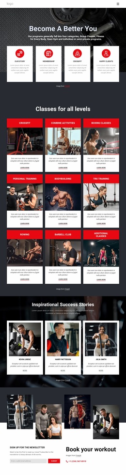
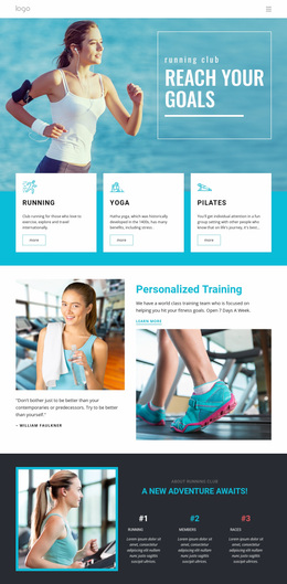
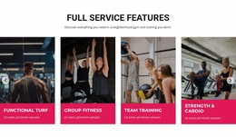
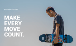
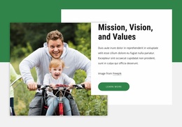
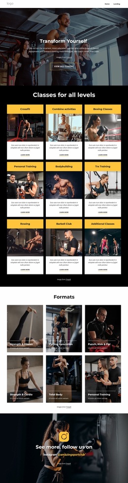
Other Sports Website Designs
Swimming Website Design That Points Visitors to the Right Class
Website design for a pool business covers much more than a blue palette. It determines how someone moves from the home screen to a suitable class, how a weekly schedule looks on a phone, and how obvious the next step is once the right program appears. Color and typography work best on top of a structure that already makes sense.
How Parents Move Toward Enrollment
Traffic to a swim school follows a path that barely changes between sites:
- A parent checks whether the school takes children of their child's age.
- They look for the level that matches what the child can already do.
- They find the nearest pool and a class time that fits the family's week.
- They book a trial or send a message.
Adults arrive by another route: squad first, then the coach, then session times and entry requirements. A site serving both reads better when the two journeys separate at the navigation, since a parent after beginner lessons and a master's swimmer checking lane availability want different first screens.
Interface Patterns Carrying Weekly Schedules
A few recurring components do most of the work on a swimming site:
- Level cards stating age range, prerequisite skill, and price in the same order every time.
- A timetable grouped by pool and by day, readable on a phone without sideways scrolling.
- Coach profiles with a portrait, a role, and the squads each person runs.
- Action buttons are placed beside the content they belong to, so booking sits with the class.
Schedules are where swimming sites quietly fail. A grid that looks orderly on a monitor becomes a wall of cells on a phone, so decide early whether to group sessions by day, level, or pool. With several pools, visitors also have to know which timetable belongs to which building.
Where Visual Identity Supports Usability
The visual layer gives that structure character. Blue is the obvious reference for water, though the useful part of a palette lies in the roles within it: one color reserved for actions, a quieter range behind the content. Nicepage Theme Colors keep those roles stable across pages, and the Site Colors documentation explains how the scheme is centrally controlled.
Typography has a job beyond personality, since prices, class names, and start times must stay legible at small sizes. Photography earns its place the same way: a coach portrait builds trust, a group lesson shows parents what a session looks like, and a race shot belongs beside competitive squads. Strong swimming website design is evident to visitors: within seconds, a person knows which programs are available, finds a level that fits, and books a trial.