
Rustic Website Designs
Woodworkers, lodges, farm shops, and handmade brands need warmth without visual clutter. A strong rustic design coordinates color, type, imagery, and spacing so every page feels natural, readable, and recognizably connected.


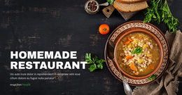

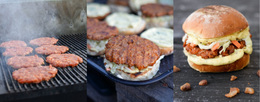
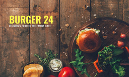

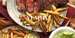


More Website Designs from Nature Category
-
-

-
-
-
-
-
-
-
-
-
-
-
-
-
-
-
-
-
-
-
-
-
-
-
-
-
-
-
-
-
-
Free Website Builder SoftwareDownload
-
-
-
-
-
-
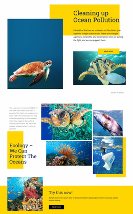
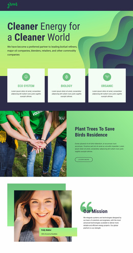
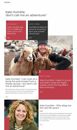
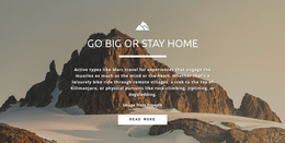

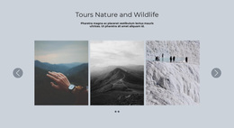
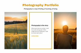
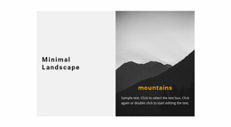
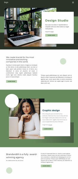


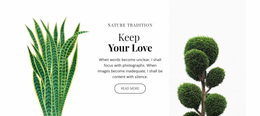
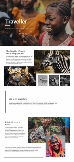
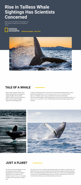

Other Nature Website Designs
Creative Rustic Website Design With Natural Character
Rustic website design draws on real materials like oiled oak, linen, and fieldstone, then gives them room to breathe. The result can be as bright as a whitewashed farmhouse kitchen or as moody as a grill room lit by an open fire. Either way, a few honest choices carry the character, and the text stays easy to read.
Materials First, Ornament Last
A convincing rustic look usually comes together in roughly this order:
- The palette starts with real materials. Two or three tones sampled from photos of wood, clay, or wool look more convincing than a stock earthy set, plus one deep shade for text.
- Type splits the work, with a display serif or sturdy slab on headings and a plain sans or book serif for body copy.
- Texture belongs in narrow bands, borders, and backgrounds behind short headings, because behind paragraphs it fights the words.
- Whitespace and a clean interface finish the job. Flat buttons, plain form fields, and wide margins keep a rustic layout closer to a tidy pantry shelf than to a crowded antique stall.
In Nicepage, one Color Scheme and a set of Typography Styles carry these decisions across the project.
Deciding Which Element Leads
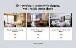
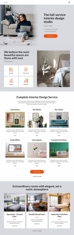
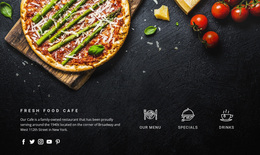
Hierarchy shifts with the business. A modern-rustic interior studio lets its finished rooms dominate through big pale photos and plenty of whitespace. Headings can stay thin, and the consultation button needs to be easy to find. A smokehouse grill works the other way around. Charred wood and lamp-lit photos set the mood, yet the menu, the address, and the reservation button deserve the strongest contrast on the screen.
Phones change three things in any rustic layout:
- Textures shrink into noise, so a wood grain that looked rich on a laptop may need to fade out.
- Wide dining room or landscape shots lose their edges, and the reservation button should never end up buried under several screens of scenery.
- Display fonts need a smaller scale, because a slab headline that spans a desktop hero can break into several clumsy lines.
Grayscale Proof, Then Warmth
Designers often check a rustic layout in grayscale. If the menu, prices, and booking button still stand out without color, the earthy tones add warmth to a layout that already works. Start with the materials, the setting, and the people who will visit. The task the site has to handle, whether a table reservation or a design consultation, decides the rest. You can usually avoid sepia filters and fake burlap.