
Mystery Website Designs
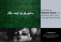
Crime-fiction publishers need a precise, tense atmosphere, while supernatural storytellers may prefer ambiguity and unease. A strong visual direction combines restrained contrast, readable type, and carefully framed scenes without making every screen dark.

More Website Designs from Nature Category
-
-

-
-
-
-
-
-
-
-
-
-
-
-
-
-
-
-
-
-
-
-
-
-
-
-
-
-
-
-
-
-
-
Free Website Builder SoftwareDownload
-
-
-
-
-
-
-
-









Other Nature Website Designs
Unique Mystery Website Design for Atmospheric Story Worlds
A noir crime series should not look like a Victorian séance, even though both run on secrets and suspicion. Picking a mystery website design starts with that difference, because the kind of mystery decides the direction long before taste does. After that, you can judge a design by how it handles case titles, evidence photos, and long stories.
Choosing Among Three Visual Directions
The genre splits into recognizable looks, and each one shapes the grid as much as the palette:
- Noir detective designs borrow the composition of an old newspaper front, with archival photos and heavy headlines. A single red accent can mark the elements visitors are meant to click.
- Supernatural mysteries lean on fog gray, muted violet, and pale silver, but layering matters more. Translucent panels over dim photographs let key blocks surface while the rest stays half-hidden.
- A contemporary investigation can skip the vintage look. A strict grid, documentary photos, and plain sans-serif type let the evidence itself supply the tension.
An expressive serif suits headlines in a historical mystery, but long chapters need a calm sans-serif on a quiet background. Nicepage's Font Scheme and Typography Styles keep these pairings consistent, and Theme Colors apply one palette across the site while each story can still have its own accent.
Composition Built Around Something Missing
Mystery imagery works best when something seems to be absent. An abandoned hallway leaves room for a headline, and the half-open door at its end gives the eye a place to land. A desk with one empty folder pulls attention straight to the gap, no trench coat required. On a case view, the title, the main image, and the summary should differ clearly in weight.
When a photo carries the opening view, run it through these checks:
- Light text over a busy photo fades, so darken the image, add a solid panel, or move the headline.
- On phones, the crop should keep the main subject, and the headline should not cover the detail that makes the image unsettling.
- Banners and preview cards should never give away a reveal, since visitors see them first.
Archive Grid or Cinematic Scale?
A detective podcast could look like an investigation archive, with a tight grid of episode tiles and muted photos. It could also feel cinematic, with edge-to-edge images and large titles over them. The archive suits listeners who browse dozens of cases, and the cinematic version favors a handful of big stories. When comparing mystery website design ideas, ask whether the look fits the mystery and whether titles and links still stand out from the decoration.