
Desert Website Designs
Desert imagery can dominate a page unless typography, color, contrast, and spacing give practical content equal visual control. A strong design system lets dunes, resorts, expeditions, and destination stories share one recognizable visual language.





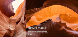

More Website & HTML Templates for Desert
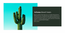
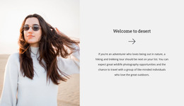
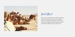
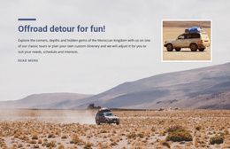
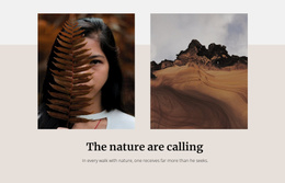
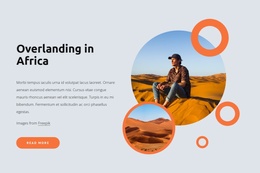
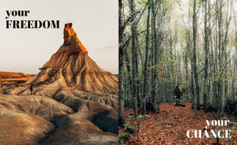
More Website Designs from Nature Category
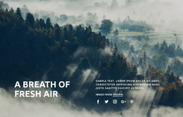
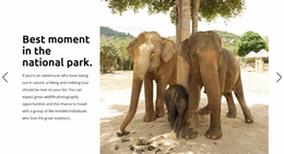
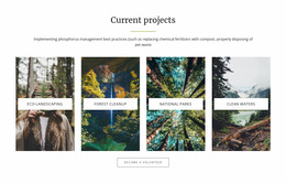
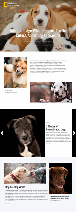


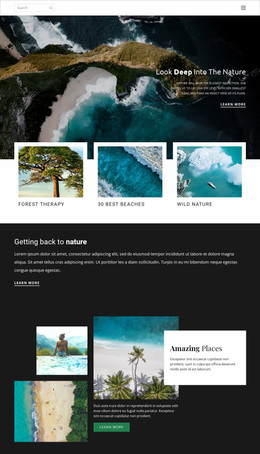
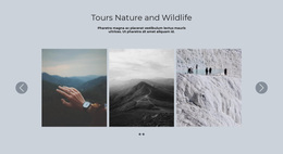
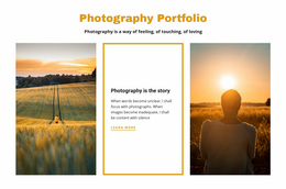
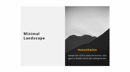
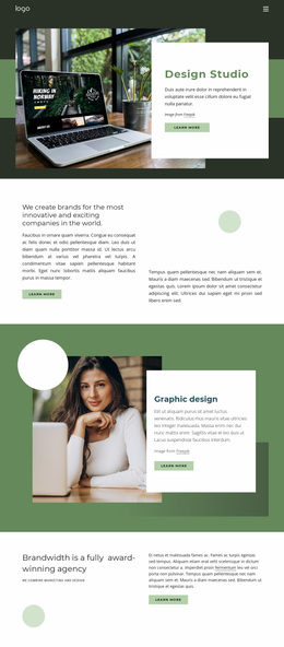
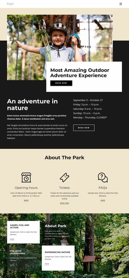
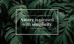
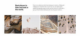

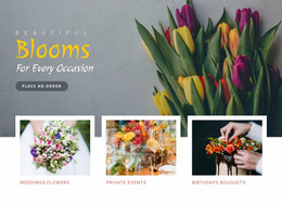
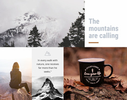
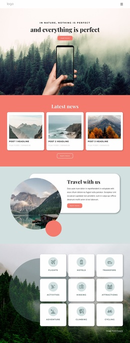
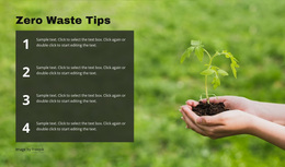

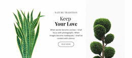
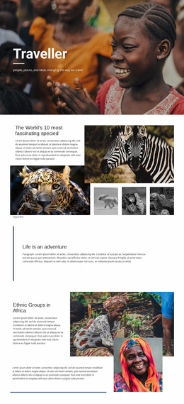
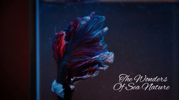
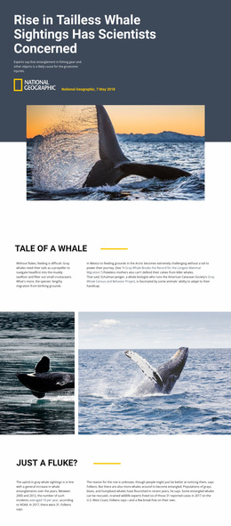


Other Nature Website Designs
Innovative Desert Website Design
Desert sites rarely fail at photography. They fail when a wall of beautiful dunes leaves visitors unsure where to find the trip details. That tension between a huge landscape and a small block of facts is the design problem here.
Giving Every Image Its Job
Photographs work harder when each has an assigned role:
- a hero image that sets the mood, dunes or canyon at low sun
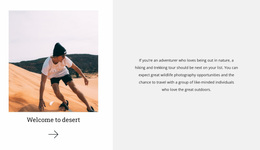
- editorial shots that pace the story between sections
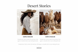
- small card visuals for tours, camps, and expedition leads
- a gallery where detailed photography becomes the content
Route or map imagery joins them when it aids orientation, not decoration. Varying image scale matters more than adding another beautiful frame: full-width photographs in a row flatten into wallpaper, and one ratio repeated everywhere turns a rich set into a contact sheet.
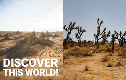
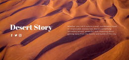
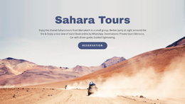
The desert hero is harder than it looks. Sand fills the frame with light and texture, local contrast drops, and white type laid over it disappears. Put the headline on the calm part of the frame or bring in a dark overlay, then keep the rest simple: a destination name, one line about the trip, and a button.
Color Roles, Type Pairs, Contrast
A desert palette does not have to be beige-on-beige. Sand, clay, and terracotta can serve as backgrounds; muted green or deep blue can carry accents; and one saturated tone belongs to actions, so an inquiry never blends into the scenery. Nicepage Theme Colors apply that scheme across the project, and the Site Colors documentation covers it.
Typography carries two jobs. A display face belongs to destination names and expedition titles, where the site is still selling a feeling. Departure times, prices, and route facts need a plain face that survives fast scanning by somebody comparing operators.
Pacing From Atmosphere to Action
A rhythm that works for desert travel often opens with the hero, moves to destination highlights and the trips, and ends with a clear inquiry block. It is a rhythm, not a required arrangement: a landscape publisher may run editorial images while an operator runs a tour list.
Density is part of the same idea. The hero and the gallery can breathe, while an itinerary block should be calmer and tighter. A day-by-day list in modest type beats a decorative treatment that hides which day the camel trek takes place. Decorative faces belong in short headings, and the action color stays the loudest thing on the screen.
Photography is what makes a desert site feel like the desert. The design earns its keep when that feeling is paired with a price, a departure time, and a button people can find at a glance.