
Pricing HTML Templates
SaaS teams, service companies, and membership businesses need pricing pages that clearly show plan differences. Ready-made HTML layouts provide a practical structure for tiers, costs, feature comparisons, and calls to action.
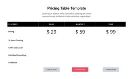
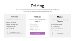
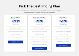

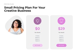
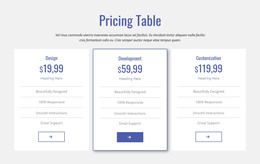
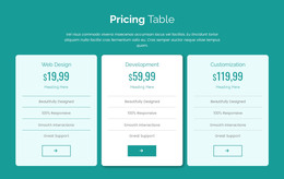
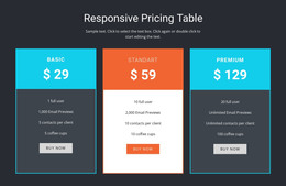
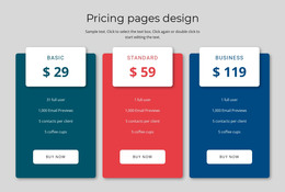

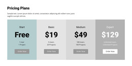
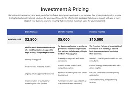
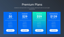
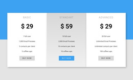







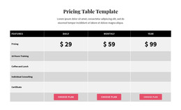
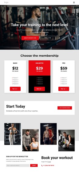
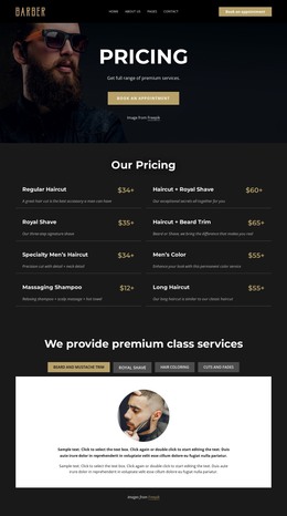












Other Pricing HTML Templates
Advanced Pricing HTML Templates for Clear Plan Comparisons
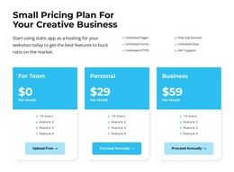
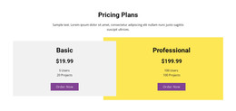
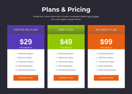
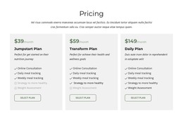
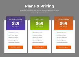
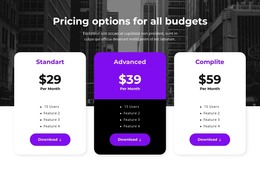
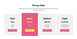
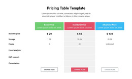
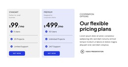
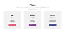
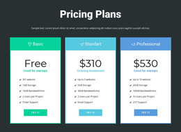
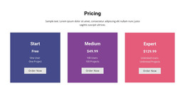
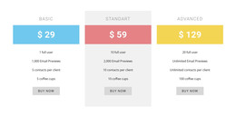
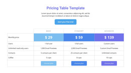
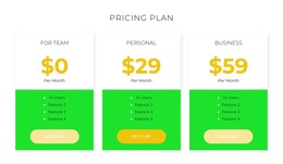
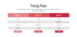
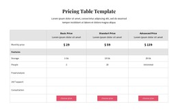
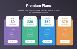
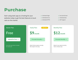
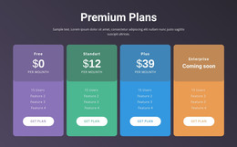
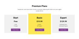
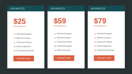
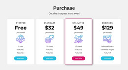
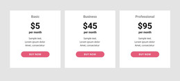
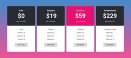
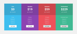
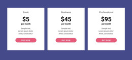
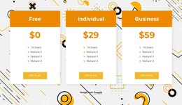
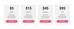
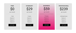
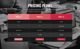
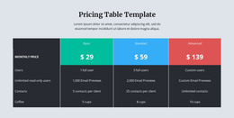
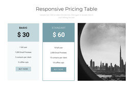
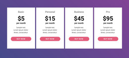
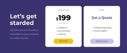
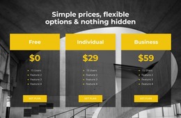
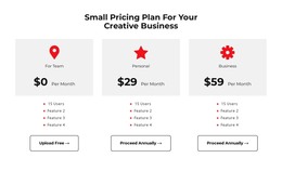
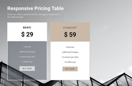
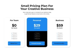
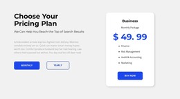
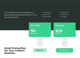
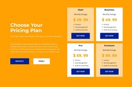
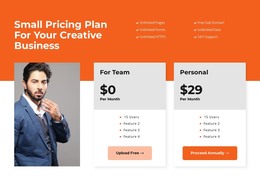
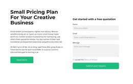
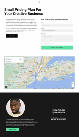
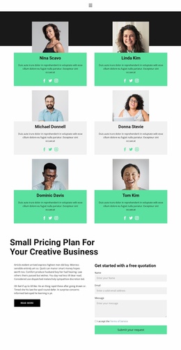
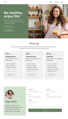
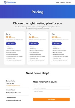
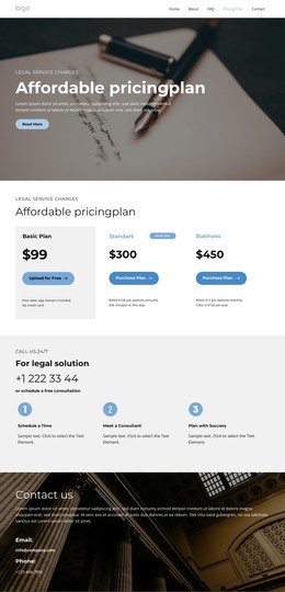
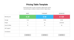
Pricing HTML templates provide a complete comparison layout so that you can start with your own plans and numbers instead of an empty section. A typical template arrives with a heading area, a row of tier cards, and a button under each offer. Many designs also add a highlighted plan and a short billing note under the prices.
Pricing Cards, Tables, or a Dedicated Page
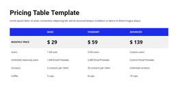
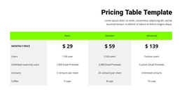
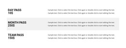
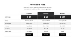
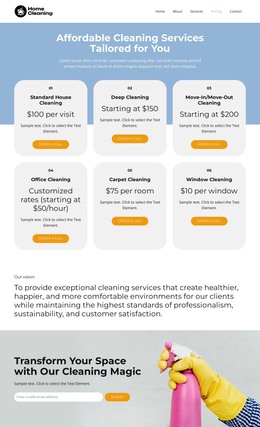
The first choice is the comparison format. Compact cards suit two or three plans with a few clear differences, while a full table handles offers where many features change from tier to tier. A pricing section template sits inside an existing homepage or product overview, so it has to stay short. A dedicated pricing page template leaves room for annual discounts, refund questions, and a longer feature breakdown.
The business model usually points to the right format:
- SaaS products often fit cards named Starter, Pro, and Enterprise, with prices shown per month or per user.
- Hosting plans lean toward feature-heavy tables, since storage, bandwidth, and support level differ between tiers.
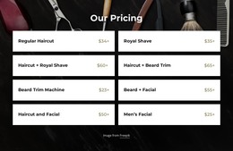
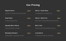
- Agency packages read better as service cards listing scope, deliverables, and the number of revisions.
- Membership offers work as access-level cards describing library access, community features, or live sessions.
Room for Real Numbers
Prices on a real offer rarely look as tidy as the demo. One plan costs $29 per month, another is billed annually, and the top tier may show a custom quote instead of a figure. A solid template provides separate fields for the amount and billing period, so switching from monthly to yearly values doesn't break the card.
A row that looks balanced with three plans can feel empty with two, while a comparison table absorbs a fourth tier more easily. The better designs also let each tier show what it adds, so visitors don't have to reread the same long list under every card. On a phone, the cards should stack with each price staying next to its plan name and button.
Customizing Tiers Before Publishing
Plan names, prices, and button labels should be easy to replace, and the tier order should be simple to change when a new plan becomes the recommended one. The highlight badge ought to follow it, so nobody rebuilds the row by hand.
Once the page is updated with final plans, labels, and links, the Export HTML guide explains how to prepare a finished Nicepage site as HTML files for external hosting.
A pricing HTML template does its job when visitors compare tiers at a glance, and you can swap in new prices without redesigning the section.