
Person HTML Templates
Consultants, creators, speakers, and specialists need more than a name and portrait online. These person HTML templates organize biography, expertise, work samples, and contact details into a responsive structure, ready for individual content.
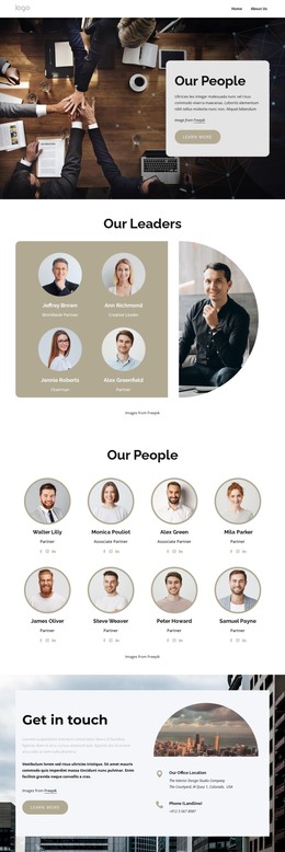
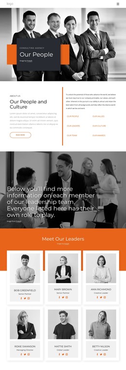
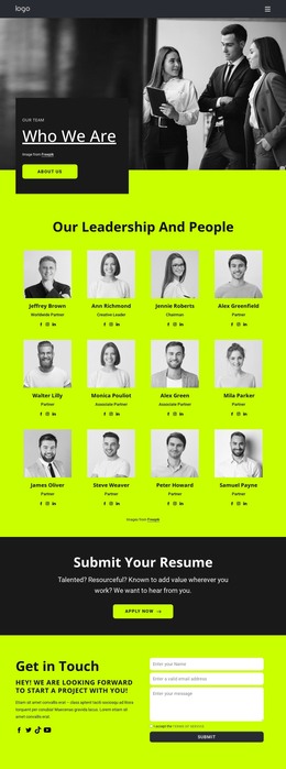
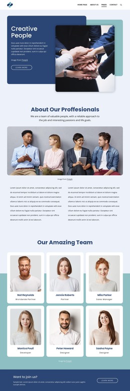
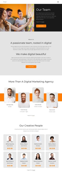





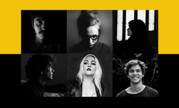
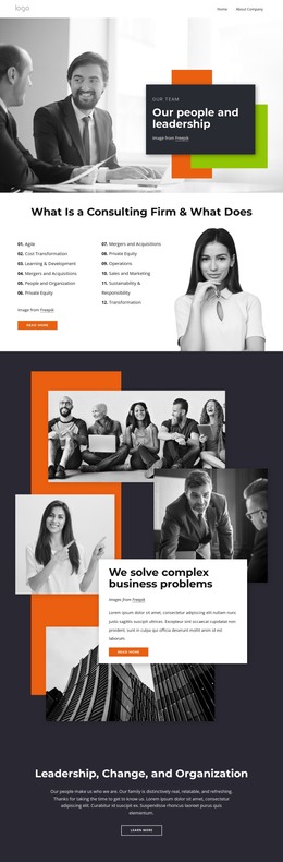
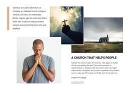
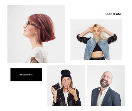
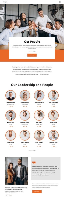
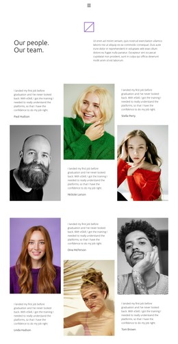


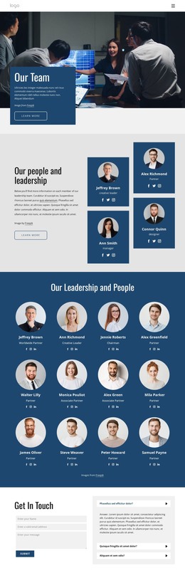
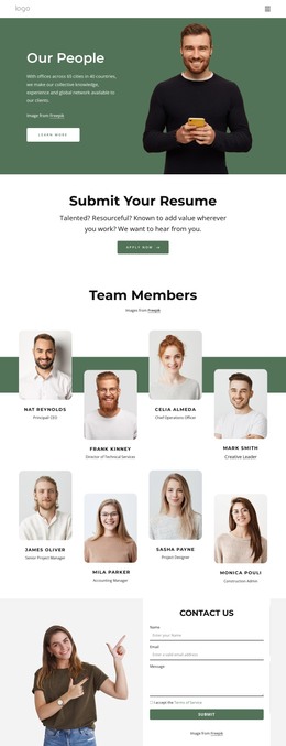
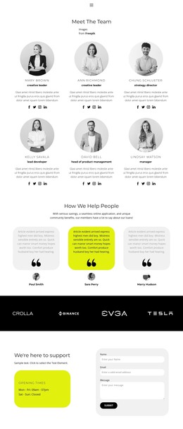
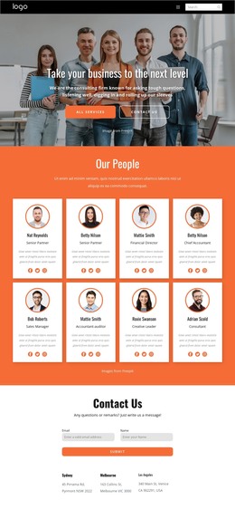
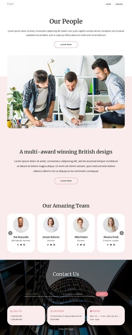
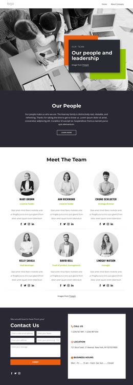
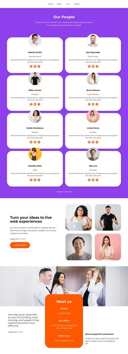







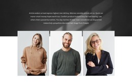
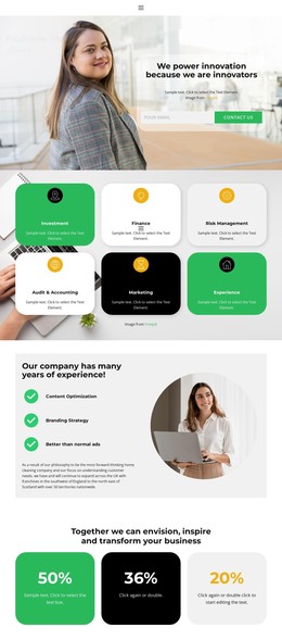
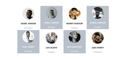
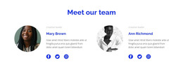


Other Team Page HTML Templates
High-Performance Person HTML Templates for Sites That Show People
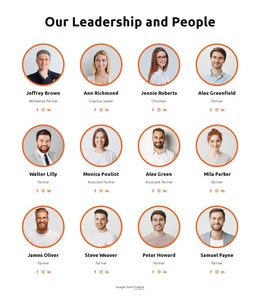
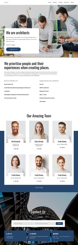
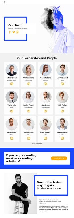
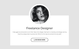
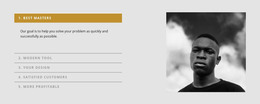
A person template is a layout built around one person: a photograph, a name, and a role that indicates where that individual fits. Catalogs under this heading mix several things. Some entries are complete personal profiles; others are leadership sections, team cards, or customer stories.
Standalone Profiles Versus Team Cards
A page devoted to one individual and a card repeated down a staff section are different jobs, though both arrive labeled the same way. What they share is a small set of content groups:
- identity: portrait, name, and the role or title sitting under it;
- context: a biography, a responsibility inside a company, or a short story;
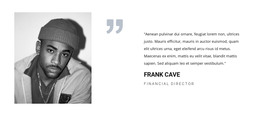
- proof: selected work, credentials, or a quote from somebody who hired them;
- Next step: contact details, social links, or a button that starts a conversation.
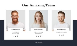
A standalone profile can afford all four in sequence. A card inside a grid usually gets an identity plus one line of context, and the rest waits behind a link. Templates that handle both let a card open into a fuller layout without a second design.
Who Is Pictured Changes the Priority
An executive profile and a photographer's portfolio pull in opposite directions. The first wants the name, title, and company to be legible in the first second, with a formal portrait that stays out of the way of the text. The second can shrink the portrait to a corner and give the screen to the work, because the pictures are the argument.
Between those sit the ordinary cases. A clinic listing forty staff members needs cards that stay consistent, and a company publishes founder bios of wildly uneven length. Consistency breaks first here. One person writes four sentences, another writes twelve, and a card designed around four will announce it.
Portraits and Bios on a Phone
People layouts fail on small screens in predictable places. A portrait sized for a desktop hero swallows the first view, and a name can drift from its title once columns collapse. Long biographies push contact links below the point where anyone scrolls.
Nicepage Responsive Modes let you open the same layout in desktop, tablet, and phone views. The Responsive Modes documentation explains how each view is adjusted, where the two-column portrait and biography are checked as they collapse into one.
The question worth asking before the visual one is how many faces the layout carries and how much each has to say. A single long biography and a directory of thirty short ones rarely live in the same template, and choosing the wrong one costs more editing than the download saved.