

Login Website Mockups
A login screen must make account access easy to understand before development begins. These website mockup concepts help designers evaluate credential field placement, button hierarchy, recovery options, and responsive compositions for customer portals and membership applications.







More Website Mockups from Contact Form Category

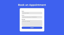
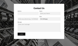
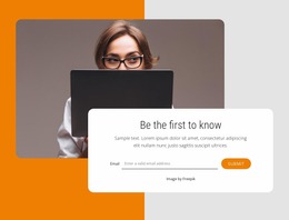
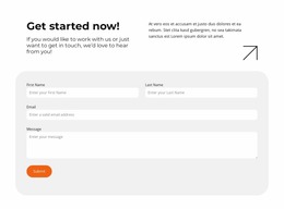
Other Contact Form Website Mockups
Login Website Mockup Ideas for Pre-Development UI Reviews
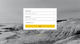
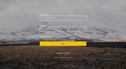
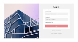
A login website mockup gives designers a visual starting point for comparing account-access screens before development begins. Options range from a minimalist login screen to a branded split-screen login or a compact member sign-in panel. Teams can review these static layouts for clarity and visual fit; a mockup itself does not test whether sign-in works.
Planning a Clear Login Screen Mockup
Start by comparing composition and contrast. A centered form keeps attention on account access; a split-screen composition makes room for an illustration or short product explanation. In either version, the sign-in action should stand out, and recovery links should be visible without competing with it.
A useful review can focus on five decisions:
- Choose the composition. Compare centered and split-screen arrangements against the available content.
- Set field spacing. Check label readability, alignment, and the distance between controls.
- Establish action hierarchy. Make the primary button visually distinct from secondary links.
- Prepare an empty state. Show the untouched form with its intended labels and hints.
- Prepare feedback states. Design separate views for invalid input, loading, and a successful transition where relevant.
These states are optional visual frames, not evidence that validation or navigation works. Clickable flows require a prototype or implementation; when choosing a mockup, first judge the clarity of the static screen.
Responsive Mockups for Different Login Experiences
Compare desktop and mobile presentations before selecting a layout. A large image beside a narrow form may look balanced on desktop, but on a phone the controls should remain prominent, with decorative content reduced or moved below the main action. Check field contrast, the placement of recovery links, and whether the primary button remains immediately visible.
Nicepage provides a Grid Element for arranging content in adjustable cells. Designers can use it to explore compositions and examine how the layout changes at narrower widths.
For a booking platform, a mockup might emphasize quick return-user access; for a creative portfolio with client accounts, it might place a restrained sign-in panel beside project imagery. The specific visual emphasis should follow the product context, not a generic login-page formula.
Before handoff, share the approved desktop and mobile frames with the developer or product team, including annotations for error text, disabled controls, and the intended post-login destination. That makes the mockup a useful design specification without confusing it with a tested authentication flow.