
Car Website Designs
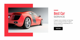
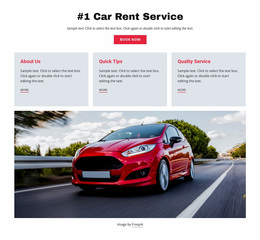
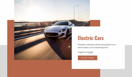
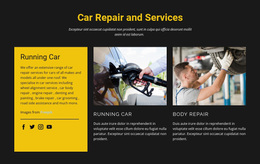
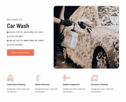
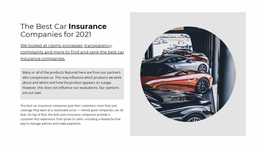
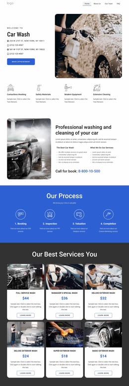
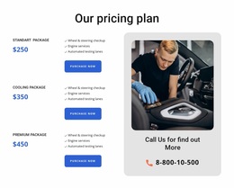
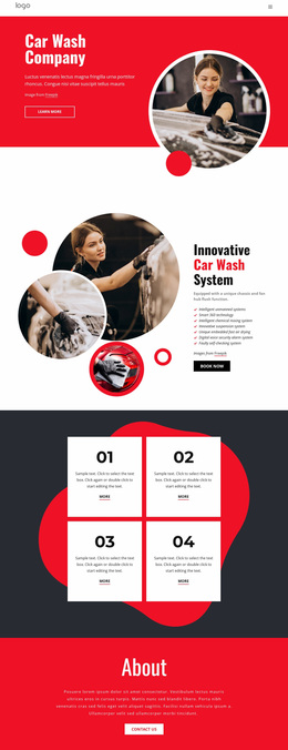
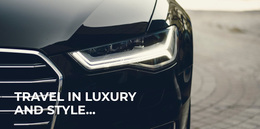
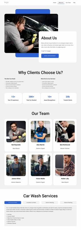
A premium showroom, used-car dealer, workshop, and performance brand should not communicate with the same visual language. Automotive website design coordinates imagery, typography, palette, spacing, and composition around the character of the business.

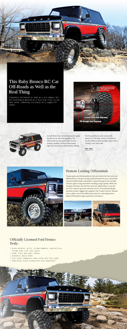
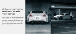
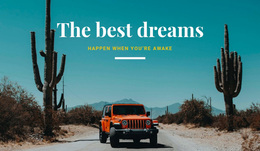
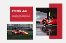
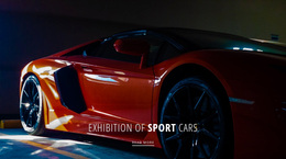
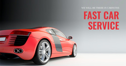
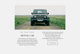
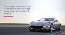

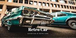
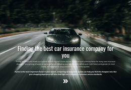
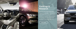
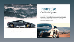

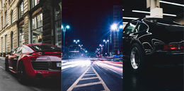
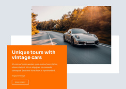
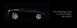
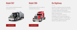

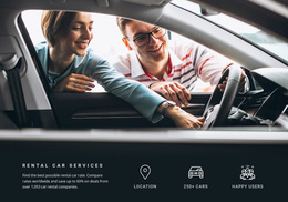

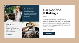
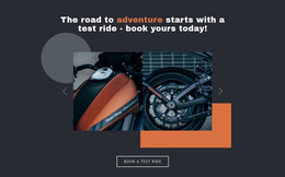
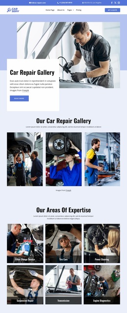
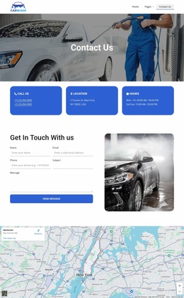
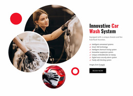
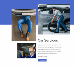
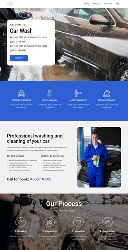
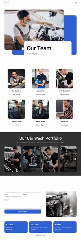

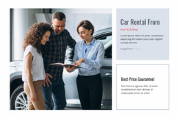
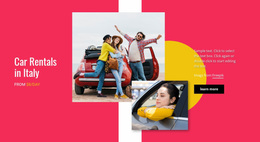
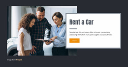
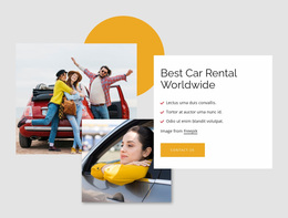




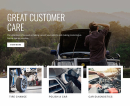
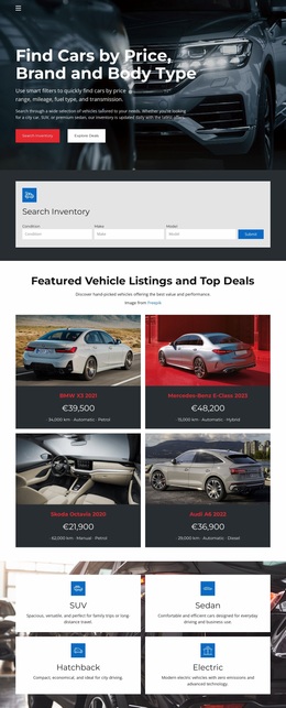
Other Cars & Transportation Website Designs
Stunning Car Website Design for a Distinct Automotive Identity
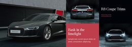
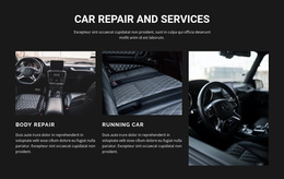
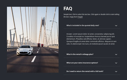
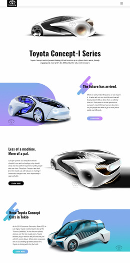
You can usually tell what a dealership sells before reading a single word. A dark grid with wide photography and thin lettering suggests performance or premium stock. A bright layout with high prices and visible service blocks says family car, fair deal, come in on Saturday. Car website design is about making that first impression accurate.
Character Comes From Positioning
Most automotive brands settle into one of three visual positions:
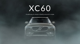
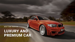
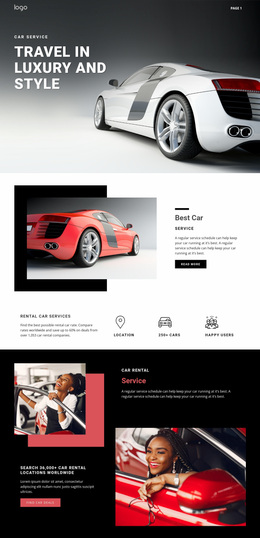
- luxury and classic, with restrained lettering, dark neutrals, and one car at a time;
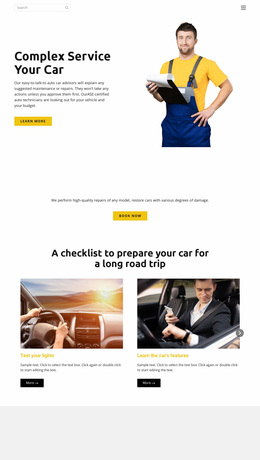
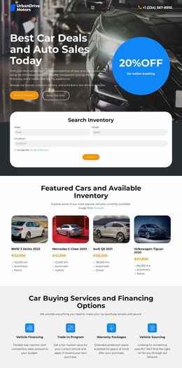
- family and volume retail, with bright accents, clear price blocks, and early access to finance;
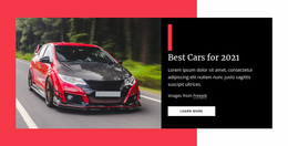
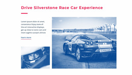
- performance and tuning, with high contrast, strong diagonals, and motion in the imagery.
Whichever one fits, the numbers still have to be legible. A performance dealer can run a black background and heavy display lettering, though the moment mileage and engine data become hard to read, the styling has cost a sale. Trouble usually starts when a family showroom borrows the visual language of a supercar brand and then wonders why its finance table feels unwelcoming.
Hierarchy Between Photos And Numbers
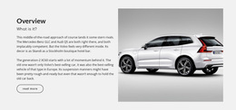
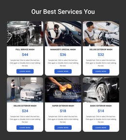
In a stock listing, images draw the eye first, and the price, with two headline figures, should be the very next thing it finds. In a full-vehicle view, a wide lead shot can dominate, with trim and specification data set underneath it and the test-drive action never far from the photography.
Typography does most of the separating. A face with personality carries headings and brand statements, while a plain, predictable one handles model names, prices, and mileage. Mixing those roles is the fastest way to make a serious showroom look like a classified ad.
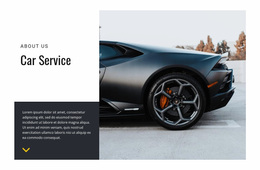
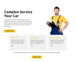
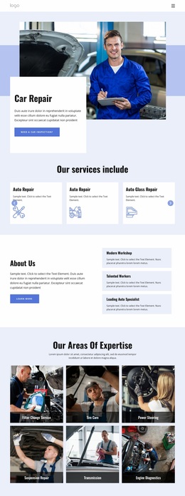
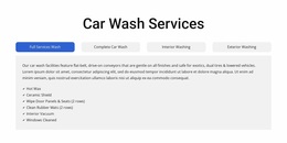
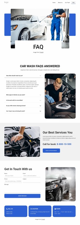
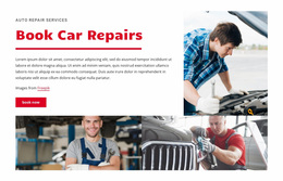
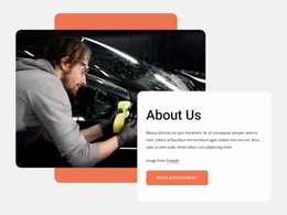
The service side of the business needs the same discipline, with the volume turned down. A booking action competes with far less imagery there, so it can afford to be quieter and still get pressed.
Consistent Palettes, Confident Type
Nicepage Site Colors apply a shared Color Scheme across a project, and the Site Colors documentation explains how the global palette is managed. Fonts, scheme, and Typography Styles do the same for lettering. With both in place, a promotion block, a service section, and a stock grid can look different from one another yet still appear related.
The measure of a good car website design is straightforward. A visitor should be able to read your positioning from the lead image, the vehicle cards, and the price hierarchy alone, before a single line of copy explains who you are.