
French Landing Pages
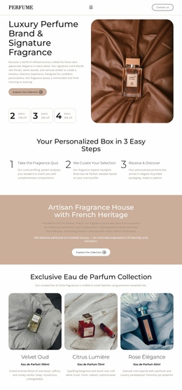
A visitor interested in an atelier de parfumerie may hesitate if the dates, materials, or language options aren't clear. Keep one workshop at the center of the page and place a direct inquiry action after the essential details.
-
-

-
-
-
-
Free Website Builder SoftwareDownload
-
-
-
-
-
-
-
-









More Landing Pages from Travel & Hotels Category




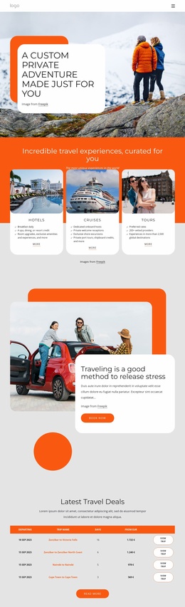

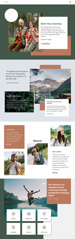





Other Travel & Hotels Landing Pages
Contemporary French Landing Pages
A French landing page is a one-page design that asks visitors for a single response, such as a preorder, a booking, or a signup. “French” may refer to the campaign language or to a brand bringing a French name and style abroad.
Sections Stacked Around One Offer
Templates in this group usually stack their sections in a familiar order:
- An opening screen with the headline, a strong image, and the main button.
- A short block of benefits or program details.
- Proof such as attributed reviews or photos from past events.
- Answers to common questions, placed just above the form.
A perfume atelier in Grasse running workshops needs dates and group size near the form. A photo of the workbench tells that story better than any view of the Eiffel Tower. A fashion label launching a capsule wants product shots and the price beside a preorder button. Favor a template whose sections already follow your sequence, since moving a block beats building a missing one.
Calls to Action in Natural French
Two equally prominent buttons with different goals make visitors hesitate, so keep one main action. Its label should say exactly what happens after the click:
- “Réserver une séance” fits a workshop with a real booking calendar, while a plain inquiry form calls for “Demander une date.”
- “Demander un devis” suits private groups and other offers priced case by case.
- “Précommander” works for a launch where payment or a deposit follows right away.
Most brands address visitors with “vous,” while a streetwear label may prefer “tu.” Whichever you pick, keep it in the headline, buttons, and form messages. French copy runs longer than English, and on a phone a wrapped headline can push the button below the first screen. Preview the template with your real text first.
Forms That Bring Real Replies
Field labels, hints, and confirmation messages should match the offer's language, since one stray English phrase makes the form feel borrowed. Formats also differ across French-speaking markets. People in France type phone numbers in pairs of digits, while visitors from Quebec use the North American pattern, so the form should accept both. Reviews need care, too, and a translated one deserves a note to that effect.
A form block in a demo still needs a destination for its entries. Nicepage's Contact Form Submission To Email documentation explains how to receive notifications at a verified email address, so send a test inquiry before launch. Then read the page on a phone as a stranger would, checking that the offer and button appear without scrolling.