
Retreat Landing Pages
Retreat guests need enough practical detail to decide whether an experience fits their time, goals, and budget. A focused landing page can connect the promise, itinerary, hosts, accommodation, trust signals, and one clear reservation or inquiry action.
-
-

-
-
-
-
-
-
-
Free Website Builder SoftwareDownload
-
-
-
-
-
-
-



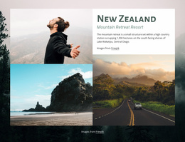

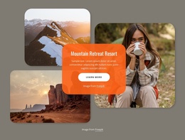

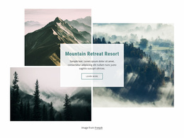
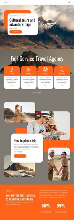

More Landing Pages from Travel & Hotels Category











































Other Travel & Hotels Landing Pages
High-Converting Retreat Landing Page Built Around One Reservation
A retreat sells better when everything on the screen argues for the same trip. A Retreat Landing Page presents a single experience on set dates at a single venue, leading to a single action: reserve a spot or send a question. Anything that belongs to next season's calendar only delays that decision.
Turn Curiosity Into Confirmed Bookings
Photography of a mountain venue rarely closes a sale on its own. Someone looking at a September yoga weekend wants to know how many sessions run each day and whether meals are included. Two lines about a shared room next to a private one will do more work here than a second gallery. Sixteen places, a deposit that holds one of them, and an optional airport transfer say more in a single line than any amount of atmosphere.
For a weekend retreat, the sequence usually runs like this:
- Name the trip, the venue, and the exact dates at the very top.
- Show the rhythm of a day: morning practice, workshop, evening session.
- Set out pricing by room type together with the deposit and what the fee covers.
- Put the reservation form where nothing important is left unanswered.
The reserve button can appear in the hero and again near the closing block. It should not compete with newsletter sign-ups or a second trip offered in the same place.
Answer Doubts Before Guests Ask
Hesitation usually comes down to a handful of very ordinary worries:
- Can I come alone, or does everybody arrive in pairs?
- Is this suitable for a complete beginner?
- Is accommodation included in the price or booked separately?
- What happens to my deposit if plans change?
Answering those where the decision happens beats another decorative band. A testimonial reads best beside the room description it supports, and cancellation terms belong next to the deposit. Transfer details are what organizers most often leave out, and the questions come back by email anyway.
Make Reserving Feel Effortless
Keep the form short. Contact details, preferred dates, and room preference are usually enough, and dietary requirements can follow in the reply. Nicepage collects submitted entries through the Contact Form Leads workflow, so an evening question about airport pickup does not vanish overnight.
When a visitor can picture the September morning, knows the cost by room type, and sees eight spots left, reserving stops feels like a leap.