2020 Shapes Landing Pages

















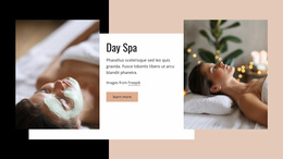
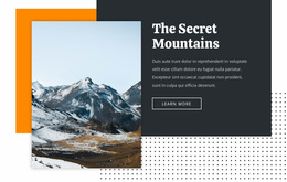
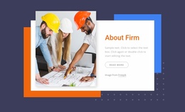














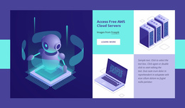
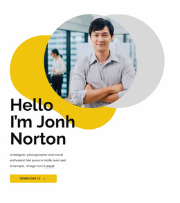
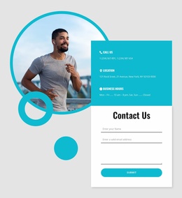
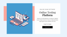









Creative Shapes Landing Page Designs for Stronger Visual Focus
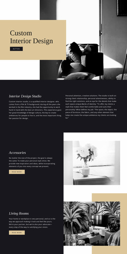
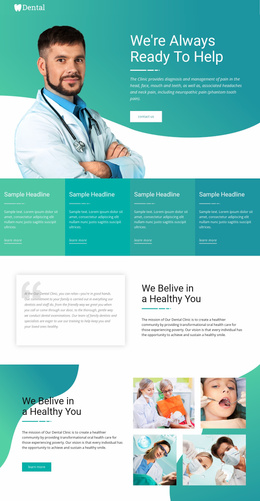
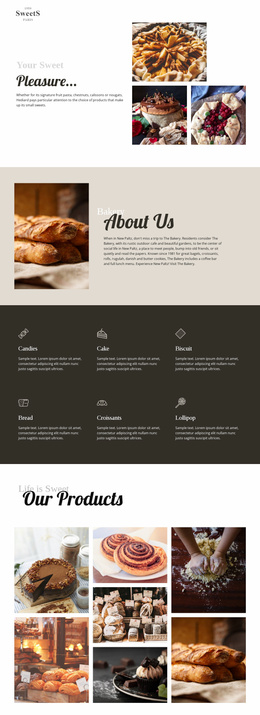
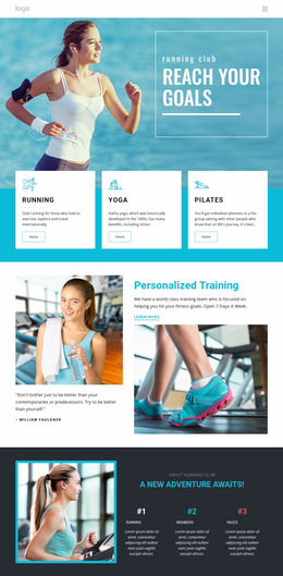
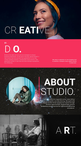
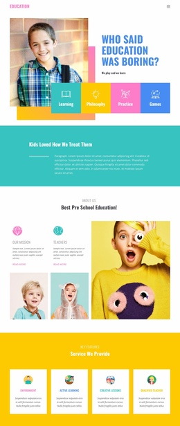
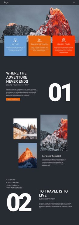
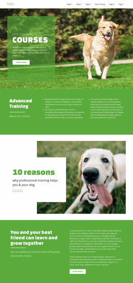
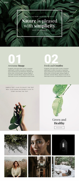
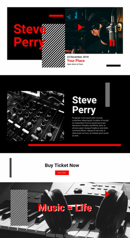
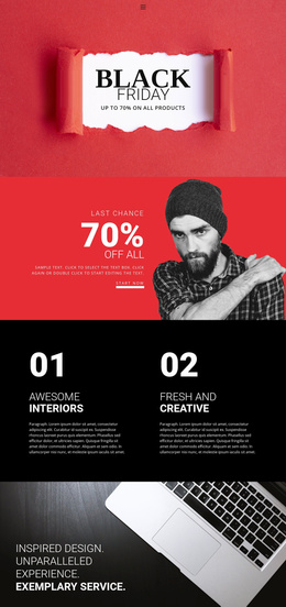
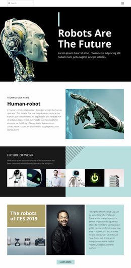
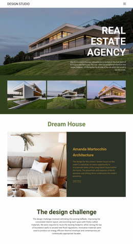
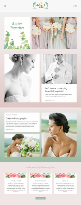
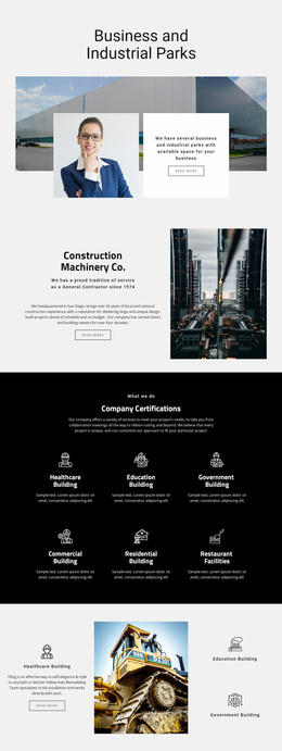
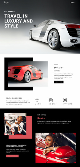
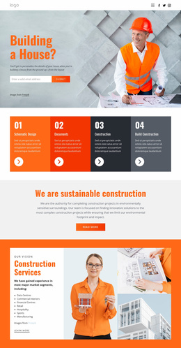
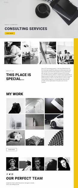
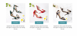
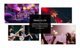
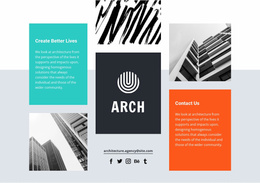
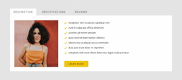
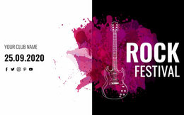
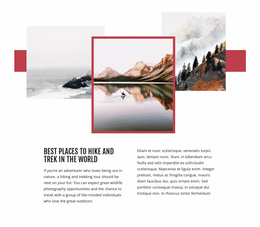
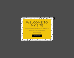
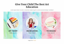
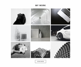
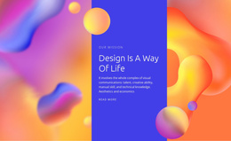
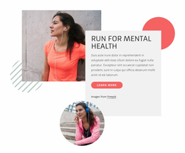
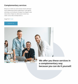
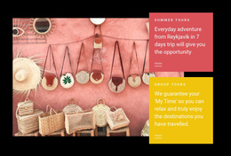
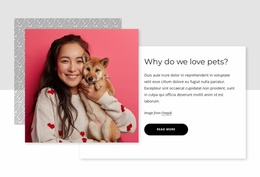
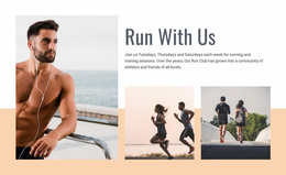
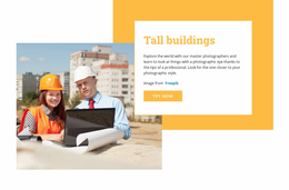
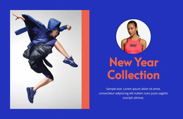
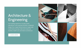
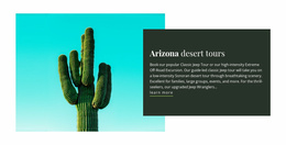
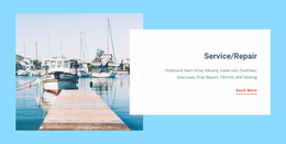
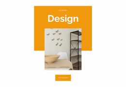
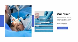
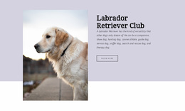
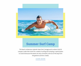
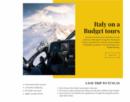
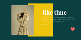
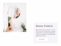
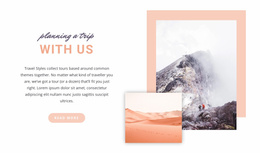
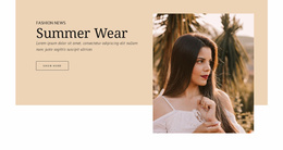
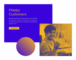
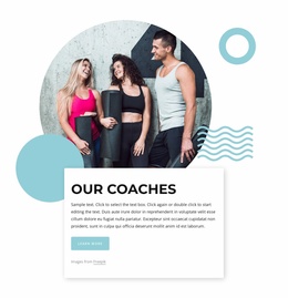
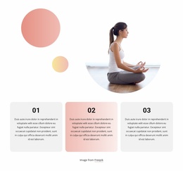
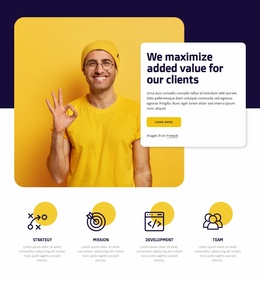
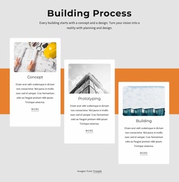
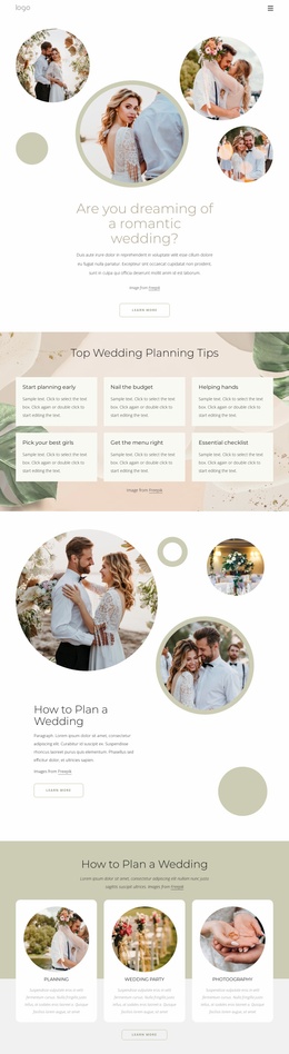
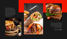
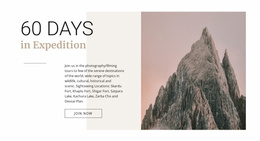
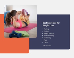
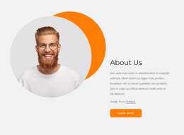
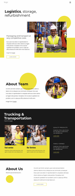
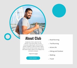
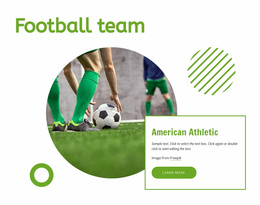
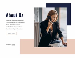
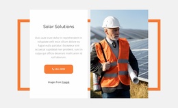
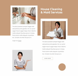
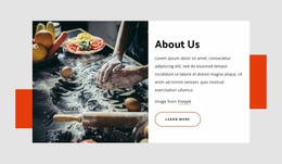
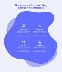
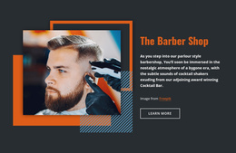
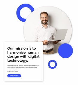
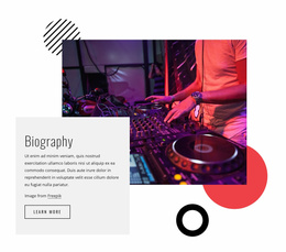
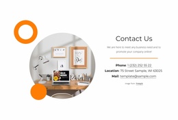
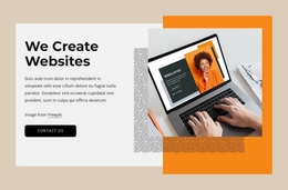
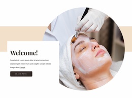
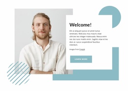
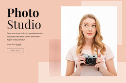
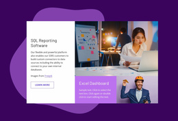
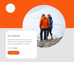
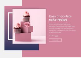
Shapes Landing Page designs use geometry to make a campaign page more recognizable without overwhelming the message. Circles, rectangles, abstract forms, and color fields can shape an above-the-fold composition, create a distinctive background, frame a product image, or add contrast around an important action. The strongest examples use these elements as part of the landing page layout rather than as decoration added after the content is finished.
A shape-led landing page can feel bold, minimal, playful, editorial, or highly polished depending on the scale and placement of its forms. That makes this style useful for product launches, services, portfolios, events, apps, and promotional pages where the first screen needs a clear visual identity.
Explore Shape-Led Hero and Content Section Ideas
The hero is often the most visible place for geometric design.
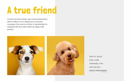
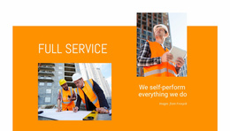
- A large color field can sit behind the headline.
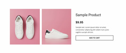
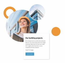
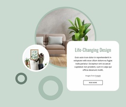
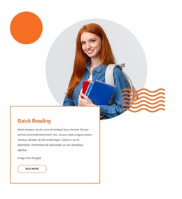
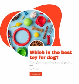
- A circle can frame a product image.
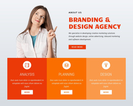
- An abstract shape can connect the headline and supporting visual into one composition. Above the fold, the main challenge is balance: the geometry should establish a focal area while leaving the value proposition readable at a glance.
Shapes can also work beyond the hero. Mid-page content sections may use geometry to:
- separate a feature group;
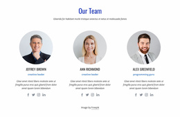
- highlight a testimonial;
- introduce a product detail;
- create a visual transition between sections. A hexagon-based visual direction, for example, can give the page a sharper angular character while still allowing the content structure to remain clear.
Build Clear Contrast Around Messages and Actions
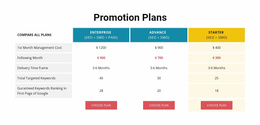
A landing page usually contains several competing elements: headline, supporting text, imagery, proof, and a CTA. Shape-led compositions help organize those elements by creating visible zones rather than forcing everything into plain rectangular rows.
The Shape Element in Nicepage can be used to place circles, geometric forms, and abstract accents directly into the composition. A large background form can increase contrast behind a short message, while smaller accents can guide attention toward a button or visual without becoming the action themselves.
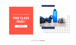
CTA contrast matters most when the page uses strong colors or layered backgrounds. If a geometric field is already visually dominant, the action needs enough spacing and contrast to remain easy to notice. In quieter sections, a smaller shape can provide just enough emphasis to distinguish the next step.
Adapt Shape Placement for Responsive Landing Pages
A composition that feels balanced on a large screen may need a different arrangement on a tablet or phone. Shapes that sit partially outside an image on desktop can crowd text on mobile, and large background forms may need resizing or repositioning so they don't reduce readability.
Responsive placement is especially important in the hero because the headline, image, and CTA usually stack more tightly on narrow screens. Start with the focal relationship you want to preserve, then adjust the geometry around it. The goal is not to reproduce every desktop offset exactly, but to keep the same visual emphasis when the layout changes.
Choose Shapes for the Right Landing Page Mood
Different geometric treatments create different impressions:
- Rounded forms can soften a wellness or lifestyle page.
- Angular geometry can support technology or architecture themes.
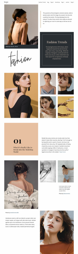
- Oversized abstract backgrounds can make a creative portfolio or campaign feel more expressive. A shape-led block is most useful when its visual character already fits the message you need to present.
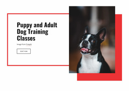
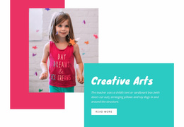
If the main effect comes from foreground and background panels crossing their layout boundaries, an Overlap Block may be a closer fit. Shapes are the better choice when the geometry itself is the defining visual language of the section.
Shapes Landing Page FAQ
Can Nicepage AI help create a block for a landing-page project?
Yes. Nicepage AI Services can generate sites, pages, and blocks. You can then refine the generated block to match the landing page content, visual direction, and shape treatment you need.
Where do shapes work best on a landing page?
They can work in hero areas, product showcases, feature sections, testimonials, backgrounds, and CTA-focused sections. The best placement depends on where the page needs stronger visual hierarchy or a more distinctive transition.
How should I choose a Shapes section if I am not a professional designer?
Start from the page purpose and audience, then choose a ready-made Nicepage design whose visual weight already fits that task. Refine the colors, imagery, copy, and geometry rather than selecting a section only because the shapes look decorative.
When should I use Shapes instead of an Overlap Block?
Use Shapes when circles, rectangles, abstract forms, or color fields are the defining visual devices. Choose an Overlap Block when the main effect comes from panels or elements crossing layout boundaries and creating foreground/background depth.
Create a Shape-Led Landing Page in Nicepage
Begin with the part of the landing page that needs the strongest visual identity—the hero, a product showcase, a campaign message, or a CTA-focused section. Adapt a ready-made Shapes design around that priority, then test the result across screen sizes. The final composition should still make the headline, supporting visual, and next action obvious even when the geometry becomes more expressive.