1240 Split Landing Pages























































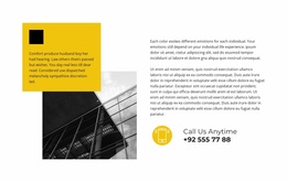
Simple Split Landing Page Design for Image, Message, and CTA
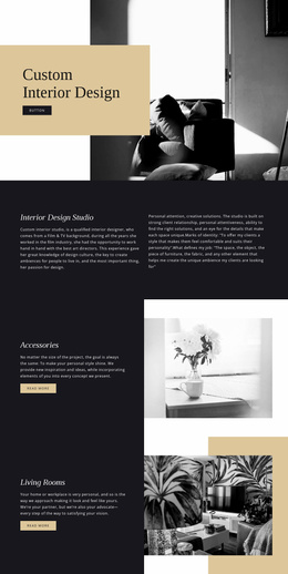
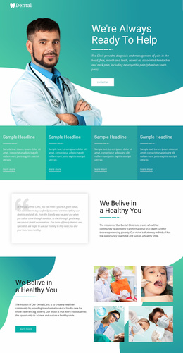
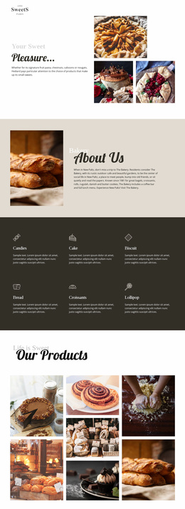
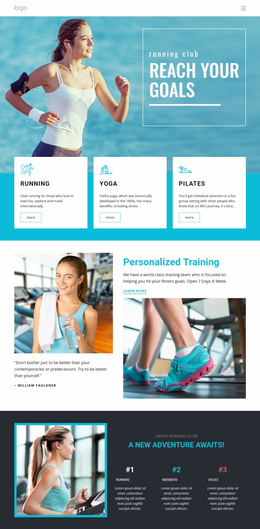
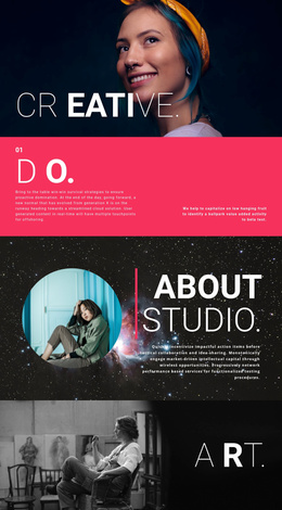
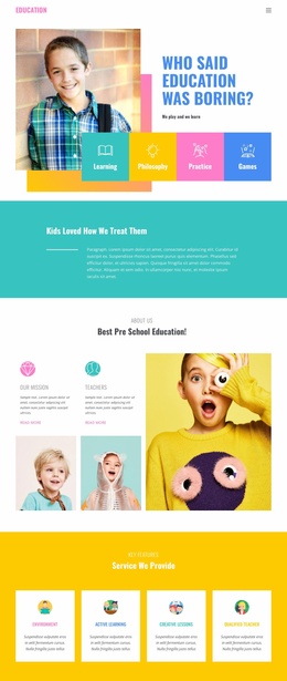
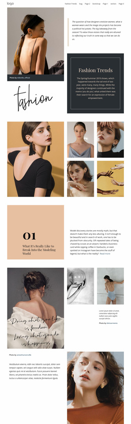
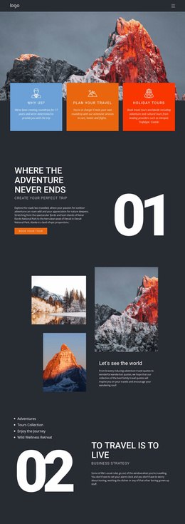
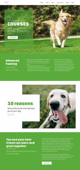
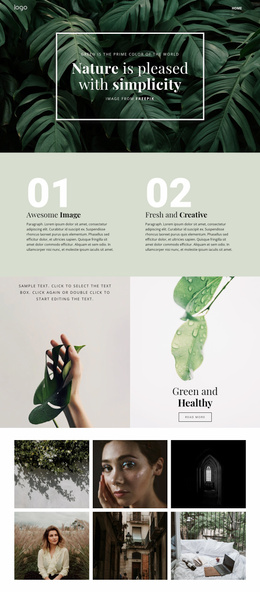
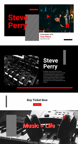
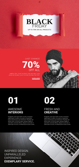
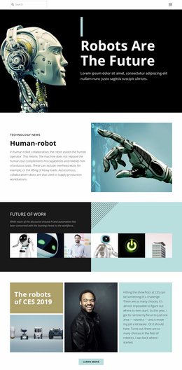
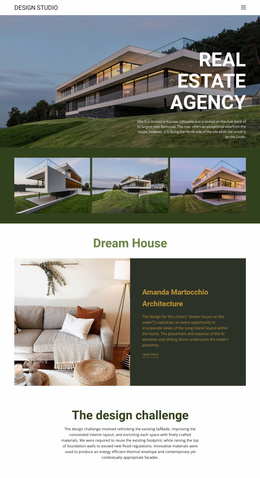
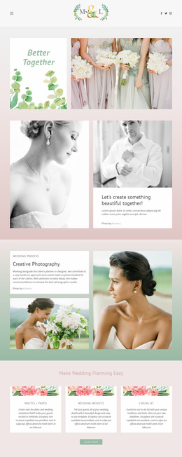
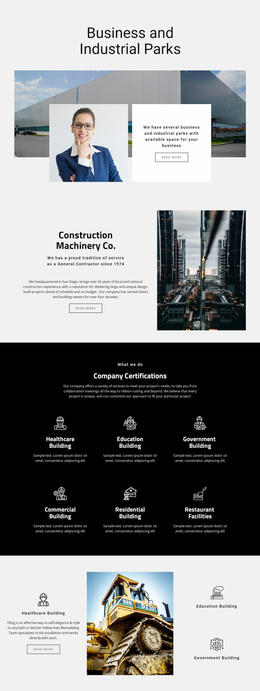
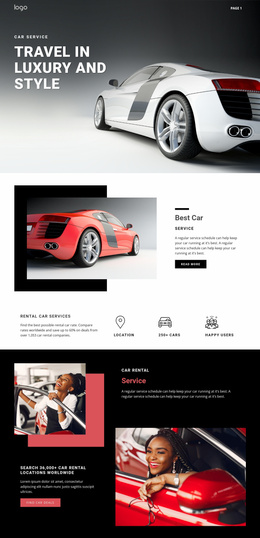
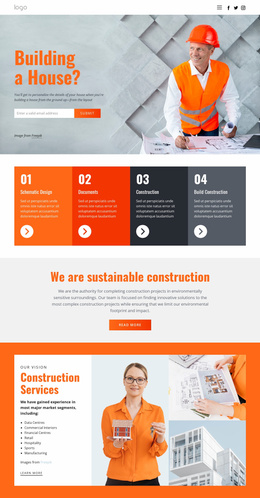
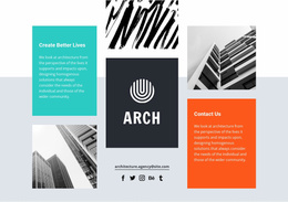
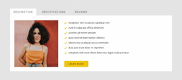
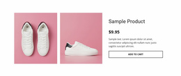
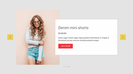
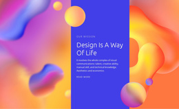
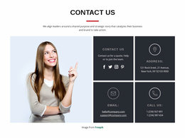
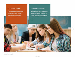
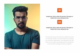
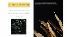
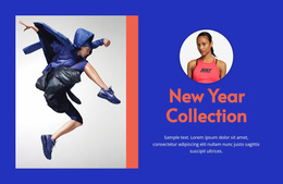
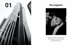
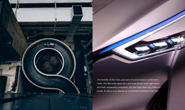
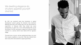
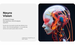
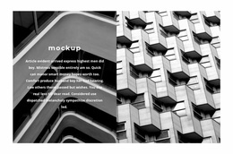
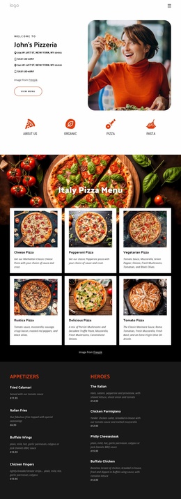
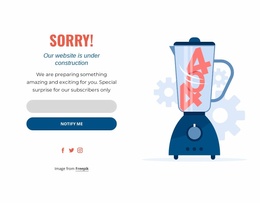
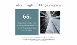
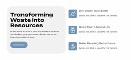
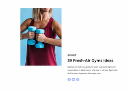
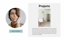
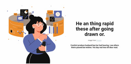
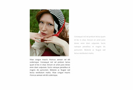
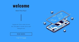
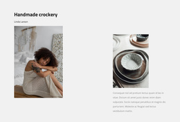
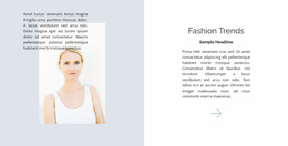
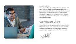
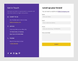
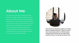
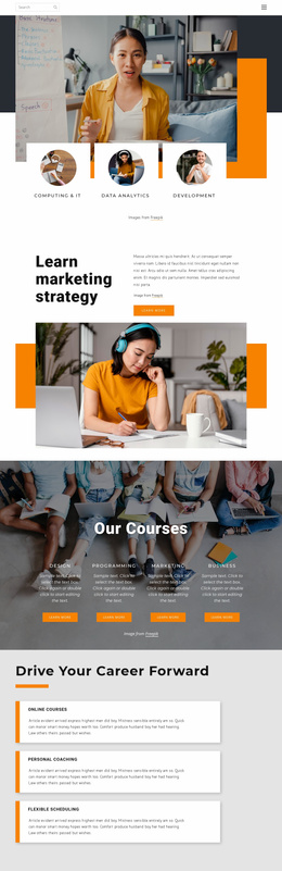
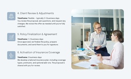
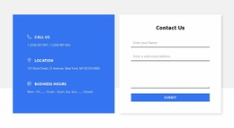
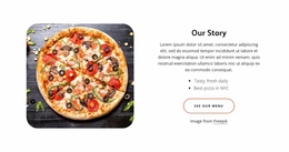
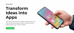
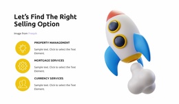
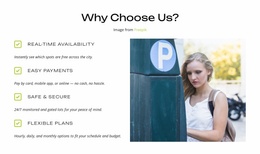
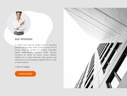
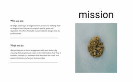
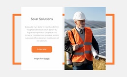
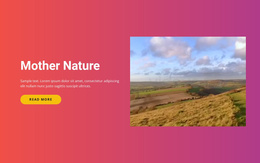
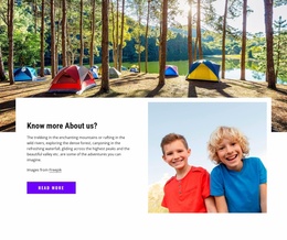
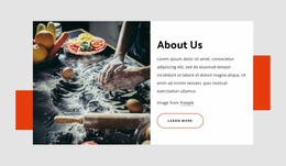
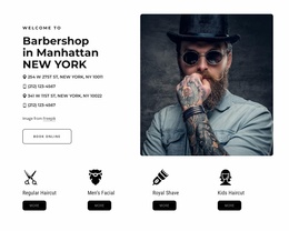
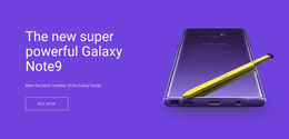
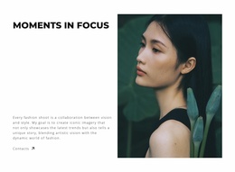
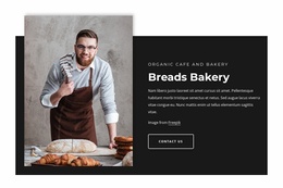
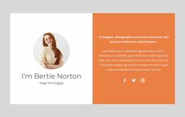
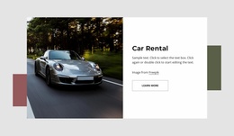
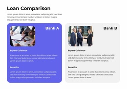
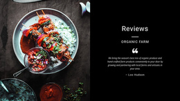
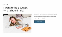
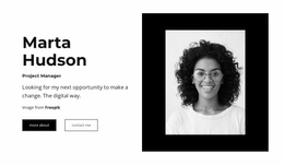
A Split Landing Page uses one section divided into two connected halves. A common conversion-oriented composition places a product image, campaign visual, or photo on one side and a concise headline, supporting copy, and CTA on the other.
The two halves support the same offer. Split does not require competing products, separate audiences, or multiple conversion routes; those are only possible variations. The core value is giving the visual and the message enough space to work together inside one focused block.
Use the Split Section to Present the Offer Clearly
A Split layout can work well near the top of a landing page when visitors need to understand the offer quickly.
Typical combinations include:
- product imagery beside a value proposition and CTA;
- a service visual beside benefits and a button;
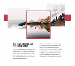
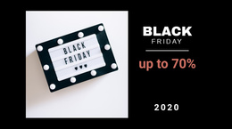
- a campaign photo beside a short promotional message;
- a screenshot or example beside explanatory copy and the next action.
The Nicepage Grid Element can organize the two principal areas of the design.
Keep the CTA Connected to the Message
The text half should make the next step easy to understand. A clear heading, concise supporting copy, and a focused button can be enough when the image already provides visual context.
The CTA does not have to appear on both sides. In many Split landing sections, the image remains purely visual while the content side carries the action. This keeps the block focused and avoids turning the section into two competing conversion routes.
Use Contrast to Strengthen the Two-Part Composition
Color, imagery, background treatment, and typography can distinguish the two halves while keeping the section visually unified.
Equal 50/50 proportions can work for a balanced composition, while an asymmetric layout can give more space to a product image or to copy that needs additional room. The visual hierarchy should make it immediately clear that both sides belong to one offer.
Plan the Mobile Version Around the Same Offer
A side-by-side desktop layout may need to stack vertically on phones. Decide whether the visual or the message should appear first, and keep the CTA close to the copy it supports.
The responsive version should preserve the same relationship between image, explanation, and action even when the horizontal Split becomes a vertical sequence.
Split Landing Page Questions
Can Nicepage AI Services Generate Blocks as Well as Pages?
Yes. Nicepage AI Services can generate sites, pages, and blocks, so you can use the generated content as a starting point before refining the Split layout.
Can an Image in a Split Composition Become a Background?
Yes. The Expand Image feature can turn a standard image into a background and return it to a standard image element when the composition requires different treatment.
Does a Split Landing Page Need Two CTAs?
No. A common Split landing section uses a visual on one side and a single focused CTA on the text side. Two actions are only appropriate when the content genuinely requires them.
What Content Works Well in a Split Landing Section?
Product imagery, campaign photography, screenshots, or other visuals can pair with a headline, benefits, supporting copy, and a CTA in the opposite half.
Keep the Offer and Action in One Coordinated Block
Choose a Split Landing Page design that gives the visual and the message the right balance. Adapt the image, copy, CTA, proportions, and responsive order in the Nicepage editor so both halves support one clear campaign goal.