Tabs Landing Pages
-

-

-
-
-
-
-
-
-
-
-
Free Website Builder SoftwareDownload
-
-
-
-
-
-
-
-
-
-
-
-
-
-
-
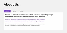

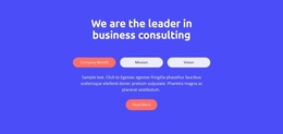
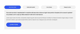
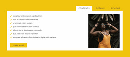
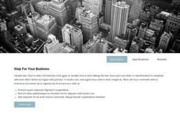
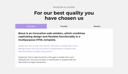


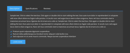
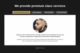
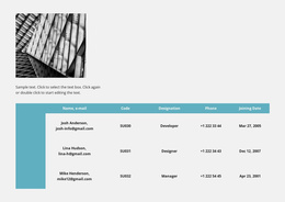


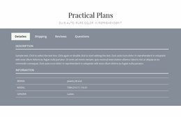

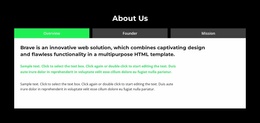
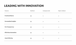
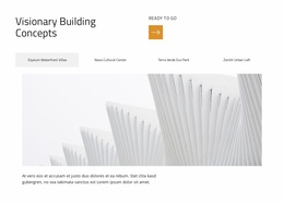
Professional Tabs Landing Page Blocks for Decision-Focused Content
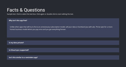
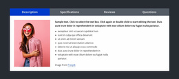
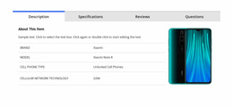
A landing page often needs to show multiple versions of the same offer. Plans, use cases, product modes, audience segments, or service packages can all compete for space near the decision point. Tabs help by keeping those parallel details in one compact area while visitors choose the view that matters to them.
The best landing-page Tabs sections do more than save space. They reduce decision friction by making relevant information easy to reach without sending the visitor to another page.
Use Tabs for Real Landing-Page Decisions
Strong use cases include:
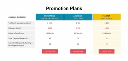
- pricing or plan variations;
- different audience segments such as teams, agencies, or freelancers;
- product modes or feature groups;
- industry-specific use cases;
- service package details.
Nicepage Tabs block designs can provide the structure, but the content should remain tied to one conversion decision.
Avoid hiding the main value proposition in Tabs. Core messaging should stay visible. Use the panels for supporting distinctions that visitors may want to compare.
Keep the CTA Close to the Information It Depends On
Tabs can work especially well when each panel helps the visitor understand why the next action makes sense.
For example:
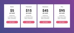
- a plan tab can explain what is included before a pricing CTA;
- an audience tab can show a relevant benefit before a demo request;
- a product-mode tab can clarify capability before a trial button;
- a use-case tab can provide context before a contact action.
The CTA does not always need to live inside the panel, but it should feel visually connected to the decision the Tabs block supports.
Reduce Friction Without Hiding Essential Content
Tabs can shorten the visible page, but hiding too much creates a different kind of friction. Visitors should not need to click through every tab to understand the offer.
Keep essential information outside the panels when it applies to everyone:
- the main promise;
- core proof;
- primary CTA;
- critical pricing conditions;
- required next steps.
Use the Tabs section for optional depth and comparison, not for information that every visitor must discover manually.
Check Mobile Presentation Around the Conversion Step
Landing-page Tabs often sit near important actions, so responsive presentation matters. A crowded control row or very tall panel can push the CTA far down on a phone.
Nicepage Responsive Modes can help you review the section across narrower screens and make sure the decision path remains clear.
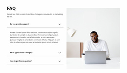
Tabs Landing Page FAQ
What Landing-Page Content Works Best in Tabs?
Plans, audience segments, product modes, use cases, service packages, and other parallel offer details work well when visitors may want to compare them before taking action.
Should the Main CTA Be Inside the Tabs Panel?
Not always. The CTA can sit beside or below the Tabs block as long as it remains visually connected to the decision the panels support. If each tab leads to a different action, panel-level CTAs may make more sense.
Can Tabs Reduce Decision Friction?
Yes, when they help visitors reach the relevant detail quickly. They can increase friction if essential information is hidden across too many panels or the controls are difficult to scan.
Should Every Important Landing-Page Message Go Into Tabs?
No. Keep the primary promise, essential proof, and critical conversion information visible so every visitor can see it. Use Tabs for parallel details and optional depth.
Keep the Decision and Next Action Connected
Choose a Tabs design that matches the offer variations visitors need to compare, place it near the relevant decision point, and keep the CTA easy to find. A strong landing-page Tabs block should clarify the choice without making the visitor work to uncover the basics.