Table Landing Pages
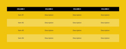
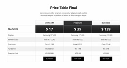
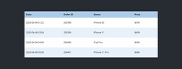
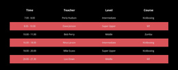

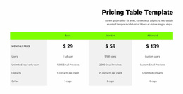
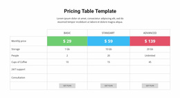
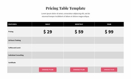
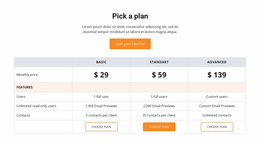

Clear Table Landing Page Designs for Confident Offer Decisions
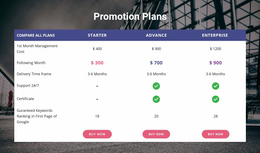
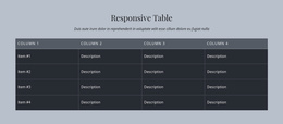
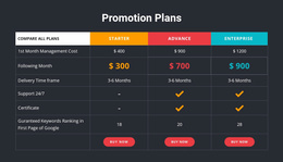
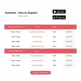
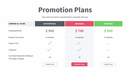
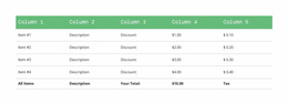
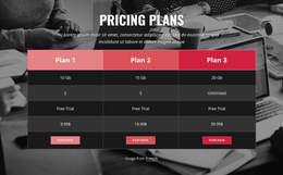
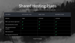
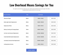
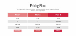
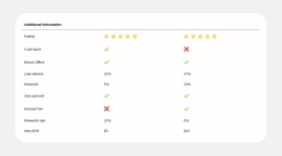
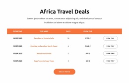
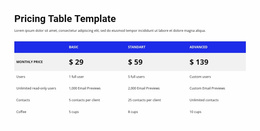
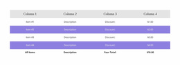
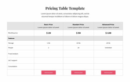
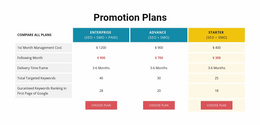
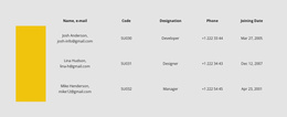
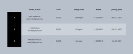
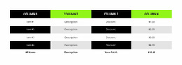
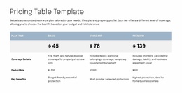
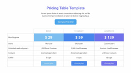
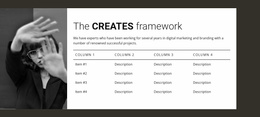
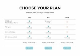
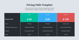
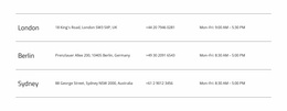
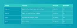
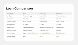
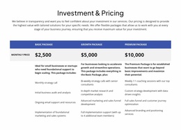
Table Landing Page designs add a focused comparison section to a page built around one main offer or action. They can bring specifications, service conditions, or product options into view when visitors need factual reassurance. The design should reinforce the message and lead naturally toward the primary CTA.
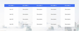
Choose a ready-made table that is compact enough to support the conversion-focused layout while still making important differences visible. A tightly styled table often works better than an extensive reference panel on a page with one clear goal.
Choose a Table That Supports the Main Offer
A Table block can clarify a limited set of facts before the visitor reaches the primary action. Different offers need different layouts:
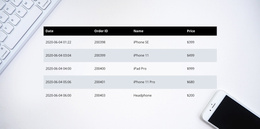
- A short specification table supports a product demonstration or inquiry.
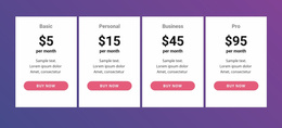
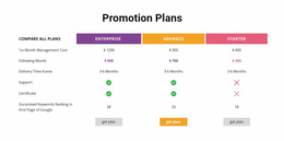
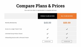
- A comparison of variants makes practical differences visible near a selection CTA.
- A service-conditions table clarifies coverage or availability before a request.
- A compatibility panel answers a decisive technical question without adding lengthy copy.
Favor clear headers, restrained column counts, and visual emphasis on genuinely important attributes. The section should support the offer rather than compete with the main headline or button.
Match Table Styling to the CTA and Page Hierarchy
The Table Element in Nicepage allows a ready-made section to be adapted through header colors, column widths, and cell spacing. Choose a treatment that relates to the page's typography and button styling while keeping the data distinct from promotional copy.
A compact table can sit between supporting benefits and a final CTA. A wider comparison may need its own full-width band. Highlight important headings or attributes carefully; if every value is accent-colored, none stands out.
For mobile viewers, keep headings concise and review wide sections in responsive modes. A landing-page table succeeds when the comparison is clear and the next action remains obvious.
Put Decision-Critical Facts Near the Main Action
On a landing page, a Table section earns its space by answering a question that might otherwise delay a response to the offer. A compatibility table can clarify whether a product fits a visitor's needs; a short service comparison may establish which option matches an inquiry.
Position the comparison where its information becomes relevant to the primary CTA. Make the next action easy to identify after the visitor has checked the facts, rather than letting the table become a long reference area.
Select the Right Supporting Section
A Table works when visitors need to check comparable facts. If paid plan selection is the centerpiece, Pricing is more suitable; if the message is primarily a set of standalone benefits, a Features block can be clearer.
Choose a Table for specific evidence that strengthens the landing-page offer, rather than using it as a second promotional headline area.
Table Landing Page FAQ
Where should a Table section appear on a landing page?
Place it where visitors need factual clarification before taking action. It often fits after an introductory offer or product explanation and before a relevant CTA. The best position depends on when comparison data becomes important to the visitor's decision.
Can I create a landing page table without writing code?
Yes. Nicepage provides a Table Element with visual controls for rows, columns, cell content, dimensions, and formatting. You can select a ready-made Table block and adapt its structure in the Nicepage editor without manually writing HTML.
How do I choose a Table design if I am not a professional designer?
Start with the offer and the questions visitors need answered before responding. Choose a ready-made table layout with enough rows and columns for those facts, then refine the headings, values, spacing, and typography. Prioritize clear comparisons over decorative effects.
Add a Decision-Focused Table to Your Landing Page
Choose a Table block that presents the offer's decisive facts without overloading the page. Refine the headings and visual accents so the information stays easy to scan. A concise comparison can strengthen the landing page's message without turning it into a long reference document.