In Nicepage, you can customize each Block, including content editing, layout changes, color and font changes, and adjustments for different responsive modes. The Editor features panels with various styling options, including Left and Right Panels, Page Management options, and a central Editor Area.

Dashboard
Nicepage features a dashboard that displays all your Sites, Pages, and Page Folders.

The settings and Profile are also located on the top bar of the Dashboard.

Video Lessons
You can find the links to the Video Lessons on the Dashboard. Now, by clicking on the video thumbnail on the Dashboard, you can open and watch a video lesson in your browser.
You can show and hide the video thumbnails and open all video lessons by clicking the link.

Sites Arrow Icon
You can go back to the Dashboard by clicking the Sites Arrow icon.
Top Bar
The primary operations are located on the Top Bar, including the Find Everything search, Responsive Modes, Undo and Redo changes, and more.

Page Navigator
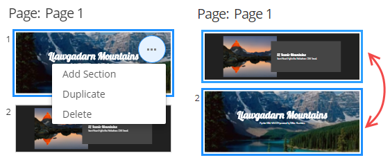
The Left Panel displays all Blocks available on the page.
Here, you can remove or duplicate the existing Block. Add a new block or change the order of the blocks by simply dragging blocks into the panel.
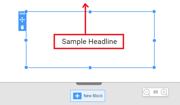
Move Elements
You can move Elements using various rules:
Show Block Structure
Usually, if a Block has Grids, Boxes, and Groups, its complicated structure is hard to see. We have added an option to make it easier to view.
You can now turn the Show Block Structure on and off in the Context Menu or by pressing CTRL+L. This option is enabled by default.

Zoom
You can use the Zoom Panel and the CTRL + Mouse Roller to zoom in and out of the User Interface.

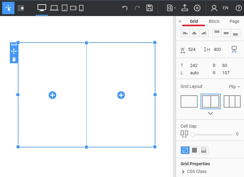
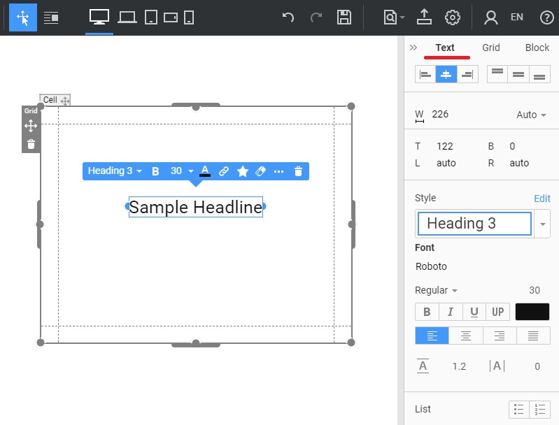
Property Panel
The Property Panel has the selected Element, Grid, and Block styling options.
Block Tab
The Block Tab provides available Variants and Coloring Schemes for the selected Block.

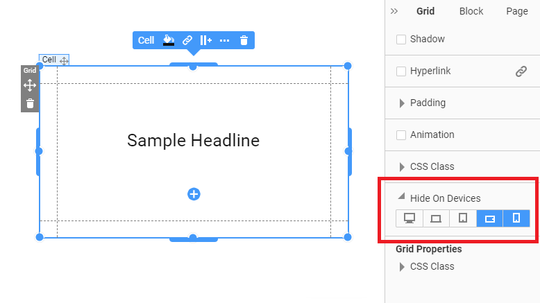
Container Tab
The Container Tab, for example, the Grid, appears when you select the control inside the Grid layout or the grid cell. Here, you can control the styling of the selected grid cell, hide/show this cell in different Responsive Modes, and change the whole grid layout if needed.
Selected Element Tab
When you click on an element in the editor area, the tab for the Selected Element appears. It contains the styling options for the selected Element. Additionally, you can hide this control in different responsive modes using the corresponding settings.
Hide Elements
You can also hide and show Elements in just one click:
Editor Width For Large Screens
The Page Editor occupies the entire space of the large device. It allows you to see the sites as they appear in the actual view.

You can set the Device Width for the Editor.

Zoom Option
Zoom Blocks in and out more conveniently. You can also enter the Zoom value on the Top Bar.

You can reset the Editor's Zoom to 100% by pressing the CTRL + 0 hotkeys.

Editor Move
You can move the Editor by holding the ALT key and using the mouse. You can also click the Mouse Wheel and drag the mouse to move the Editor.
