Good mood good food Website Mockup
Edit Template Offline
2. Create new page and search for id 14548
Edit Template Online
Create Awesome Websites


Free Nicepage Builder
Keywords
Large Food Images and Eight-Tile Galleries Need Careful Screen Review
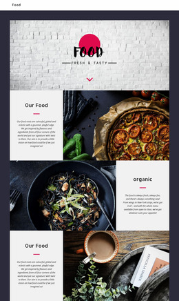
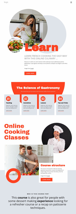
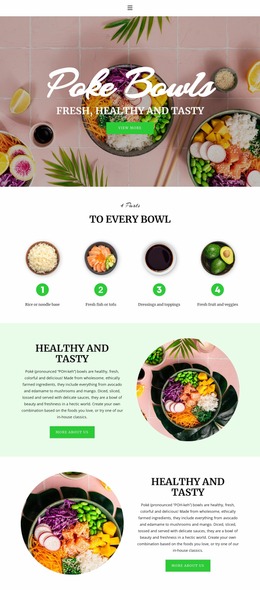
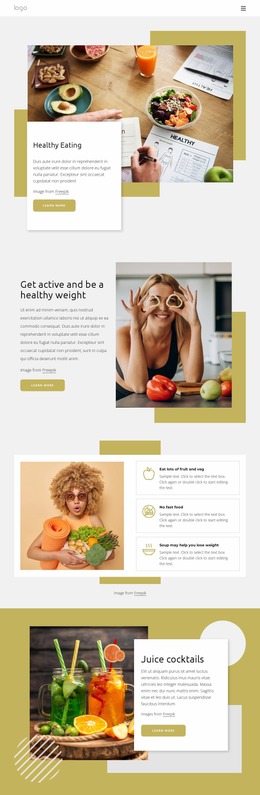
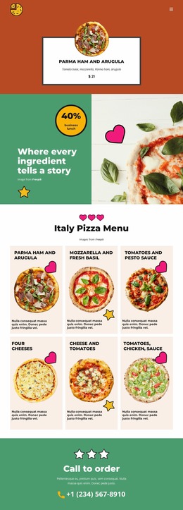
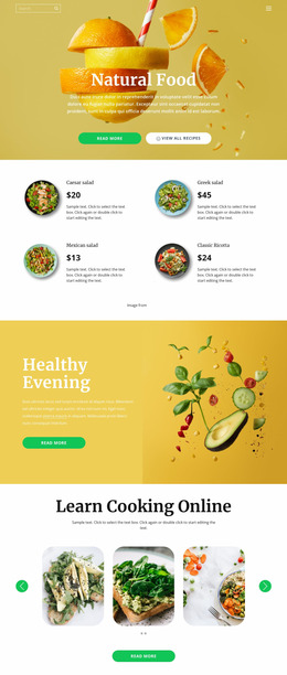
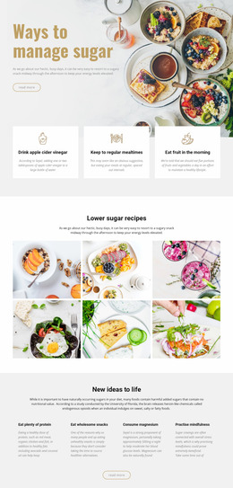
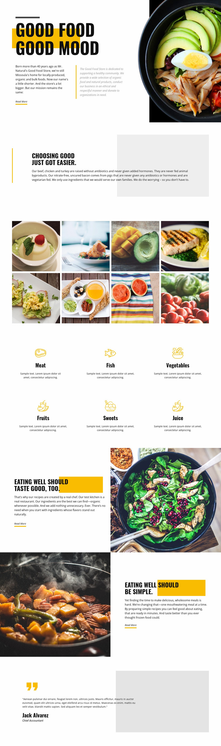
The design relies on several visual relationships that should be inspected when the page is viewed at different widths. The opening places a large bowl photograph beside the GOOD FOOD GOOD MOOD message, so image scale and text width need to remain balanced as the available space changes. The two later split sections create a similar review point: the chef-created recipe panel and the convenient-meal panel reverse the image-and-text order, which may affect how the story is perceived when the columns become narrower.
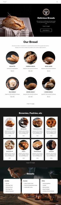
The eight-image gallery is another responsive-sensitive area. Two rows of four equal tiles create a dense but orderly desktop presentation, while smaller screens may require a different number of columns or a longer vertical sequence. The six category items create a related test for spacing and reading order. Their icons, labels, and descriptions need enough room to remain distinguishable without losing the visual equality established by the repeated grid.
The pale gray shapes, fine divider lines, and bold condensed headings should also be reviewed alongside image changes. Generous white space is an important part of the design, so reducing it too aggressively could make the page feel crowded even if every element remains visible. Reviewing the mockup across screen widths helps preserve the intended contrast between open editorial sections, image-heavy moments, and compact category content.
Customize with Nicepage
Open this ready-made template in the Website Mockup Builder and customize it visually in the Nicepage editor. Replace demo content, edit page sections, and adapt the design to your project without rebuilding the template from scratch.
Preview and Refine This Website Mockup
Review the Design Across Devices
Use Responsive Modes to see how the website design appears on Large Screens, Desktops, Laptops, Tablets, and Phones. Switch between the available views to compare the same layout at different screen widths and review how typography, images, spacing, navigation, and other content adapt to each device.
Adapt the Mockup for Different Screens
Nicepage provides responsive web design tools for adjusting individual device views when the initial layout needs refinement. You can customize Mobile Views separately, change element sizes and positions, adapt Grids, Lists, and Galleries, and hide selected Elements or Blocks on particular screen sizes. This makes it possible to develop a responsive website mockup instead of evaluating the design at only one fixed desktop size.
Preview the Website Without Editing Controls
Use Live Page / Preview to review the design with the editing interface removed from view. Instant Preview can hide the Page Navigator, Property Panel, selections, and frames, making it easier to evaluate the overall presentation, content hierarchy, and responsive layout as a visitor would see them.
This workflow makes the template useful as a responsive website mockup for visualizing, comparing, and refining how the same website design will appear across different screen sizes.