
Teenagers Website Designs
Teen-focused sites often need to present clubs, creative work, events, and personal projects without visual clutter. A clear design direction helps color, typography, imagery, and page composition feel expressive while staying easy to follow.


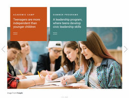
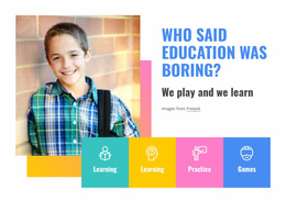

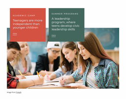


More Website & HTML Templates for Teenagers
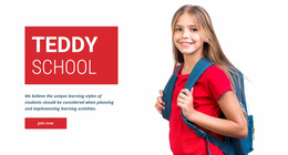






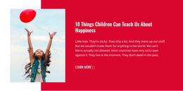
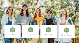
More Website Designs from Education Category
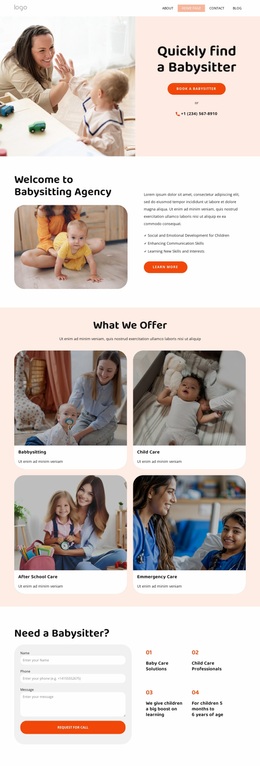
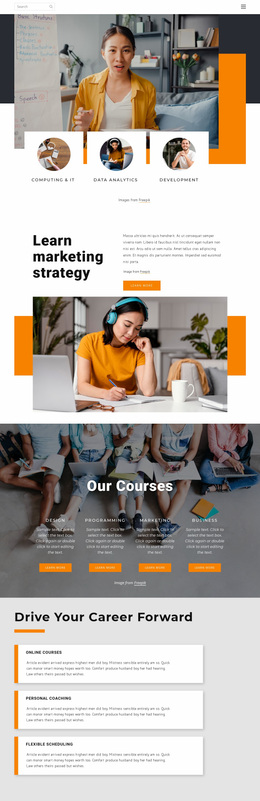

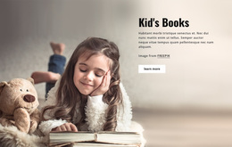
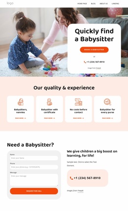

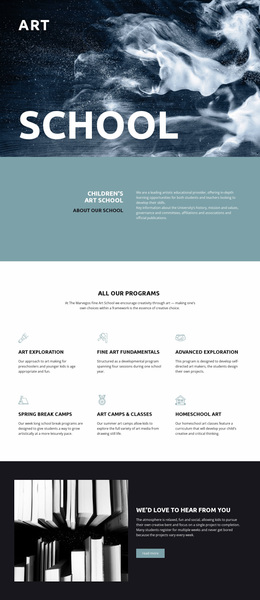
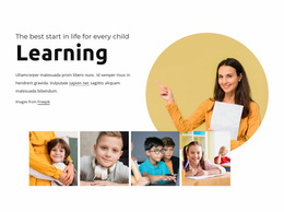
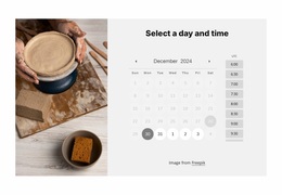
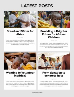

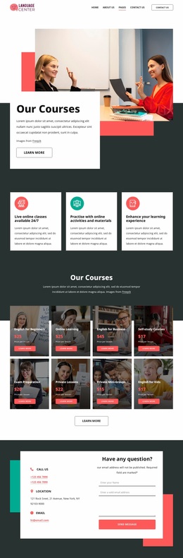
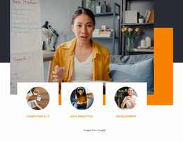
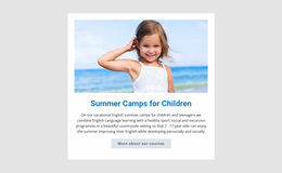

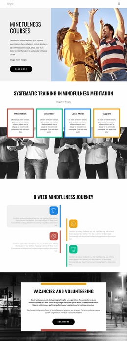
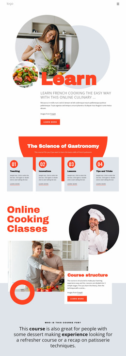





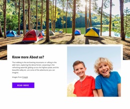
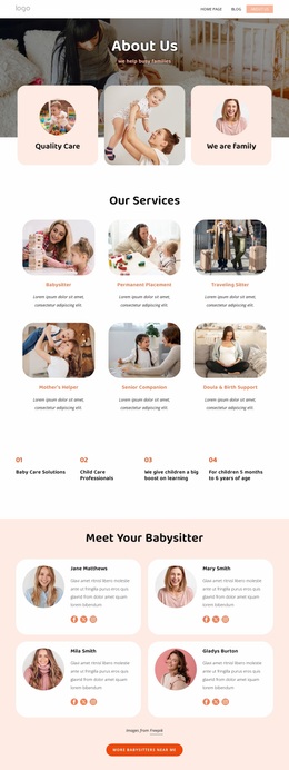
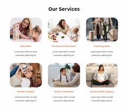

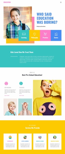

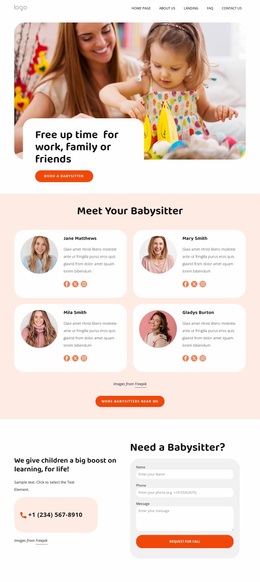

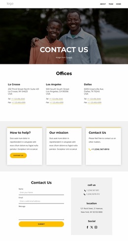
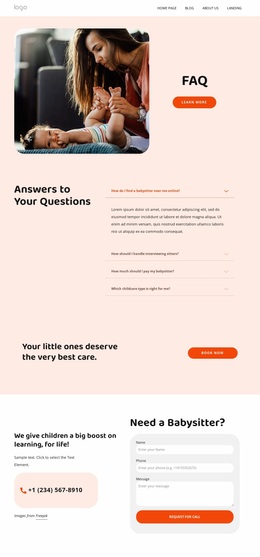

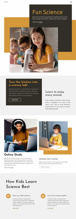

Other Education Website Designs
Innovative Teenagers Website Design
Teenagers' website design has to win over visitors who usually arrive on a phone, often from a link in a social bio or a group chat. They decide within seconds whether the site feels like theirs, and a corporate layout with bright colors on top rarely passes that test. Personality should come through type, imagery, and color, while the most important thing on the screen stays easy to spot.
Bold Palettes With Readable Typography
Teen audiences often expect a louder palette than most sites use. One saturated accent against calmer neutrals still marks what deserves a tap, like a sign-up button or the next meetup date. Five bright colors and three display fonts, though, turn an expressive layout into visual noise.
Teen-oriented sites usually express personality in one of these ways:
- bold condensed headings that feel closer to a gig poster than a school report
- collage-style photo arrangements with sticker or hand-drawn accents
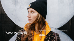
- photography-led screens where one strong image sets the mood
Body text still needs a comfortable size, since club schedules are often read on a phone between classes. In Nicepage, a Color Scheme can hold the palette across all pages, so the accent color never drifts into other shades.
Composing Screens Around Priorities
A portfolio-first site for a young photographer or illustrator leads with the strongest recent work, and its thumbnails double as navigation. A community-first site for a dance crew or school club has a harder job. Its opening screen must show who the group is, when it meets next, and what the last event looked like. With equal weight, nothing stands out, so the date and the join button should read faster than any decorative graphic.
Hero photography sets the mood, while event photos add social context through real faces. A gallery works better when it sits visually apart from the schedule. Social icons and links to creator profiles belong in plain view because the site is often a one-stop in a teen's wider online presence.
Keeping One Recognizable Identity
On a teen site, consistency works like a small design system. Repeating one card corner radius, one heading scale, and one photo ratio makes a gallery and an event listing look related. A portfolio page can still give artwork more room, and an event page can push dates forward, as long as the type and accent treatment stay familiar.
The best test of teenagers' website design comes when someone who saw a single project card in a group chat opens the site and recognizes the style. That identity feels personal and stays flexible enough to absorb new work as it keeps arriving.