How to use different web page elements while building websites
Grid Element
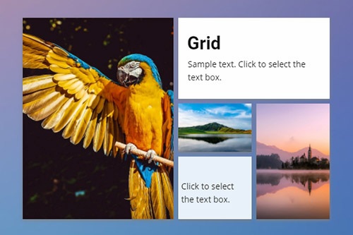
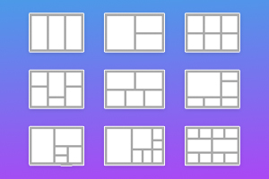
The Grid is a container element that you can use to place web page elements in cells. We recommend using the Grid Element, as it is good for responsive designs, as cells move one under another automatically on smaller screens.
Image Gallery Element
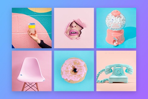
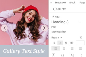
Add a collection of your favorite images to your web designs using the Gallery Element. Add text titles, apply hover effects, and styling.
Box Element
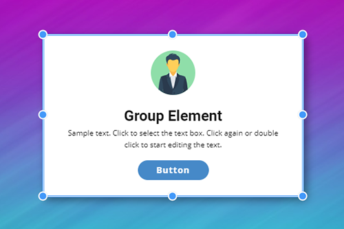
Unlike grouping, you can use the Box Element to add the Background and Border under the grouped elements. You can also move, resize, and add background, border, and effects around the Box element in the Context and Property panels.
Grid Repeater Element
Design one column and the Grid Repeater will automatically repeat your design to other columns, including a set of elements, styling, and positioning. Specify text, images in each column to finalize your design. It will save time, allowing you to focus on creativity.
Slider Element
Add Slider as an essential interaction element to any place on your web page. You can set a different width for your slides, unlike the Full-Width Slider. And you can use various sets of Elements on slides adding variety to your web blocks.
Contact Form Element
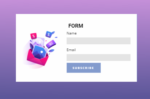
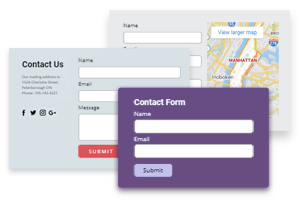
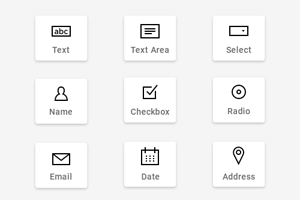
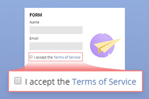
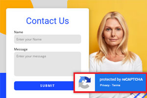
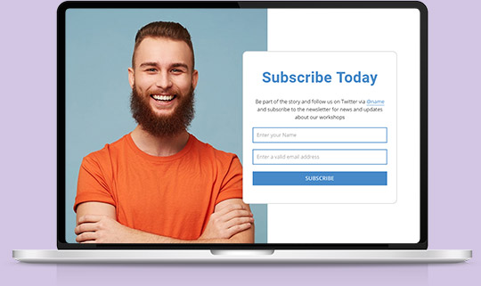
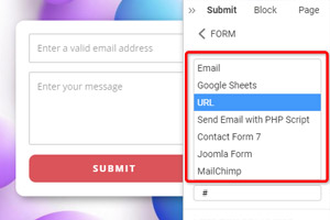
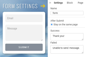
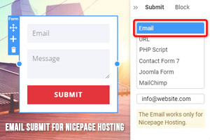
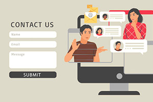
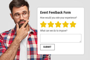
You can easily build the login, contact, subscription, and other types of forms with the Form Builder Element to communicate with your website visitors. All forms are fully responsive and ready to use.
Video Element
Insert Videos the same way you add images and icons. You can expand a video to make a video background. You can use links to YouTube, Vimeo, and your hosting and upload videos.
Carousel Element
The Carousels are very popular and work best in many aspects of web design. You can refer to the Carousel Element to any circularly rotated content like Images, Columns, etc., that you can use as a Slider, slideshow, or gallery.
Social Icons Element
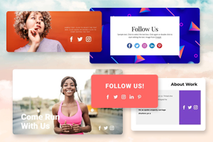
Add Icons with links to your social networks on your web pages to connect with your audience. You can use the preset icons and also select your own if needed.
Language Element
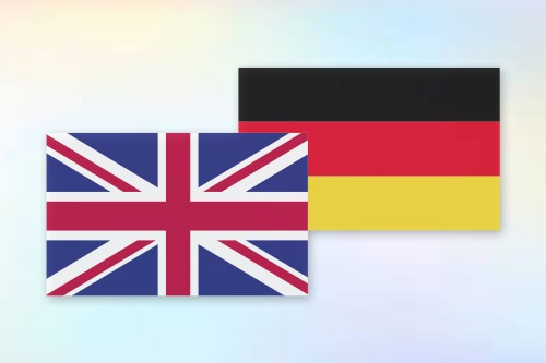
Build Multi-Language Websites with Nicepage by adding the Language Element. It allows website creators to translate Texts, Menus, Buttons, etc., into other languages and to switch languages on live websites.
Audio Element
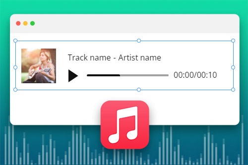
Use the Audio Element to insert audio files into your website pages and blocks. The supported formats in the Audio Element are MP3, WAV, FLAC, M4A, WMA, AAC, AIF, and AIFF.
Accordion Element
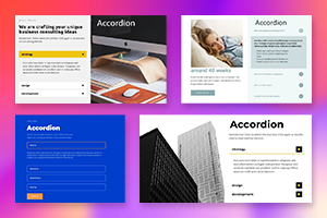
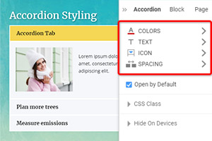
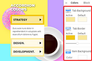
Add the Accordion to present tabbed data in the form of expanding and collapsing panels. You can see only one panel of the Accordion open and can expand only one panel at a time.
Tabs Element
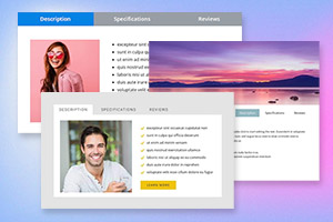
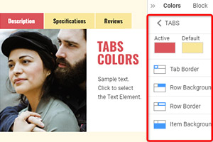
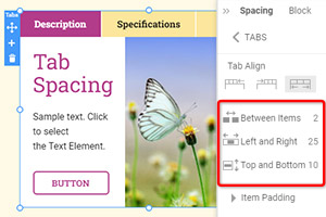
Add the Accordion to present tabbed data in the form of expanding and collapsing panels. You can see only one panel of the Accordion open and can expand only one panel at a time.
Table Element
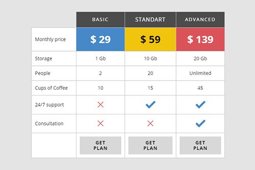
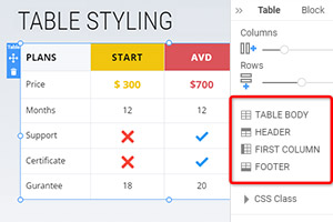
Organize your text data in Tables. Unlike the Grid Element, the Table can contain only texts and icons in the text. You can use the Table element to create pricing tables, time tables, schedules, and more.
Modal Popup Element
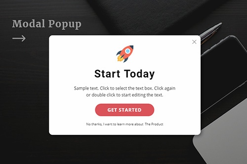
Promote your offers with the Modal Popup dialog. You can add the link to the popup dialog for the Hyperlink and Button dialog and trigger it on an event.
Google Maps Element
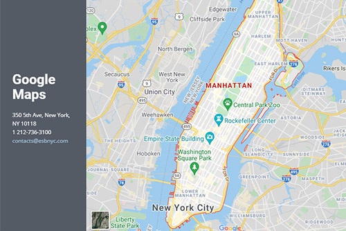
Allow your visitors to find faster and easier offline. You can specify the exact location of your business or yourself with Google Maps.
Countdown Element
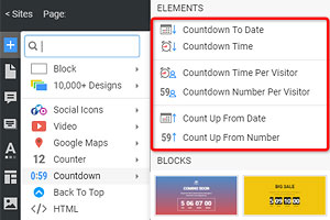
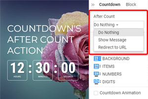
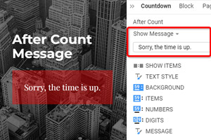
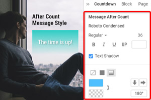
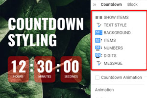
The Countdown is an excellent Element to show the dynamics of changes on your website for your visitors, who will see a countdown to a special date, time, or number, which will give more information about the future sale, anniversary, etc. The Countdown Element allows you to calculate the time automatically and stylize it for your web design requirements.
FAQ Element
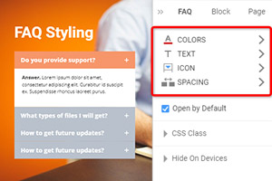
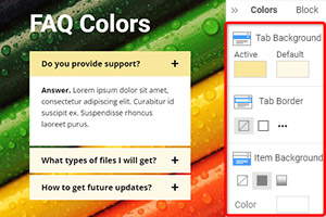
Organize your questions and answers with the FAQ Element into the one Frequently Asked Questions structure. Your users can click on the question's row to expand and collapse it to see the answer.
Counter Element
Present your personal and website achievements in numbers and figures. You can improve the building of trustful relationships with your visitors.
Back To Top Element
Allow your site visitors and users to scroll back to the top of the page smoothly. It's a minor detail that enhances the navigation experience on a website or long landing page.
How To Create Website Using Web Page Elements
Every web designer wants to make sure they succeed in creating their own web pages with a unique user interface (UI) to provide maximized user experience using a custom design pattern. Modern online workshops provide the best web design examples of elements tested and proved to be the most efficient in modern website building. We will look into some examples to help you build a unique and responsive design for your website. A great case of web design is a grid. This element organizes the content of your landing page, creates alignment and page order. Using grid modules will help you understand how to create page layouts. The grid will help you put web elements like a logo, a headline, content of the body, images, and so many others in the design patterns of your landing page design. With the help of a grid repeater, you can automatically repeat your design patterns to other columns, including a set of elements, styling, and positioning, which drastically saves your time and allows you to focus on creating different types of the grid.
A simple user interface design (UI design) of the page is improved by design best practices like the group element that simplifies the process of resizing and moving elements, adding background, borders, and effects. Another effective element of design with some best practices is back to top - an element that improves the navigation experience of future site visitors by allowing them to immediately skip to main content from the bottom to the start of the page. Although not popular in web design trends, adding a slider, accordion, or repeated carousel to your website design can be very productive. Those UI design elements can save your space if you want to deliver lots of information that takes more than 20 min to read in a neat structure and create a good user experience (UX) similar to social media design. For example, if you are building an e-commerce store and want to maximize your conversion rates, adding a slider, accordion, or carousel is vital in displaying products to your clients. At the same time, they will look through all the product photos, an accordion will systemize the information in categories on which they can jump, continue reading, or close it, and a repeated carousel will display short previews and information on different types of other products.
To improve the user experience design with images, you need a gallery, gallery thumbnails, gallery caption, gallery carousel, and gallery slider. Those are examples of best practices in web design that are vital for creating a beautiful design for your photo gallery and image board that easily displays picture after picture in high quality and allow you to quickly upload new pictures and images, which is a great way to improve your overall graphic design. Other effective elements of a website design are table - elements used to create tables with custom CSS texts and icons in the text on your website no matter how many columns your table will require, tabs - an element that helps to divide your page into categories and present tabbed data in the form of expanding and collapsing panels, and counter - an element that counts any information you require and displays it on your page. More vital elements commonly situated at the bottom are form builder that establishes a dialog between you and your site visitors, Google maps to reflect the physical address of your company or business, social icons that contain links to your social media profiles for a quick transfer, and follow. Last but not least, the FAQ contains answers to the most popular questions and provides additional information about your website. It will not take time to develop your own best practices, so check what elements you can use in your design process.
