You can use the Modal Popup Element to create modal dialog windows on your websites. You can see the Modal Popup Panel, which helps you work with modal popups, especially when you have many and need careful management and convenience.
You can click the Names to switch the Modal Popups, and the Panel stays open.

Open Modal Popup Panel
Click on the Modal Popup Icon on the Quick Access Pane to open the Modal Popup Panel.
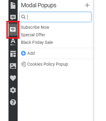
You can also open the Panel to manage Modal Popups from the Add Elements.

Add Modal Popups
You can add the new Modal Pop-up to the Panel by clicking either the link at the bottom of the list or the icon at the top of the Panel.

When you add a Modal Popup, edit it, and exit editing mode, we display a dialog offering you the option to add a button.

This Button will be automatically linked to the added Modal Popup Element, which improves its usability and speeds up your work.

Add Elements to Motol Popup
Click the small round Add Plus in the center of the Modal Popup to edit Elepanel's

Manage Modal Popups
You can manage modal popups in the Modal Popup Panel of the Quick Access Pane.
Modal Popup Search
Enter the Name letters to search for Modal Popups in the Panel. It's handy if you have tens of different pop-ups.

Modal Popup Options
Click on the Options icon for the Modal Popup Name in the Modal Popup Panel to rename, copy, and duplicate operations for the current Modal Popup. You can also delete the Modal Popup in the Options.

Delete Modal Popups
To delete a Modal Popup, click the Bucket Icon near the Name in the Modal Popup's line.

Navigation To Page Blocks
The navigation shows the Bloсks when the Modal Popup Mode is active. You can easily switch between the Modal Popup and Blocks.

Show Modal Popup
You can specify the event for showing the Modal Popup, such as button click, Timer, or page exit.

You can access the Modul Popups used in Blocks by clicking the links in the Page Navigator, allowing you to access the Modul Popup Editor easily.

We have added the link to the Modal Popup Element, which is linked to the Button or Hyperlink, to the Block Outline. Clicking on the link opens the Modal Popup Mode.

For Modal Popups, you can find the Popup button to open the linked Modal Popup.

Modal Popup On Button Click
You can set the Button or Hyperlink to open the Modal Popup on a page by clicking.
Modal Popup On Timer
You can also show the Modal Popup dialog after a specified time.
Modal Popup On Page Exit
You can show the Modal Popup when a website's visitor clicks to close the browser tab.
Select Pages For Modal Popup
You can specify the Site Pages on which the Modal Popup will appear for the On-Timer and On-Page Exit Options.

Modal Popup Auto-Close
Modal Popups can close after you press any button on the dialog. For example, if you click the Submit Button on a form or any other Button, the Modal Popup will close automatically.
Modal Popup Back Button
Click the Close Button near the Modal Popup to close the edit mode.

Modal Popup Properties
You can edit all properties available for the Modal Popup in the Property Panel.
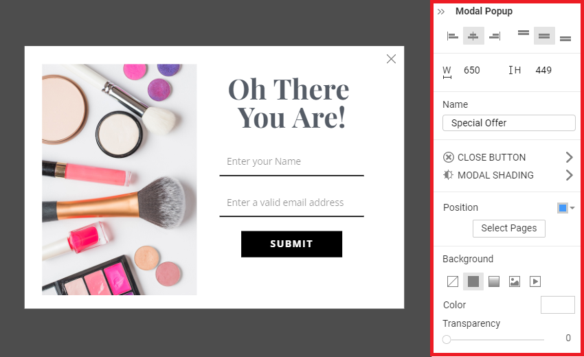
Name
You can rename the Modal Popup in the Property Panel.

Dimensions
You can resize the Modal Popup Element in the Editor and set its Width and Height in the Property Panel.
Alignment
Use the Horizontal and Vertical Alignment to position Elements inside the Modal Popup.
Position
Use the Position property to place the Modal Popup Dialog on the screen.

Close Button
You can stylize the Close icon by selecting and modifying its properties in the Property Panel.
Modal Shading
You can also edit the Shading of the Modal Pop-up by setting the properties in the Property Panel.

Exit Modal Popup Mode
Click the Back Button to exit the Modal Popup Edit Mode.

Modal Popup in Responsive
You can set the Modal Popup for each Responsive Mode, similar to all other Elements.
