How to flip the Grid Layout to change the block look
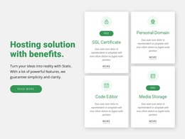
Everything You Need To Create Your Free Website
Use our Website Builder to design and create websites without coding. Drag and drop anything you want, to any place you want it. The Website Creator automatically adapts your website for mobile to make it responsive. Choose from more than 15,000 customisable website templates.
Related Features
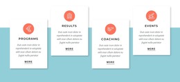
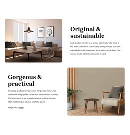
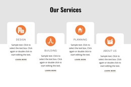
Free Templates with Grid Element
Get started with our best templates, great for any business. Create and customize them with our powerful and free website builder with no code. All templates are mobile-friendly and look excellent on any device.


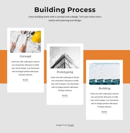


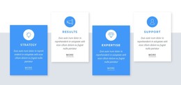


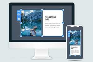
How To Make Flip The Responsive Grid
When you add columns and rows after getting started, you can always flip the CSS Grid layout to change the positioning and overall look of the Grid items and the CSS Grid block. The flip does not affect the space between rows and columns and only affects the positioning. To flip the columns and rows in the CSS Grid layouts, go to the Property Panel, and in the CSS Grid Layout section, you can the Flip or Rotate buttons to make the Grid Cells change places to set up the block look you desire. This function will help you create a responsive Grid without changes in the space between columns and rows.
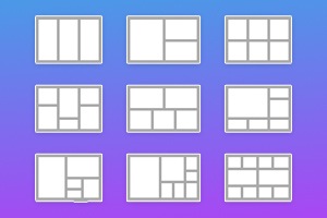
The CSS Grid template helps to place the content of the CSS grid under pre-designed layouts to make the object fit the current media queries. After you align content within the Grid Layout using CSS grid template columns with pre-installed space between rows and columns, ensure no conflict between your content with various screen sizes. The screen size and media queries go hand in hand, so to make sure the column layout works, learn how to manage the overall space between Grid items.
No matter how many rows and columns you set up, you need to ensure that your responsive layout will make your internal content work and draw attention. Use the right click on the cells to determine will the object-fit after adding it to the Grid layout. Please help us provide the updated navigation to align content. You can set the maximum number of columns and rows inside your block using right-click. Please help us improve our builder with the help of your comments and suggestions.