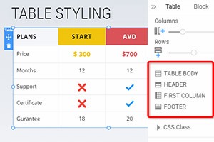
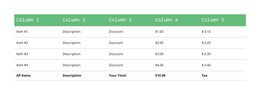
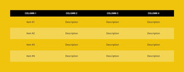
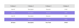
How to change the number of Table's Columns and Rows
Everything You Need To Create Your Free Website
Use our Website Builder to design and create websites without coding. Drag and drop anything you want, to any place you want it. The Website Creator automatically adapts your website for mobile to make it responsive. Choose from more than 15,000 customisable website templates.
Related Features
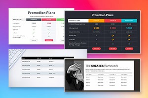
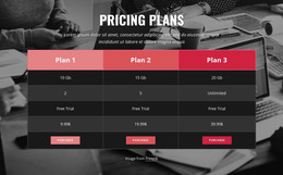
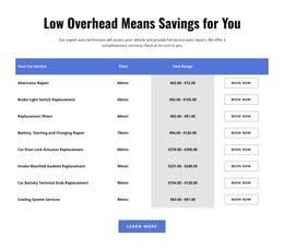
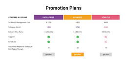
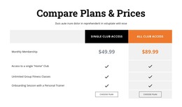
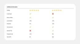
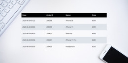
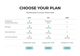
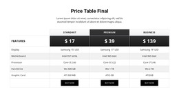
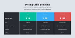
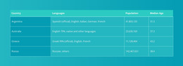
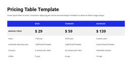
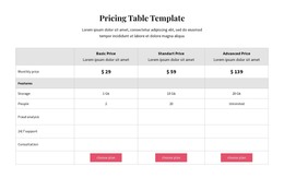
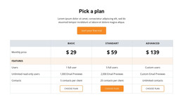
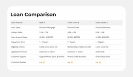
Free Templates with Table Element
Get started with our best templates, great for any business. Create and customize them with our powerful and free website builder with no code. All templates are mobile-friendly and look excellent on any device.


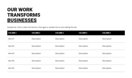


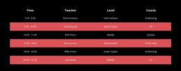


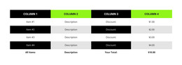


How To Change The Number Of Rows And Columns For Your Tables
After creating a table, you want to change how many rows and columns this table has to fit all the content information you need. Our top site constructor allows you to quickly and easily manage the tables and row and column numbers it contains. After adding the table, please select it and go to the Property Panel on your right. You will immediately see two sliders, one for Columns and one for Rows. Dragging those sliders will allow you to increase or decrease the number of rows and columns inside your tables. You can even leave one row and one column responsive design if it suits the style of your site.
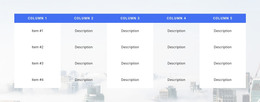
You can not only add the columns, rows, and text elements to your tables but customize the content that is already present in the layout grids. You can customize multiple table lines or text styles as well as text color and the overall background color to make it fit the general layout of your site. Adding tables and multiple HTML tables can help your website design systemize a great amount of information and content you want to provide to your users and potential customers. Customize the background color of any column and the background color border to stress certain text to help users orient easily.
Start forming your layout using simple steps our community provides to make your website design unique and memorable. Adjust the desktop for mobile devices with the proper column width and text size so that your websites would fit any mobile device. Start customizing the grids using the column color border color option. There are many ways grids can display amazing results you can work on to improve to perfection. Experiment with multiple settings to form the best layout for your future websites or create unique designs.