How to stylize the Slider Arrows for your web design needs
Everything You Need To Create Your Free Website
Use our Website Builder to design and create websites without coding. Drag and drop anything you want, to any place you want it. The Website Creator automatically adapts your website for mobile to make it responsive. Choose from more than 15,000 customisable website templates.
Related Features
Free Templates with Slider Element
Get started with our best templates, great for any business. Create and customize them with our powerful and free website builder with no code. All templates are mobile-friendly and look excellent on any device.
How To Stylize The Slider Arrows
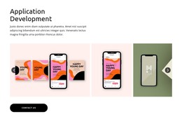
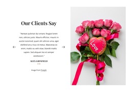
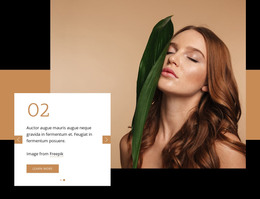
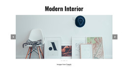
Sliders are one of the most functional elements in modern online stores. You can stylize left and right arrows using this feature. Many people use the visual editor to customize the arrows, and you can stylize arrows with this feature in several clicks. You can have various styles for the arrows and set them for the different arrows (change the background color, add on the arrows the buttons, and so on). You can select the slider, then arrows, and you can change its style from the property panel. You must consider that you need to change the color of the slide arrows to fr to the whole style in some cases. The Arrow color and the text color must match the background images, giving a nice visual effect.
The Background color behind the slider can change its look. The slick Full Width slider is also a very popular instrument for modern websites. The arrows for navigation can navigate users on the slider. Carousel is an interactive ad consisting of several slides that replace each other when you click. The user sees an ordinary ad on social networks - with a picture, title, and text. Instead of one picture, the ad hides several images - usually several pieces. Using gradient as the background color is common to make sliders more beautiful and nice looking. A theme maker, or optimizer plugin often can't correctly work with the URL data we use for default arrows. Many people also use arrows on modern sites on the contacts. Also, they add text color on the items, and so on.
The Full width slider with the colorful arrow buttons you can use everywhere on your site. So, add images on the slide, show arrows, and set the nice text color, making it easy for the users to find needed elements. Users can flip through the card's slide by clicking on the arrows with the computer mouse or by swiping to the side of their smartphone. Use a carousel with the gradient text color if you don't know which product to attract the user or if you want to talk about different product features. The format is most often used for advertising online stores, but it's not the only option. For example, it can also promote events by showing photos of the speakers.


