How to use the Header and Footer Blocks on a website
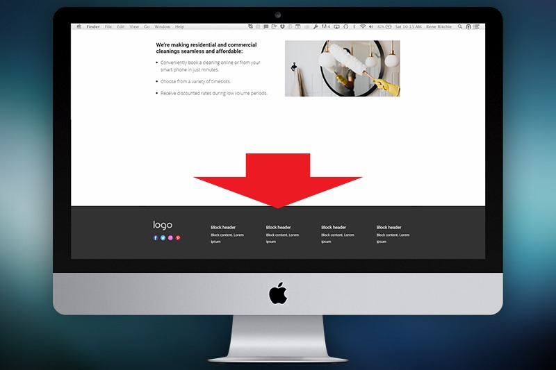
Website Footer
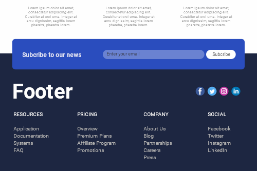
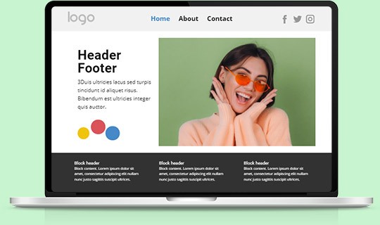
The Footer is a bottom block of any website shared among all web pages containing data common to other pages. The information in footers may include links to pages, posts, or external resources, references, and copyright notices, as well as links to the social accounts, contact and subscribe information, and more.
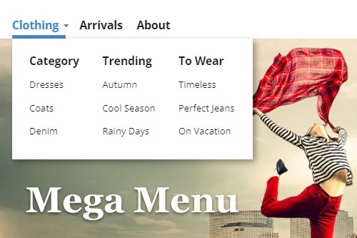
Mega Menu
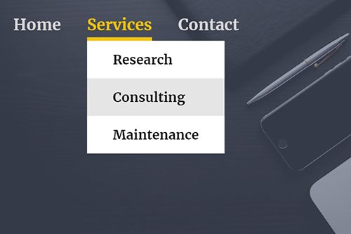
The Mega Menu is the most popular Layout used in modern menus containing Submenu Items. It allows adding Subitems in Columns, also adding images and other Elements to a Menu. To add a Mega Menu, you can select a Menu in the Header, go to the Property Panel to the right, then switch its Layout to the Mega Menu by clicking the corresponding icon in the Layout section.
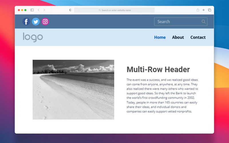
Multi-Row Header
Combine several Header blocks at the top of your pages into one large Header. It allows placing more information than into the classic one-row Header. You can add Menu, Search Field, Shopping Cart, Social Icons, and Contacts into two and more Header blocks. Usually having different colors for the block backgrounds. It is the most popular on eCommerce websites.
Show Header Link
You can hide and unhide the Header in the Property Panel for a Page by clicking on the gray area beyond the Editor and going to the Property Panel. In addition, you can click on the link to the top right of the Editor near the Options icon to unhide the hidden Header at any time, which is very convenient, quick, and easy to find.
What Is The Header And Footer For A Modern Website?
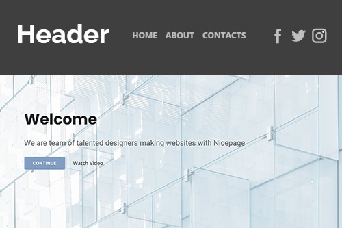
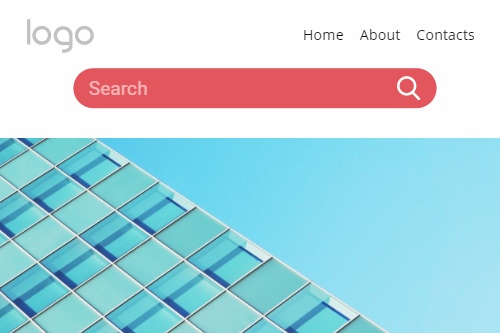
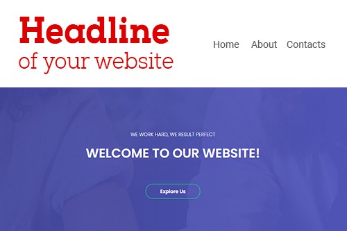
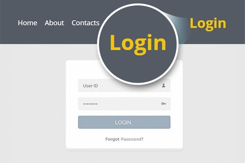
The creation of modern websites is impossible without the header and footer. Their footer design and header design as well play a significant role in providing a unique and excellent user experience, efficient navigation throughout the website, finding the information they need, and attracting attention to vital points. Common website footers and headers are also essential tools for UX design and additional promoting of their website brand, various CTA (call to action) integrations, and providing company current location, contact details, or asking specific questions. Let's review what roles header and footer play in website design development and UX design, how websites use their website footer and header designs for promotion, and how to integrate your ideas into the best website footer and header. If you start from the top of a page, you see the header area, which is the first thing your target audience and site visitors see when they enter your landing page. The website header design can attract your user's attention, promote your business's brand identity with an excellent logo and slogan, and unfold other website pages apart from the main home page. Their login and sign-up forms via email address and phone number info are traditionally also situated in the header to quickly access additional functions of a website. The header is primarily consistent throughout the site. However, there are examples of the website header that change based on the section of a website. Functionally headers can also contain a site navigation slider menu, site search widget, a shopping cart widget (for shopping sites), and CTA buttons.
When your site visitors scroll down to the bottom of your website page, they will find their website's footer. Like the header, the footer is typically consistent throughout the site, on all pages and posts, as in good website footer design examples. Website footer design mainly receives marginal attention, which some believe to be a wasted potential as the footer is repeated on every page. However, the excellent website footer design efficient practices show that, depending on settings, their best footer design can reflect the essential information, for example, copyright information, your terms of use and privacy policy, comprehensive sitemap, contact forms, and news, google maps or their images, put social media icons or integrated social media widgets, and more. Some sites also put sign up below their headers. However, it is less effective as website footer design best practices proved because if we speak of web pages with a massive data capacity, not every user would scroll down thousands of posts to sign up or log in. To build an attractive and informative header and footer, first, you need a vision of your future site, think what people see when they first visit your site, then pick a website theme you want to use as a basis. You must set the color scheme for the whole site and for footer and header backgrounds to correlate with style and color. Your website with best practices can use an attractive and unique split image background when one image gets split in half and set in the header and footer, respectively.
In the header, include enough information to encourage visitors to explore the page further. Your site's name and logo display must be clear, readable, and clickable to provide an easy way for site users to return to the main page. Place the search plugin and sign-up/login elements close to the site sections or navigation menu. Then you can start building your best unique-looking website footer design. As renowned best website footer designs, examples suggest, you must include information on how to contact you, whether a phone number, a link to the contact form, or both. Your page footer design with a site search is the last chance to attract a visitor's attention and encourage him to complete a specific action. Additional information like terms of use, privacy policy, and copyright information should be at the very bottom of the page. If you have a physical representation, add google maps geolocation and written address. Your added social media icons should be at the center to attract attention. You can even add an option to skip the main content and find contact information immediately and links to social media pages. Go to our builder and create custom headers and footers designed for your website.
