
Cozy Website Designs
When a brand depends on comfort, warmth, and personal attention, harsh contrast or crowded sections can break the mood. A cozy web design should coordinate muted colors, readable typography, tactile imagery, and generous spacing across the site.


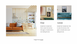
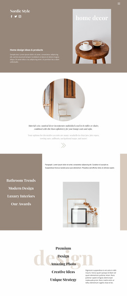



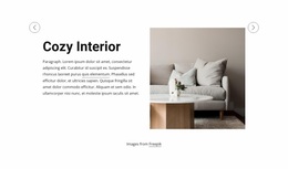
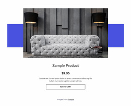
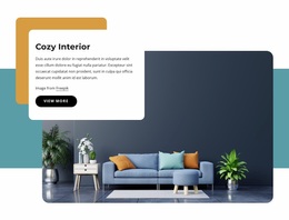
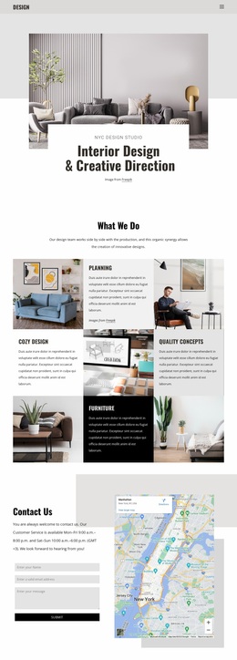


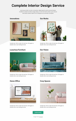
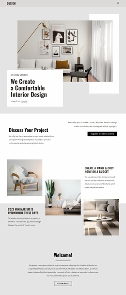
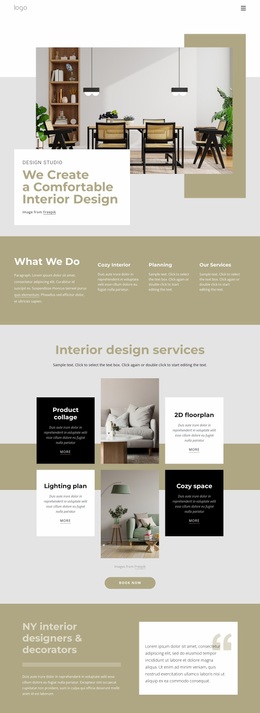



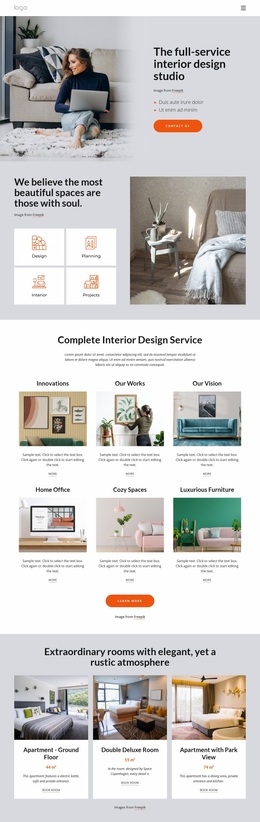
More Website & HTML Templates for Cozy
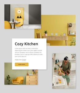
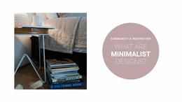

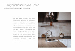


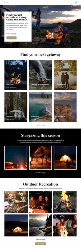
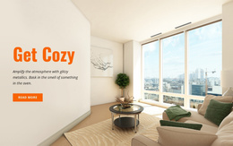
More Website Designs from Interior Category
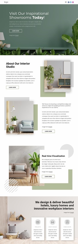
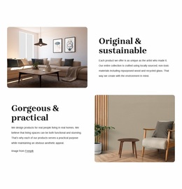

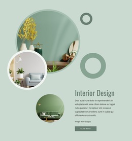
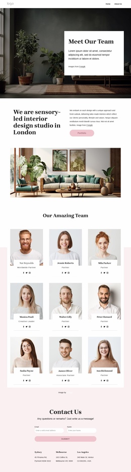
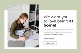


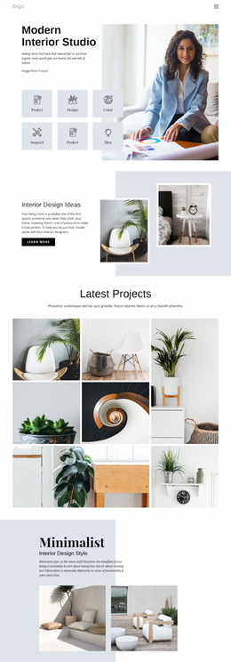
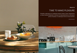
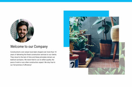
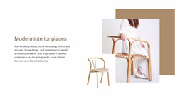

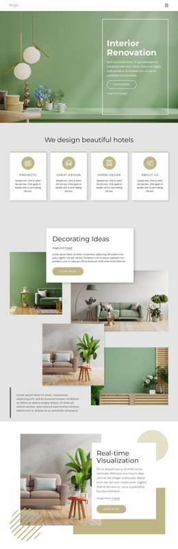

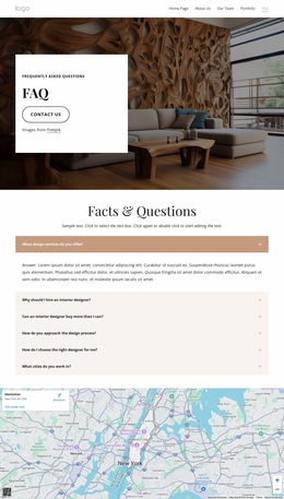
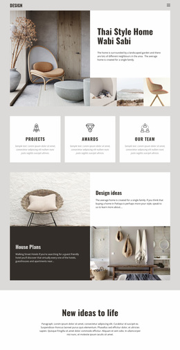
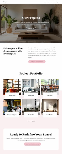







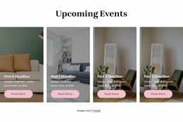
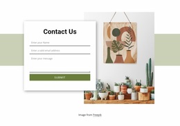
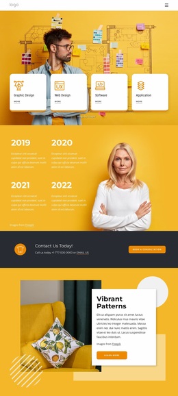
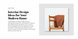
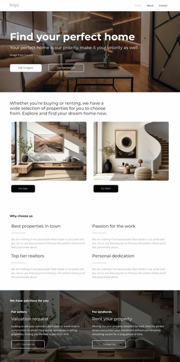

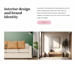
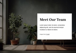

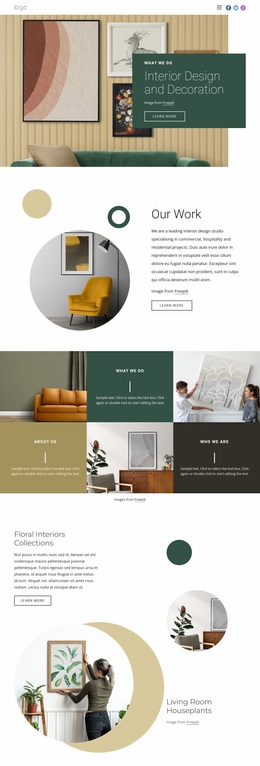
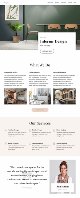
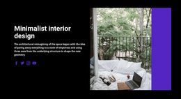

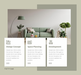
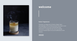
Other Interior Website Designs
Creative Cozy Website Design
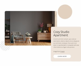
Cozy website design starts by softening the screen. A warm off-white background softens the glare, photos with visible texture add a sense of material, and open space keeps it all from tipping into clutter. Color is only one lever, because scale, density, and the tone of the copy shape the mood too.
Palette Roles at One Steady Temperature
Each tone in a cozy palette needs a job. The lightest covers backgrounds, deep brown or charcoal carries text, and one natural accent marks details. Beige is the obvious route, and several other pairings reach the same mood:
- Cream with dark brown type reads like a printed catalog.
- Muted sage over off-white lets a serif headline look relaxed.
- Warm charcoal with dusty blue-green suits brands that find brown too sweet.
A warm hero next to a stark white pricing block or a default blue button cools the whole page, so temperature matters as much as hue. Site Colors in Nicepage keeps one scheme across the project, and adjusting a shade there updates it wherever it is used. Softness has its limits, though. Pale taupe text on cream tires the eyes within a few paragraphs, so body copy should stay dark, leaving the softening to borders and shadows.
Picking Typefaces With Gentle Character
A soft serif gives headings personality, but in small navigation labels and long product descriptions it turns fussy. A plain sans serif handles those better. A bold jump in size from heading to body text calms a screen more than a third-accent color does. Moderate weights and open letterforms feel approachable, whereas strictly geometric forms lean toward the feel of a banking app. Handwritten scripts are the usual shortcut to friendliness, yet at small sizes they start to look like a costume.
Tactile Imagery and Soft Surfaces
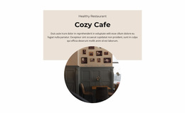
Most of the texture comes from photography. Close crops of knitted wool, oak grain, or glazed clay shot in daylight make the screen feel physical. A coffee cup on a table makes a page cozy only when it matches the rest of the set in contrast and grain. Avoid applying a single orange filter to every image, since fabric and food lose their true color under it.
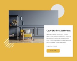
Off-white cards on a cream base, a faint shadow, and gently rounded corners feel calmer than pure white boxes with hard edges. A single hand-drawn underline does more than doodles in every block. In a finished direction, palette temperature, type, and photo treatment agree with each other. Card shapes and surfaces then repeat the same softness on every page.