
Car HTML5 Templates
Dealerships need vehicle listings, specifications, photos, and inquiry details to stay clear on every screen. A car HTML5 template provides reusable markup sections that keep this content organized across desktop and mobile layouts.
-
-

-
-
-
-
-
-
-
-
Free Website Builder SoftwareDownload
-
-
-
-
-
-
-
-
-
-
-
-
-
-
-
-
-
-
-
-
-
-
-









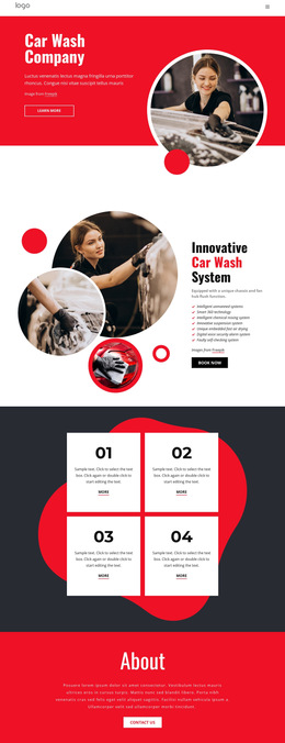
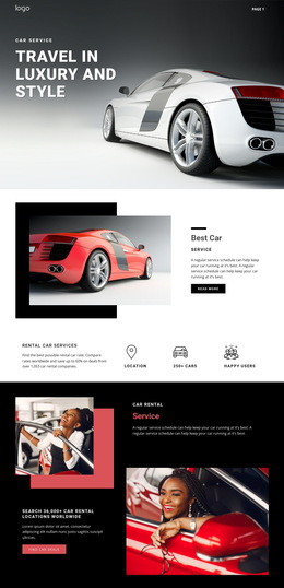




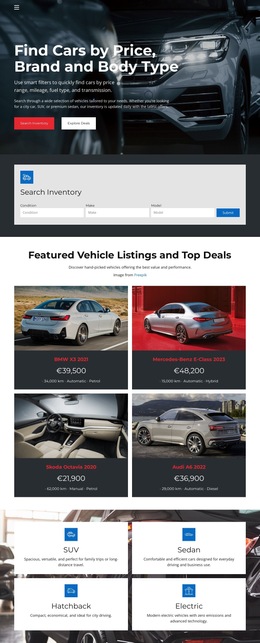
More Website & HTML Templates for Car

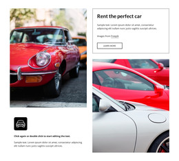
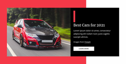

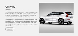


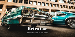

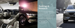
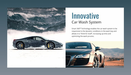


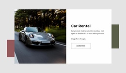




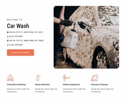





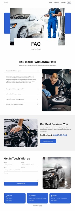
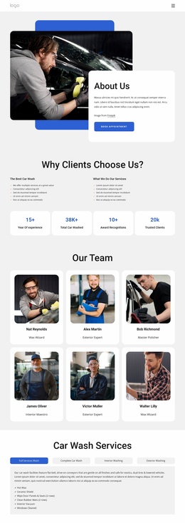




Other Cars & Transportation HTML5 Templates
Responsive Car HTML5 Template for Structured Vehicle Content
HTML5 is the markup standard underneath an automotive interface, and a car HTML5 template is worth judging on how well it uses it. Which regions the document declares, how a vehicle entry is described, and how photography and forms are marked up: those choices decide what happens once demo cars give way to real stock.
Semantic Regions Behind Each Listing
Automotive content repeats, and meaningful markup keeps it readable. A stock grid is a set of vehicle entries, each with a name, a price, and a short list of specifications. A document whose structure says so is easier to extend than one built from anonymous containers.
Structural choices worth checking in a demo:
- "nav" and "header" carrying showroom identity and the route into stock;
- "section" separating inventory, finance, and servicing zones;
- "article" holding one vehicle entry that can stand on its own;
- "footer" keeps the dealership address and contact details out of the flow.
Heading order matters as much. In a vehicle detail view, the model name should be the top heading, with the gallery, specification, and inquiry blocks under their own headings, so the layout matches how a buyer reads a car. Specification markup requires the same care, since name, price, and mileage belong in an order that is repeated in every entry.
Heavy Media Across Narrow Breakpoints
Automotive content is photography-first, and HTML5 gives it a sensible place to live. The "picture" element and "srcset" can serve a wide showroom shot on a laptop and a lighter version on a phone, which matters when a listing carries twenty photographs.
A walkaround clip may sit in a "video" element with its own poster frame, the one case where a listing genuinely earns moving pictures.
The quiet part is source order: on a narrow screen, the document decides what a visitor meets first, so the model name, price, and inquiry action should come before secondary text in the markup. Nicepage Responsive Modes let you check the same composition down to Phones; the Responsive Modes documentation covers the workflow.
Forms People Finish On Phones
An inquiry form is marked up too. Input types do quite a bit of work there: a telephone field that displays a numeric keypad, an email field that catches typos, and a date control for a test drive or a rental pickup.
Labels count for as much. A field marked only with placeholder text disappears the moment someone types into it, just as a buyer is recalling which model they meant. Descriptive alternative text for vehicle photography also earns its place, since a listing loses meaning without it.
Judge a car HTML5 template on that foundation: regions that carry meaning, media that adapts, and forms a person can follow in order.