2010 Art & Design HTML5 Templates
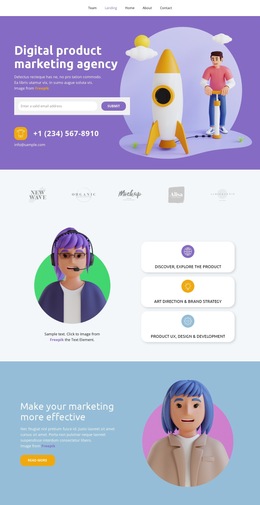
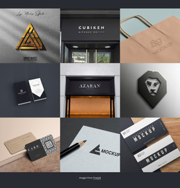
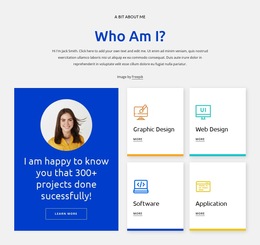
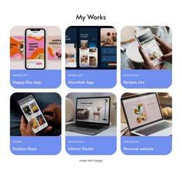
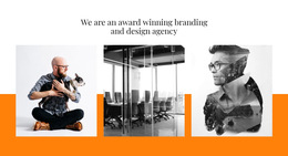
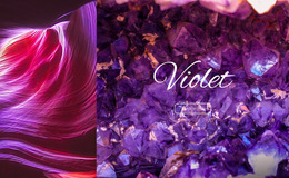
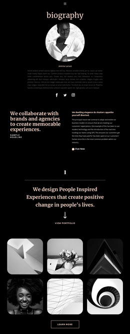
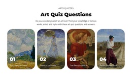
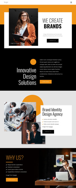
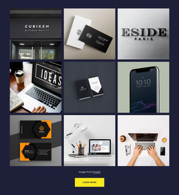

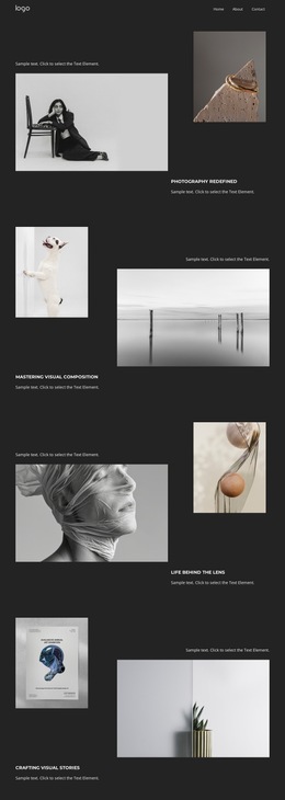
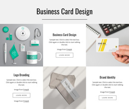
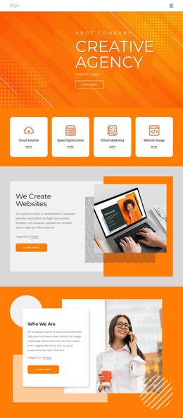
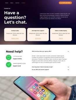
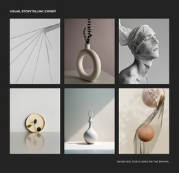
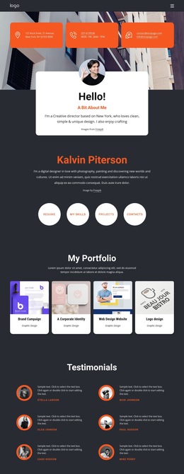
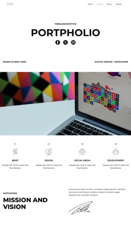
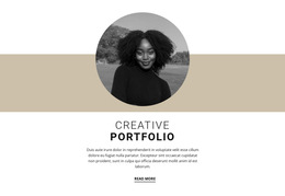


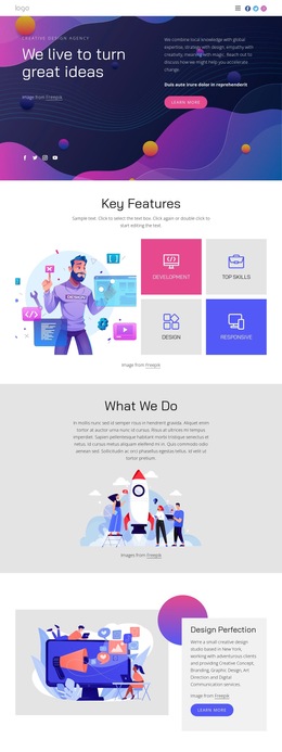
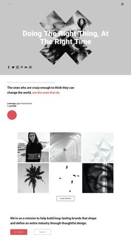


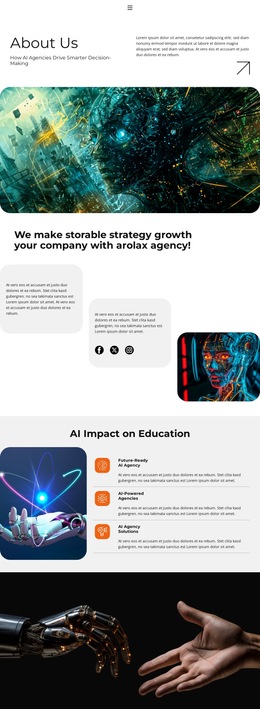
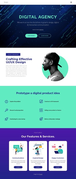
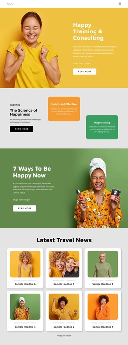
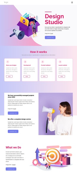

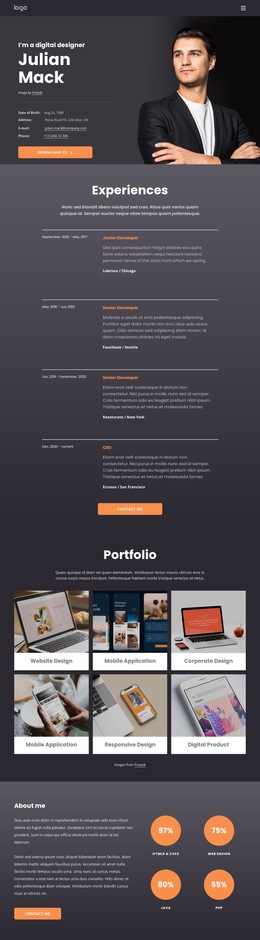

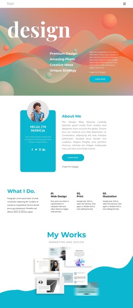
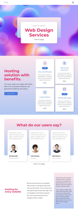
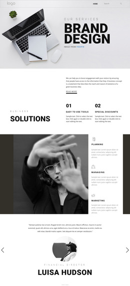

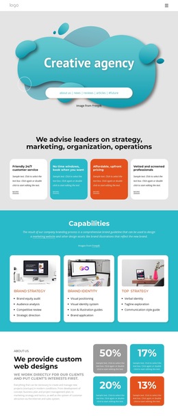

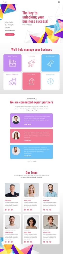
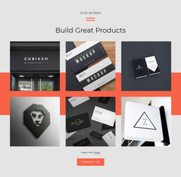
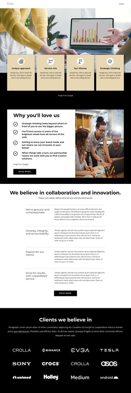
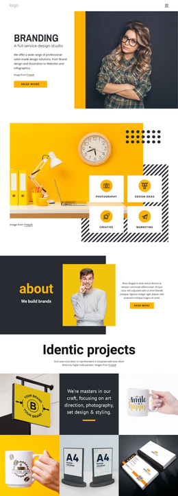
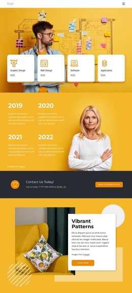
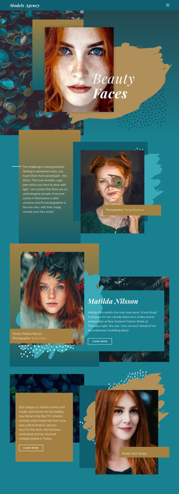

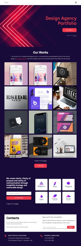
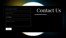
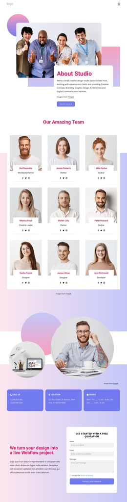
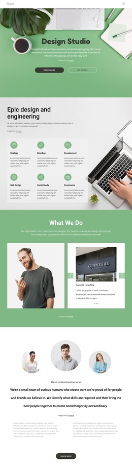
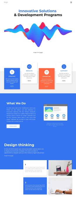
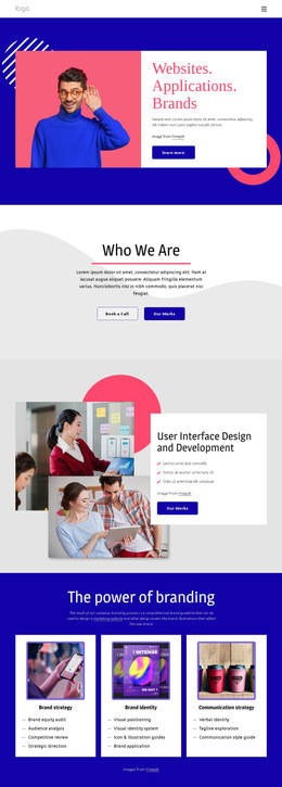
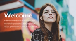
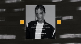
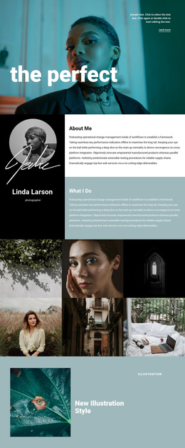
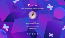
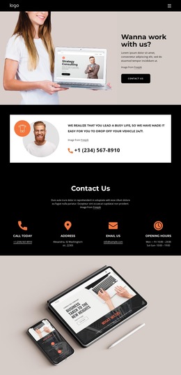

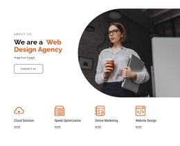
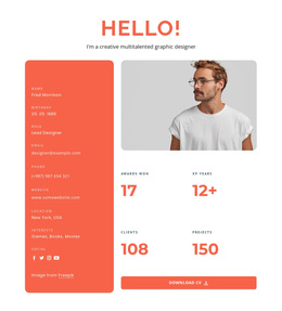
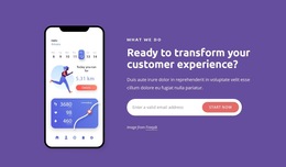
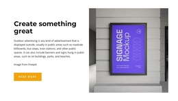
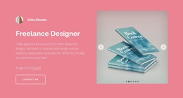
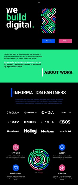
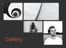


Responsive Art & Design HTML5 Template
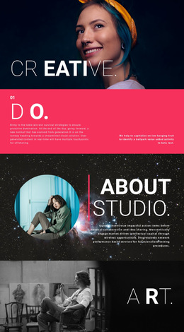
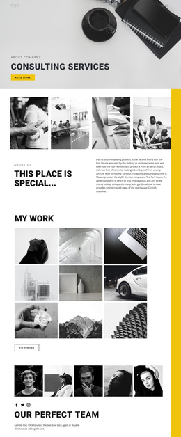
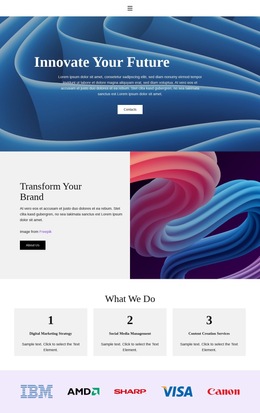
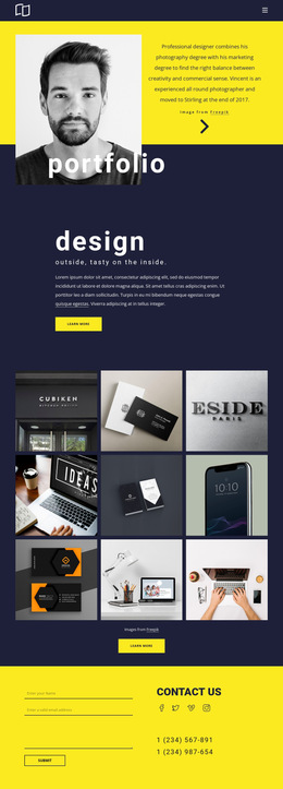
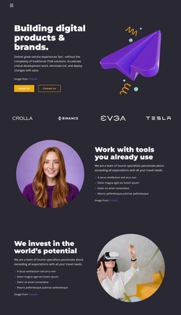
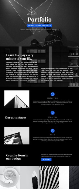
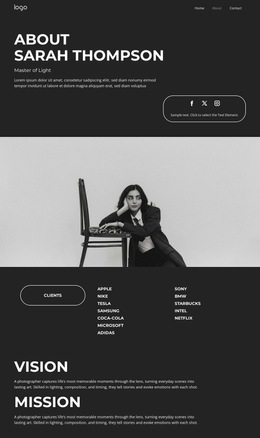
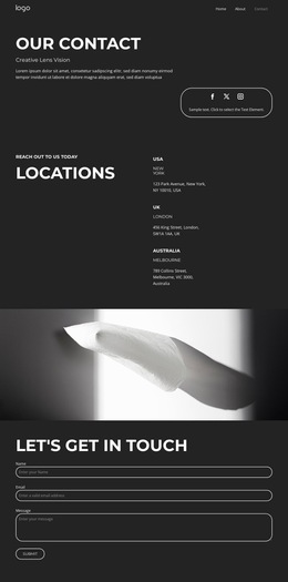
Control your source, preserve visual detail, and prepare an art portfolio for independent deployment. An art & design HTML5 template gives photographers, illustrators, and studios an adaptive layout for image collections, project context, and clear contact paths.
Why Choose a Lightweight Art & Design HTML5 Theme?
A lightweight HTML5 art layout works when visual work must remain easy to host and inspect. It is useful for:
- independent static portfolio hosting;
- responsive artwork presentation across devices;
- clean source for developer review;
- a focused foundation for galleries, project notes, and contact details.
For an HTML5 portfolio for artists, the technical layer should support the work. Keep artwork titles, descriptions, and contact content in a logical hierarchy, use semantic tags consistently, and treat W3C validation as a final quality check after export. A clean HTML structure also helps when a developer needs later code-level changes.
Nicepage follows a direct path: choose a design, open it in the Desktop Application or Online Builder, adjust the layout, then export HTML/CSS or publish online. The HTML export workflow explains how projects from the Windows or Mac OS applications are exported as static HTML websites for your preferred hosting provider. For an image-first direction, photo-oriented layouts can help balance artwork and supporting text.
Fast loading Features for Art & Design HTML5 Sites
A creative studio HTML template benefits from practical controls that protect presentation and output quality:
- Export Websites prepares HTML websites from the Nicepage Desktop Application for independent deployment.
- Responsive Modes let you adjust layouts for large screens, desktops, laptops, tablets, and horizontal or vertical phones; the responsive-mode controls document those views.
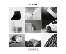
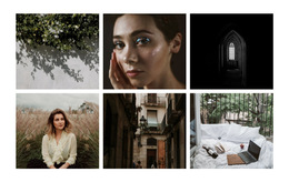
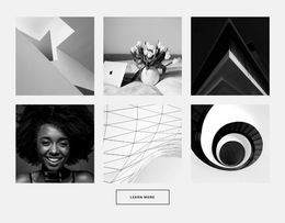
- Image Gallery Element groups artwork and supports text titles, hover effects, and styling.
- Alt Text Image Property adds relevant text for images on an artist's HTML5 website.
- Image Lazy Loading delays image resources until needed, useful for portfolios with many high-resolution works.
- Export Minimal CSS Per Page can create a separate CSS file containing only the styles required for that page.
These controls support an adaptive layout without forcing every project into the same treatment. A photographer can use portfolio ideas for photographers to emphasize series and image scale, while a poster artist may prefer retro design references for stronger typography and graphic framing.
SEO friendly Art & Design HTML5 FAQ
Can I export an art HTML5 site from Nicepage Online?
Yes. Nicepage Online can export HTML for hosting on your own server. It can also export Projects for import into the Nicepage Application for Windows or macOS.
Can I add SEO metadata or custom code to an artist HTML5 website?
Yes. Nicepage supports custom meta tags and SEO descriptions through page settings, Schema structures, and custom CSS where needed.
How can I keep a large artwork gallery from loading every image at once?
Use Image Lazy Loading. It delays image loading until resources are needed, reducing initial page weight for image-heavy portfolio pages.
Customizable HTML5 Portfolio Deployment
Choose a visual direction, open it in the Desktop App, and refine the artwork grid, typography, captions, and responsive views. Start with the free HTML5 website builder while you test the composition, then export HTML/CSS or publish the finished site online. This keeps an HTML5 portfolio for artists or creative studio HTML template ready for fast handoff without tying routine design changes to custom development.