Music & Entertainment Web Page Designs
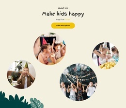
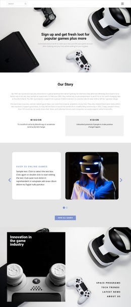


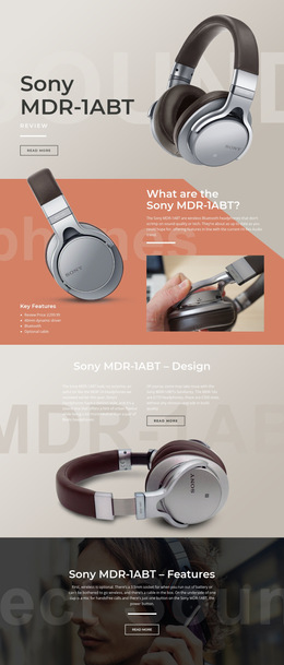
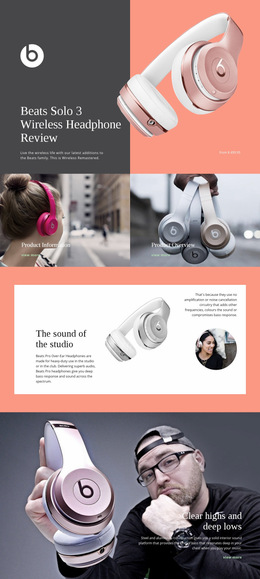
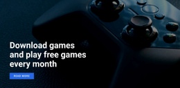
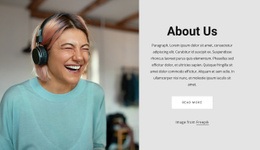
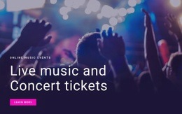
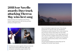
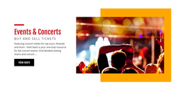




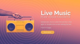
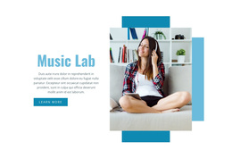


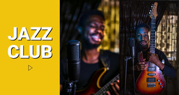
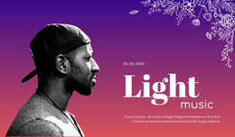
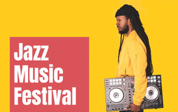


Modern Music & Entertainment Web Page Design
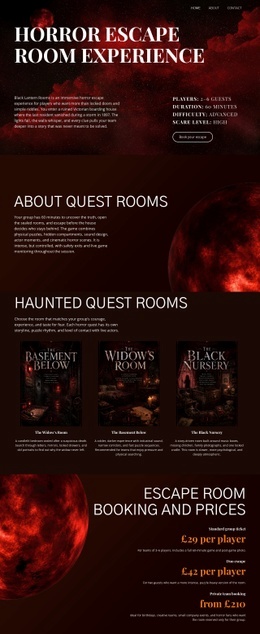
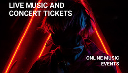
Music & entertainment web page design is about the composition of one page: what appears first, how media supports the message, and where the visitor moves next. A release page, festival schedule, episode page, or artist profile may all belong to a larger website, but each needs its own hierarchy, mobile order, and primary action. Nicepage helps arrange that page-level experience without turning the discussion into a site-wide design system.
Design the Page Around Its Single Job
A release page should not behave like a festival schedule, and a festival schedule should not imitate an artist biography. On a release page, put the cover or campaign image first, follow it with a short release summary, then give the track, video, credits, or dates enough space before the listen or buy action. A festival page needs date and place earlier, because visitors often arrive with practical questions before they explore the lineup.
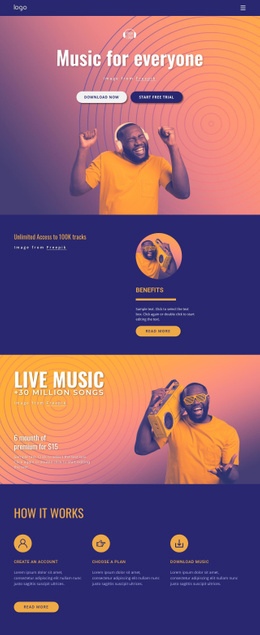
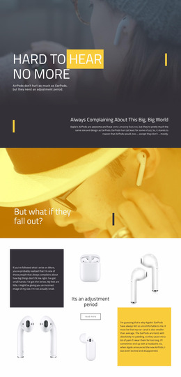
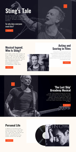
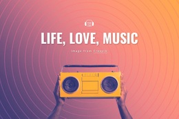
Episode pages benefit from a different rhythm: title and key art, a concise description, the player, guest or topic details, then a related action. An artist profile can lead with identity and a short bio, followed by media, appearances, and booking information. For album campaigns or DJ sets, a focused playlist page concept can show how artwork and listening actions fit on a single page without making the whole site use the same template.
Page-Level Visual Hierarchy and Media Placement
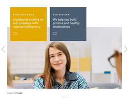
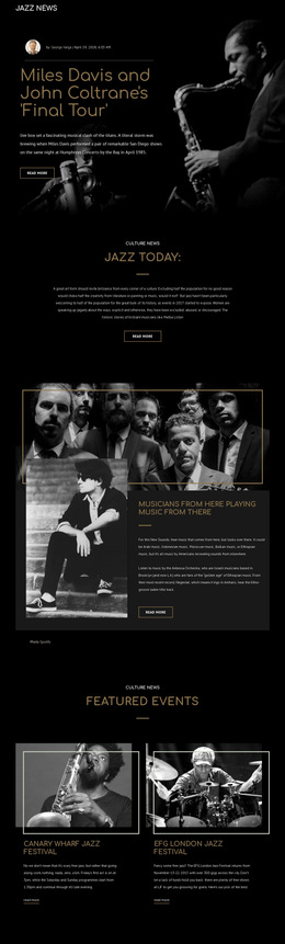
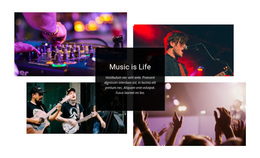
A single entertainment page works best when the first screen answers three questions quickly: what is this, why does it matter, and what should I do next? A Full-Width Slider can be useful when the opening area genuinely needs several states. At the same time, the Video Element or Gallery Carousel can support a release, episode, or event story after the main context is clear. The Image Gallery Carousel workflow is relevant when multiple photos need to remain compact rather than competing for separate full-width sections.
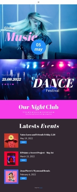
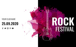
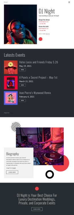
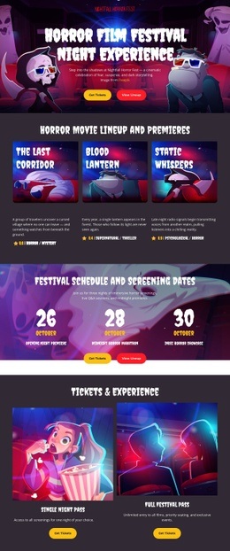
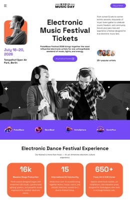
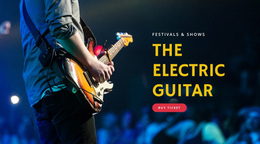
For a festival, music festival layouts can help frame lineup cards and timetable content. The key is not simply to add more blocks: the lineup should lead naturally into schedule information and the ticket action, while secondary media sits lower on the page.
Mobile Composition for Entertainment Pages
Desktop composition rarely transfers well to a phone unchanged. Use the responsive layout controls to reconsider order, scale, and density rather than only shrinking elements.
On mobile:
- place the main CTA near the top if it is time-sensitive;
- move decorative galleries below essential release or event information;
- stack lineup or performer cards in a scan-friendly order;
- reduce oversized artwork when it pushes dates or actions too far down;
- keep video posters proportionate so playback does not dominate the first viewport.
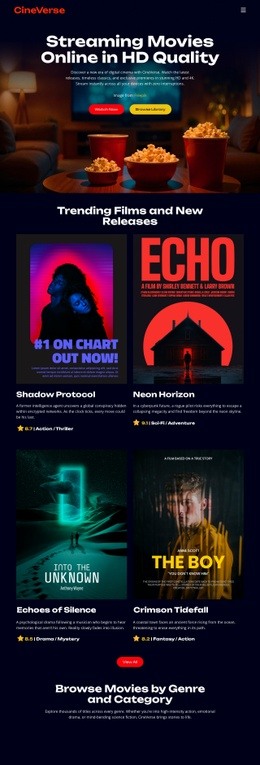
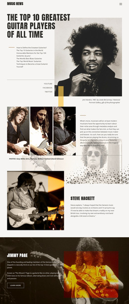
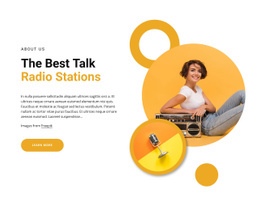
A broadcaster page can apply the same principle. Television website concepts can guide an episode or program page where title, description, player, host information, and next action need a clear vertical sequence.
Music & Entertainment Page Design FAQ
What should appear above the fold on a music release page?
Show the release identity, enough context to understand the project, and one obvious action such as listen, watch, buy, or view dates. Supporting galleries and long credits can follow later.
How should a festival page change on mobile?
Prioritize date, location, lineup highlights, and ticket access. Secondary photography, long descriptions, and decorative motion can be moved lower so that the essential event information remains easy to scan.
Are ready-made elements useful for media-focused page layouts?
Yes, when they support the page hierarchy rather than define it. Video, gallery, grid, and button controls should be chosen because the specific page needs them, not because every entertainment page needs the same feature set.
How can I keep several artist or event photos from crowding one page?
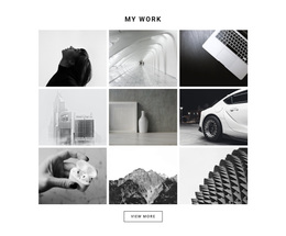
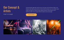
Use the Gallery Carousel Element to display multiple images in a single interactive block. It suits artist press photos, venue galleries, festival highlights, or entertainment portfolios that need a compact visual sequence.
A Simple Test Before the Page Is Finished
Look at the page once without scrolling. Can a new visitor tell what the page is about and what the next useful action is? Then view it on a phone and check whether the first meaningful content still appears before decorative media. Finally, scan the page from section to section: if removing a block makes the sequence clearer, that block may not belong there.
This page-level test is more useful than adding another generic feature. Web Page Design succeeds when one screen sequence feels intentional, even if the surrounding website uses a broader design system.