Overlap Block Web Page Designs
-

-

-
-
-
-
-
-
-
-
-
-
-
-
-
-
-
-
-
-
-
-
-
-
-
-
-
-
-
-
-
Free Website Builder SoftwareDownload
-
-
-
-
-
-
-
-
-
-
-
-
-
-
-
-
-
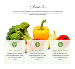













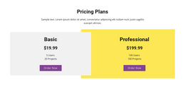




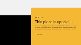

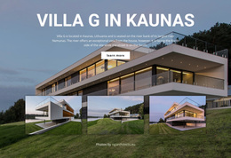




















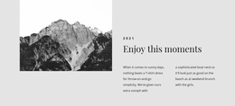


Unique Overlap Block Web Page Design for Page Hierarchy and Flow
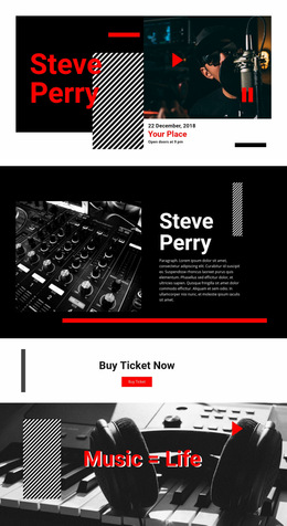
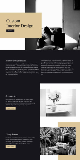
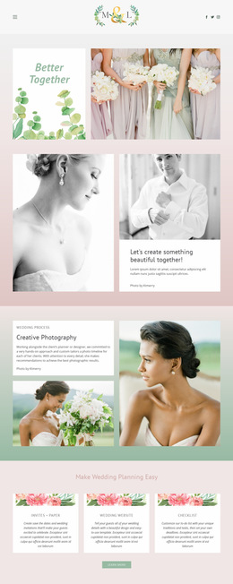
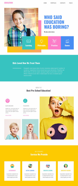
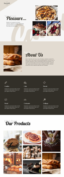
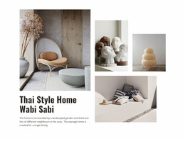
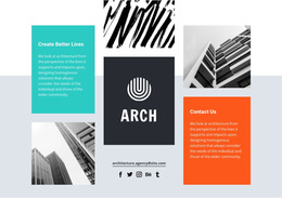
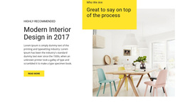
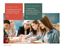
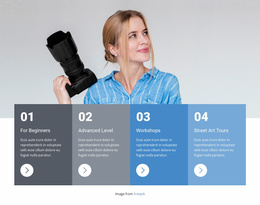
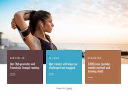
Within a web page, an overlap section can act as a deliberate change in rhythm. Images, text cards, and color panels move beyond strict rectangular boundaries, creating asymmetry and a stronger focal area. The value of the design is not only inside the block itself; its placement also affects how the eye moves from the section above to the section below.
How Does an Overlap Block Shape Page Hierarchy?
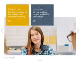
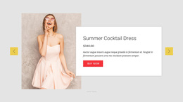
An overlap composition can give one message more visual weight without isolating it from the rest of the page. A foreground card may cross the edge of a large image, or a color area may extend behind both text and imagery. These relationships help indicate what should be noticed first and what should be read next.
The effect is especially useful when the page contains several sections with similar visual density. One asymmetrical block can create a clear pause or transition between more regular content areas.
Plan the Reading Path Around the Overlap
The strongest placement depends on what happens immediately before and after the block. Think about the transition, not just the section in isolation.
An overlap block can:
- bridge a quiet introduction and a more detailed content area;
- pull attention toward an important story or offer;
- break a long sequence of aligned rows without disrupting the reading order.
If the foreground card sits to the right of a large visual, for example, the next section can continue that directional movement through its alignment or spacing. If the overlap is centered and visually heavy, more breathing room below it may help the page reset before the next content group.
Use Asymmetry Without Making the Page Feel Unbalanced
Overlap works best when one element clearly dominates and the surrounding spacing supports that decision. Too many equally strong crossings can make the page feel restless.
A balanced composition often uses:
- one primary visual anchor;
- one secondary foreground element;
- controlled negative space around the section.
Nicepage Elements and Blocks provide pre-designed content parts that can be adapted on the visual canvas. Responsive Modes can then help adjust scale, spacing, and placement so the same hierarchy remains readable at different widths.
Coordinate Visual Weight with Neighboring Sections
A large image with a dark panel may feel visually heavier than a simple text-and-icon section. That difference can be useful when it is intentional. Place the overlap where the page needs stronger emphasis rather than repeating the same high-contrast treatment several times.
For example, a web page can move from a restrained introductory section into a bold overlap feature and then return to a lighter content grid. This creates a high-low-high or low-high-low rhythm that makes the page easier to scan than a sequence in which every section competes equally for attention.
Choose the Pattern That Fits the Composition
Use Overlap Block when mixed content needs to cross boundaries and create one focal relationship. Shapes are more appropriate when geometric forms themselves define the visual language. Over Grid fits layouts where a repeated grid remains visible and another element intentionally sits across it.
The distinction matters because web page design is about choosing the composition that best supports the reading path, hierarchy, and relationship between neighboring sections.
Overlap Block Web Page Design FAQ
Where Should an Overlap Block Appear on a Web Page?
Place it where the page needs stronger emphasis, a visual transition, or a break from a sequence of regular sections. Its position should support the reading path rather than interrupt it.
Can the Overlap Arrangement Change on Smaller Screens?
Yes. Nicepage Responsive Modes support layout customization for Large Screens, Desktops, Laptops, Tablets, and phone views. The exact offsets can change while the intended hierarchy remains consistent.
Should Every Major Section Use an Overlap Effect?
Usually not. The pattern has more impact when it marks selected focal areas. Repeating the same strong treatment too often can reduce contrast between important and supporting content.
Fit the Overlap Block into the Full Page Composition
Start with the page flow: identify where attention should increase, where the reader needs a transition, and which neighboring sections should feel quieter. Then adapt the overlap block around that role. Adjust the image scale, card position, spacing, and responsive behavior until the section feels connected to the page rather than placed on top of it.