900 Features Web Page Designs



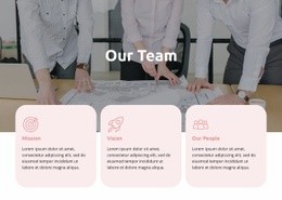
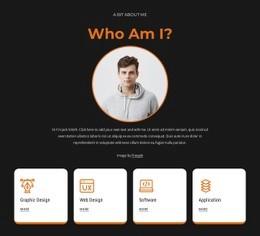
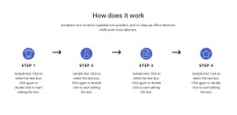
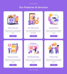





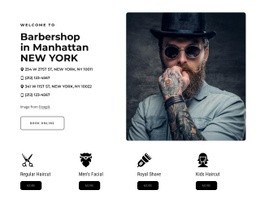
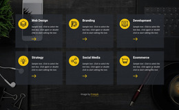
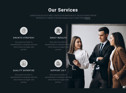
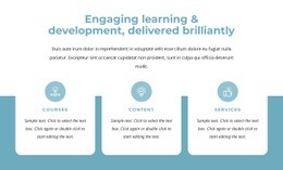



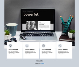

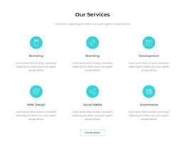
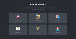
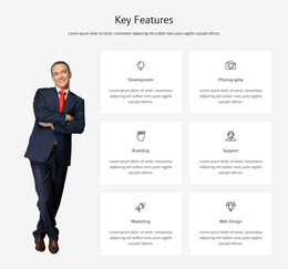
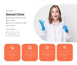
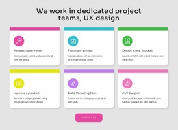

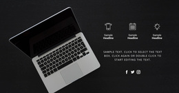
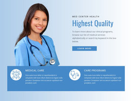

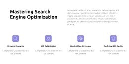

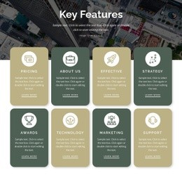
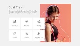
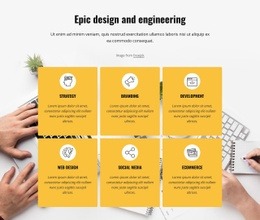
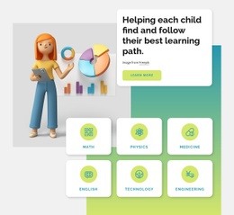
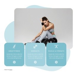
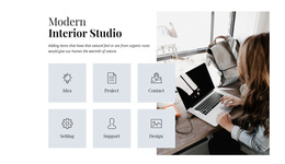
Unique Features Web Page Design Ideas for Clear Visual Hierarchy
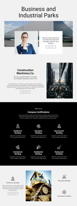
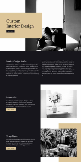
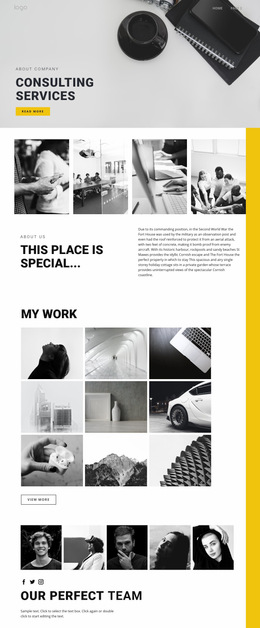
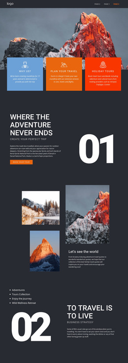
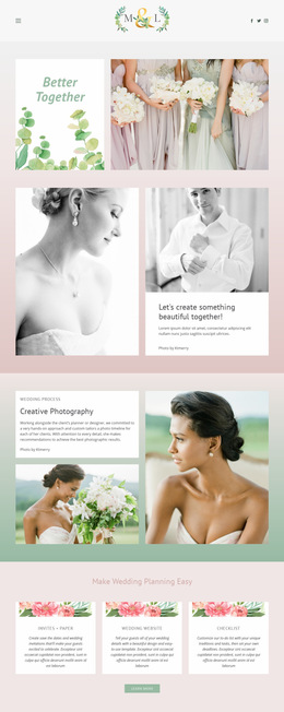
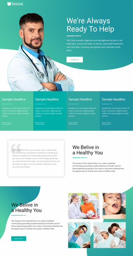
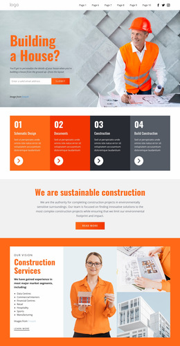
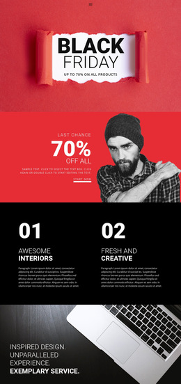
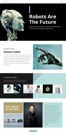
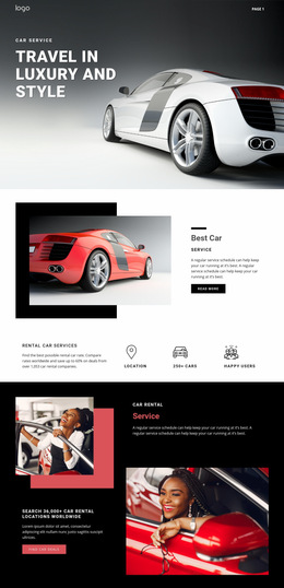
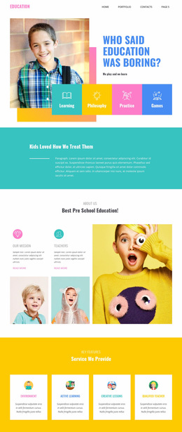
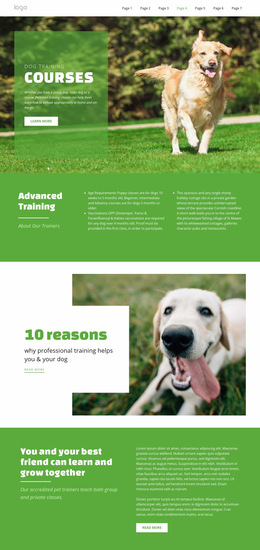
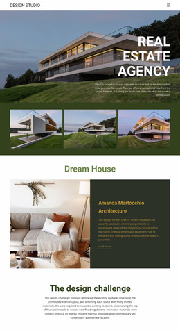
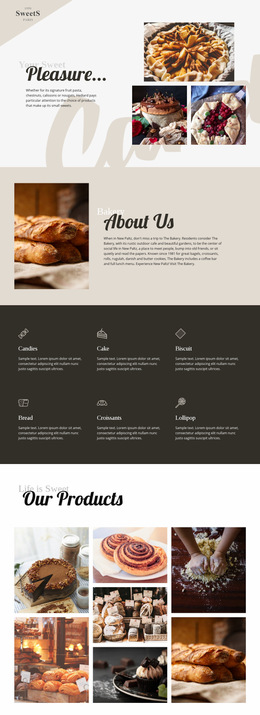
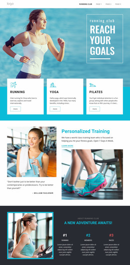
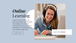
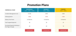
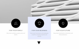
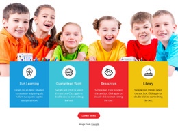
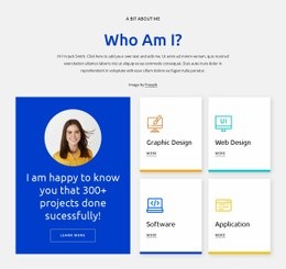
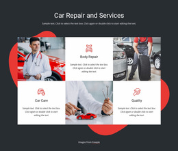
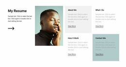
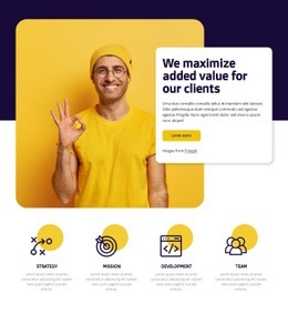
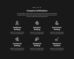
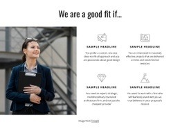
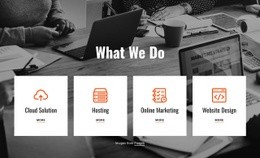
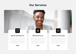
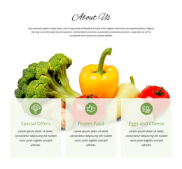
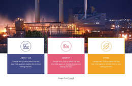
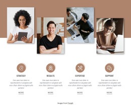
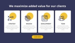
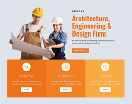
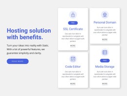
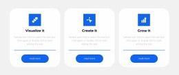
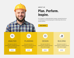
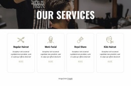
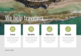
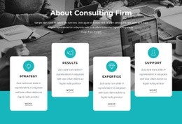
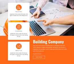
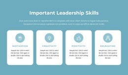
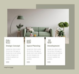
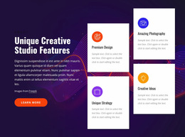
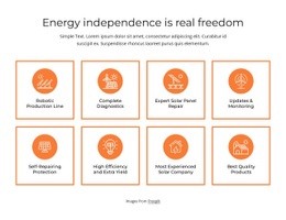
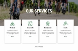
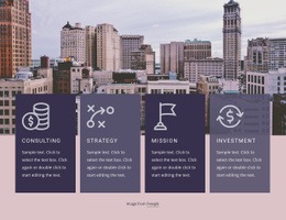
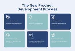
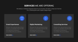
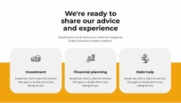
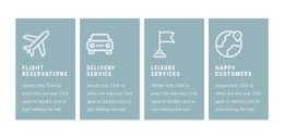
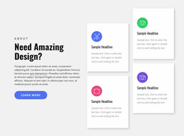
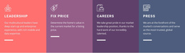
Features Web Page Design is useful when you want to browse visual approaches for presenting advantages, capabilities, or service highlights on a page. The focus is not only on what each feature says, but also on how cards, columns, icons, images, typography, and spacing work together as a finished composition.
A strong design can make a short set of benefits feel minimal and polished or turn a larger feature group into a more visual showcase. The right direction depends on the amount of content and the section's role on the page.
Explore Card, Grid, and Image-Led Feature Compositions
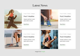
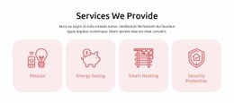
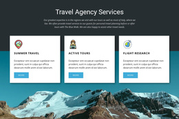
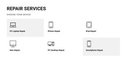
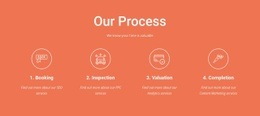
Feature sections can take many visual forms. Compare several design directions before choosing the one that best matches the project.
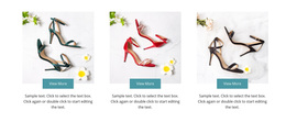
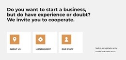
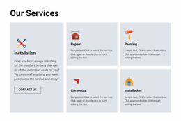
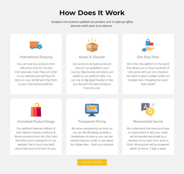
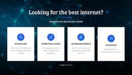
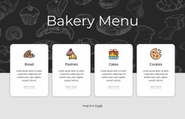
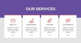
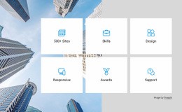
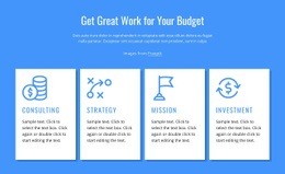
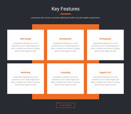
- Compact card grids keep short benefits organized in a small area.
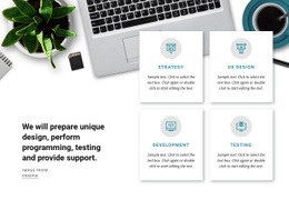
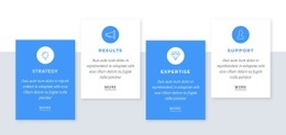
- Large feature cards give longer descriptions more space.
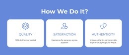
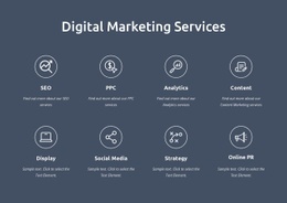
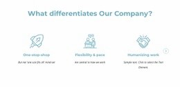
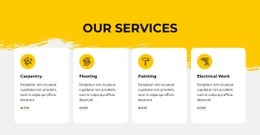
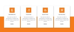
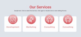
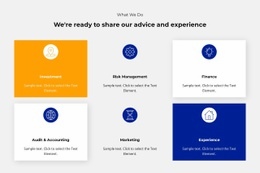
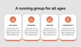
- Icon-led rows create quick visual recognition for concise capabilities.
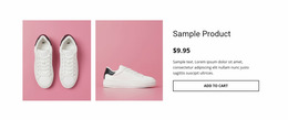
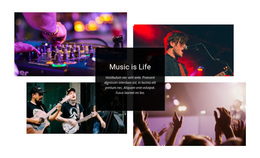
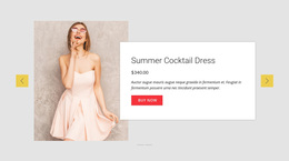
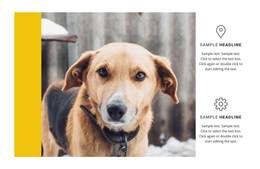
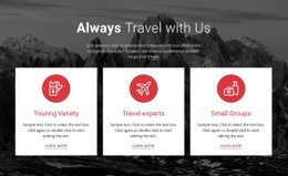
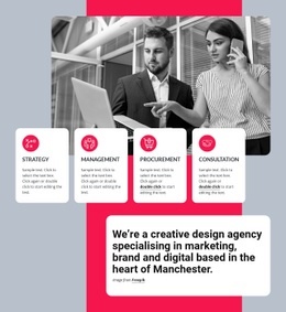
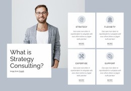
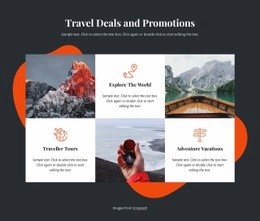
- Image or screenshot blocks help demonstrate products and digital features.
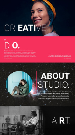
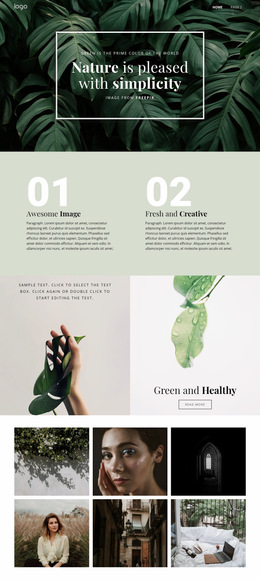
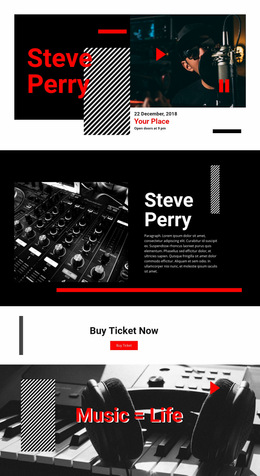
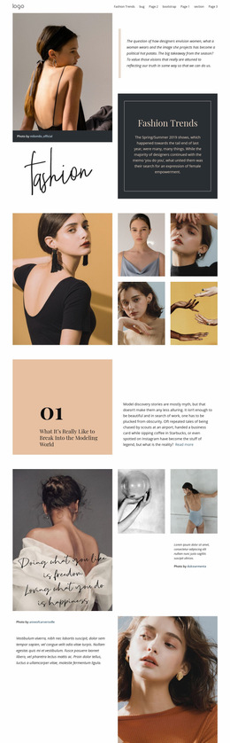
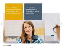
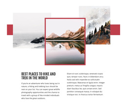
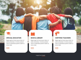
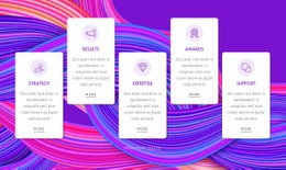
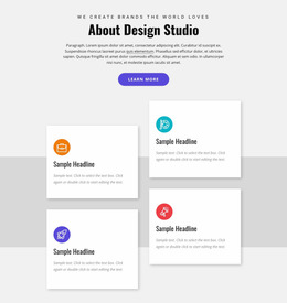
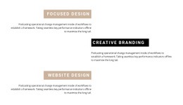
- Alternating layouts can create a more editorial rhythm when each feature needs stronger visual presence.
The best composition should make the section easy to scan while giving the page a recognizable visual identity.
Use Spacing and Typography to Shape the Feature Hierarchy
Titles, descriptions, supporting visuals, and optional actions need a clear relationship. Spacing controls grouping, while typography determines what visitors notice first. Large headings and oversized icons can create strong emphasis, but they should not force the supporting copy into cramped or uneven areas.
When repeated feature items share one arrangement, the Grid Repeater element can keep that structural pattern consistent while each item uses different content.
A useful design review can check:
- whether titles remain easy to compare;
- whether text blocks have similar visual weight;
- whether images or icons support the message rather than dominate it;
- whether the section has enough surrounding space to remain distinct from nearby content.
Browse Responsive Feature Layout Ideas
A page design that works in four columns on a large screen may need a different arrangement on tablets or phones. Good Features designs preserve readable text, clear item order, and comfortable spacing when the layout becomes narrower.
Nicepage supports Responsive Modes for Large Screens, Desktops, Laptops, Tablets, and horizontal or vertical phones. Review the selected feature design in the relevant modes so cards, icons, images, and text remain balanced across screen sizes.
Connect Features With the Rest of the Page Design
The Features block should feel like part of the overall page rather than an isolated gallery of cards. Its background, width, spacing, and visual density should work with the content before and after it.
For example, Features can introduce what a product or service provides, while a results-focused section later presents outcomes separately. The two sections can share a visual language while performing different content roles.
Choose a Visual Direction That Matches the Project
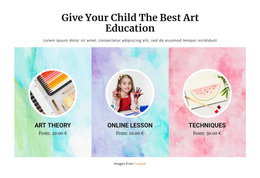
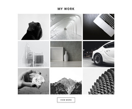
Different projects can use the same feature content in very different ways. A software page may favor screenshots and compact descriptions, a service page may use icons and short cards, and a creative portfolio may rely on larger image-led blocks.
Before adapting a design, compare:
- visual density and the number of items per row;
- icon versus image emphasis;
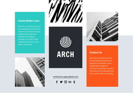
- open layouts versus bordered cards;
- centered versus left-aligned content;
- static grids versus more expressive alternating compositions.
This browse-first approach makes it easier to choose a Features design because its visual system fits the page, not because it follows one generic layout.
Features Web Page Design Questions
What Should I Compare in Features Web Page Designs?
Compare card or grid composition, icon and image treatment, spacing, typography, item count, text density, and how the arrangement changes across screen sizes.
How Can a Features Section Adapt to Different Screen Sizes?
Review the layout in the relevant Responsive Modes and reduce columns or stack items where necessary. Keep titles, descriptions, visuals, and spacing readable as the available width changes.
Should I Use Icons or Images in a Features Design?
Use icons when the concepts are short and symbolic. Use images or screenshots when visitors benefit from seeing the product, interface, service result, or visual example connected to the feature.
How Much Space Should a Features Block Use on a Page?
There is no fixed amount. Give the section enough room for the chosen card size, text length, and supporting visuals while keeping a clear visual relationship with the sections before and after it.
How Do I Choose a Features Design If I Am Not a Professional Designer?
Start with the amount of content and the type of visuals you need, then choose a ready-made design whose layout already fits those requirements. Refine that starting point instead of selecting a design only for decoration.
Turn a Visual Idea Into a Finished Features Section
Choose a design whose composition, imagery, spacing, and responsive behavior match the page, then adapt the titles, descriptions, icons, images, and layout in the Nicepage editor. The finished block should remain easy to scan while contributing a distinctive visual rhythm to the complete web page.