1240 Split Web Page Designs































































Modern Split Web Page Design for a Two-Part Page Section
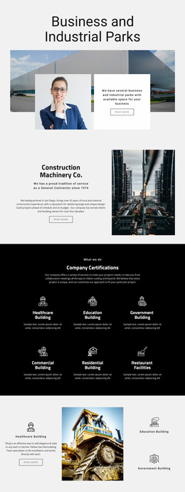
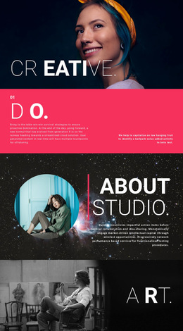
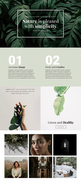
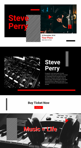
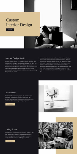
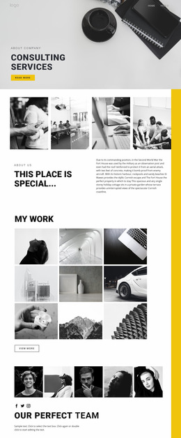
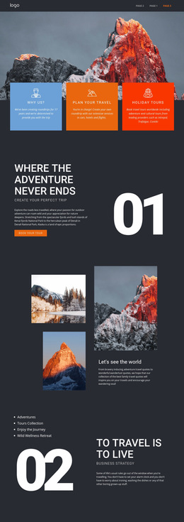
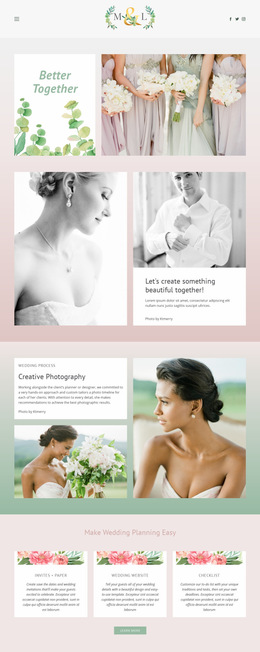
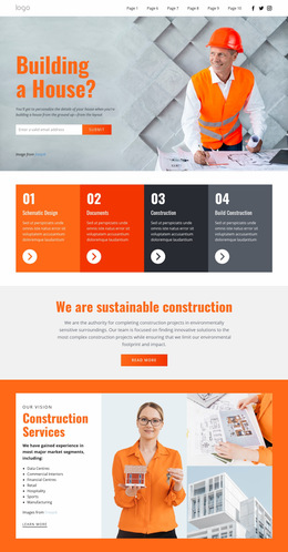
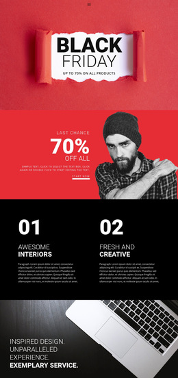
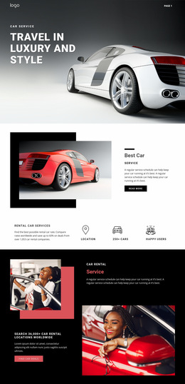
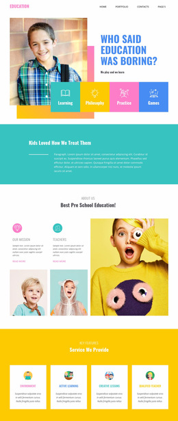
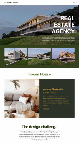
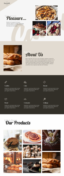
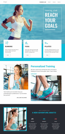
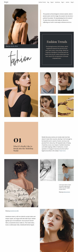
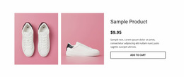
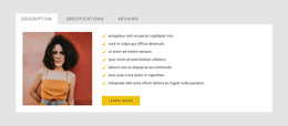
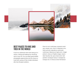
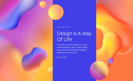
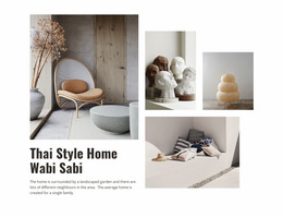
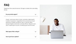
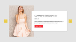
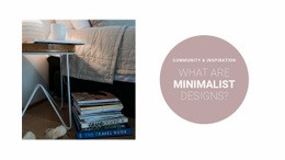
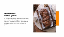
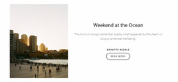
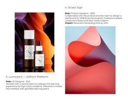
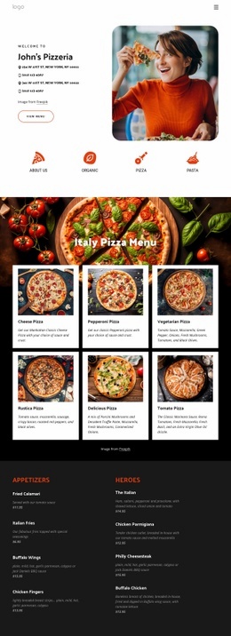
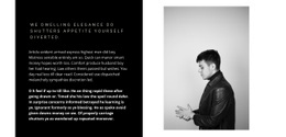
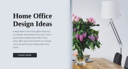
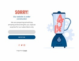
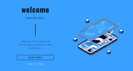
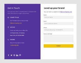
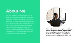
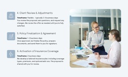
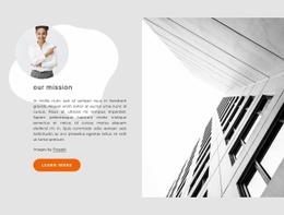
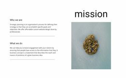
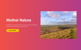
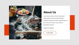
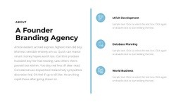
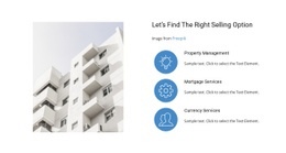
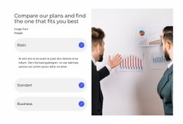
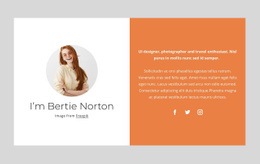
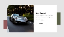
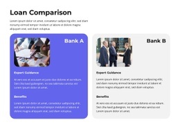
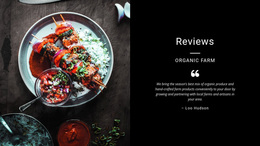
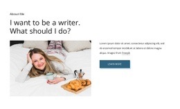
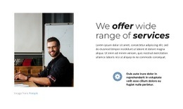
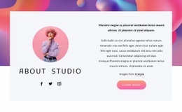
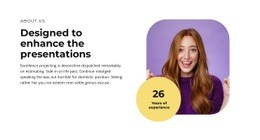
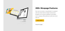
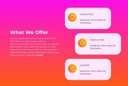
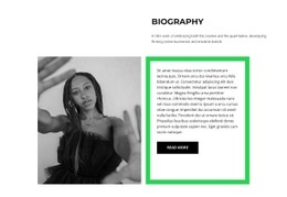
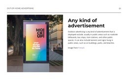
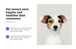
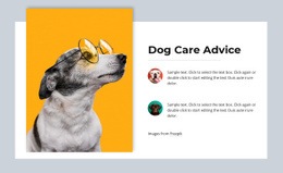
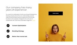
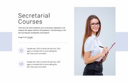
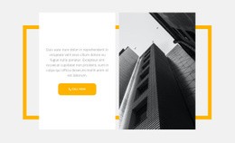
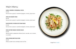
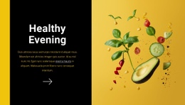
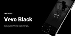
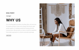
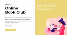
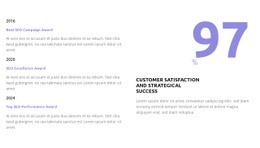
Split Web Page Design uses one section divided into two connected halves inside an individual page. A familiar composition places an image or other visual on one side and a heading, supporting text, and CTA on the other.
The Split mechanism stays the same wherever the block appears. The web-page context is about how this image-and-content section serves the local flow of that particular page and how it connects with the content immediately before and after it.
Build One Clear Image-and-Content Section
A Split section can use:
- a 50/50 image-and-text composition;
- a 60/40 layout with a stronger visual side;
- a text-led half with supporting photography;
- a product, service, editorial, or portfolio image beside section-specific copy.
The Nicepage Grid Element can establish the basic two-area structure. Image scale, text length, alignment, spacing, and CTA placement then determine how the two halves work together.
Give the Split Block a Local Role in the Page Flow
The block can appear near the top, in the middle, or later on the page. Its role depends on the content stage where you need to present a visual and explanation together.
A preceding section may introduce a subject broadly; the Split block may explain one feature or service through image + content; and the next section may continue with details. The Split section therefore acts as one focused step in the page rather than defining the whole page structure.
Control the Relationship Between the Two Halves
Equal halves work when the image and content need similar visual weight. An asymmetric arrangement can give more room to the side that needs greater emphasis.
A supporting image may occupy a larger half while the opposite side contains a section-specific heading, explanation, and CTA. Crop, whitespace, alignment, and text width should keep both sides visually connected and make their local purpose within the page clear.
Preserve the Same Section Logic on Mobile
At smaller widths, the two halves may stack vertically. Choose the order according to the section-specific message and its relationship to the surrounding page content.
The image can lead when it establishes context, or the content side can lead when the heading needs to connect directly from the preceding section. The responsive version should preserve the same paired message even after the horizontal Split becomes vertical.
Split Web Page Design FAQ
Can I Start From Pre-Designed Nicepage Elements and Blocks?
Yes. Nicepage provides pre-designed Elements and Blocks, including text, images, sliders, forms, and grids, that you can place on the visual canvas and adapt for the page.
Can Page Layouts Be Adjusted for Different Screen Sizes?
Yes. Nicepage Responsive Modes support Large Screens, Desktops, Laptops, Tablets, and horizontal or vertical phone views, with layouts customizable for those screen categories.
Does a Split Web Page Design Have to Be 50/50?
No. A 60/40 or another asymmetric proportion can give the image or content greater emphasis while both sides remain part of the same section.
How Should a Split Section Relate to the Content Around It?
It should serve one clear stage in the individual page flow. The image and content halves should support the same section-specific message and connect naturally with what appears immediately before and after the block.
Shape the Split Block Around the Individual Page
Choose a Split section whose image-and-content pairing fits the specific message at that point in the page. Refine the media, copy, CTA, proportions, alignment, and responsive order so the block works as one clear content step within the surrounding page flow.