410 Testimonials Web Page Designs










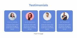
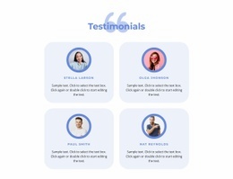
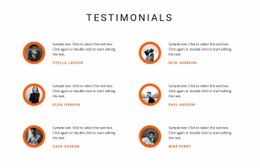

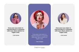





















Modern Testimonials Web Page Design for Balanced Review Section Composition
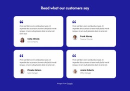
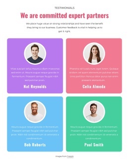
Testimonials Web Page Design focuses on how customer experiences fit into the visual structure of an individual page. A testimonial section groups quotations, author names, and optional portraits into a distinct area, helping visitors recognize personal feedback without confusing it with promotional copy. The arrangement should make each statement easy to read while maintaining a clear relationship with the surrounding content.
A strong composition gives customer quotations enough visual importance without overpowering the page. The number of reviews, length of statements, and placement of author details all affect how naturally the section fits beside other content.
How Testimonials Shape a Web Page Composition
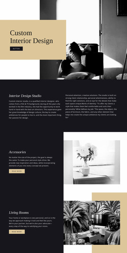
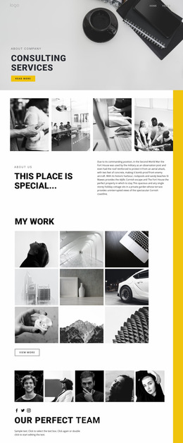
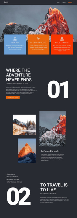
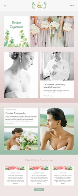
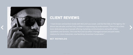
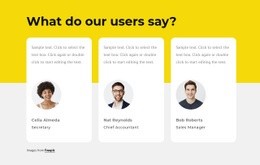
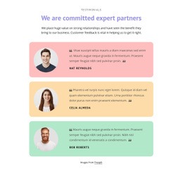
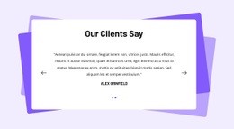
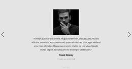
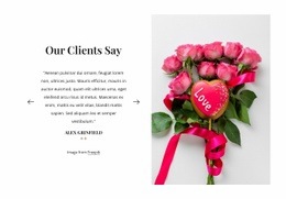
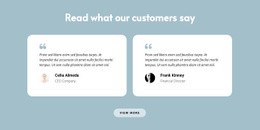
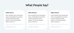
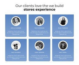
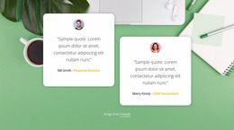
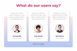
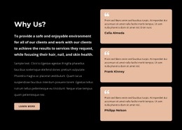
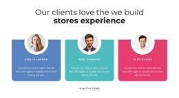
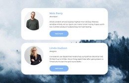
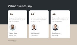
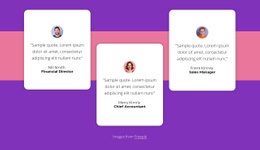
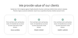
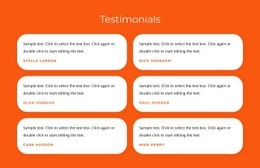
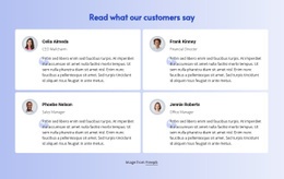
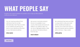
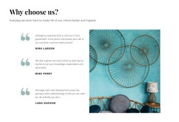
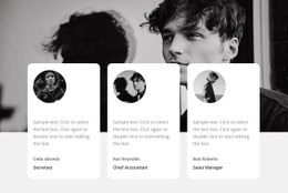
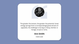
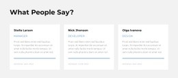
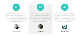
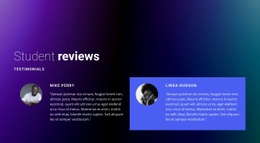
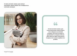
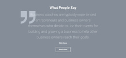
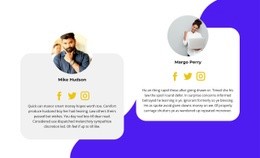
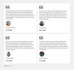
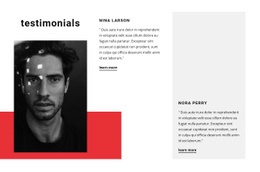
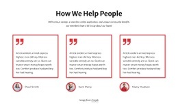
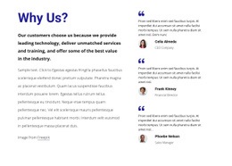
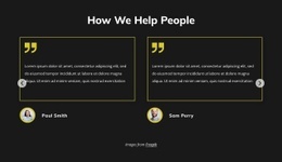
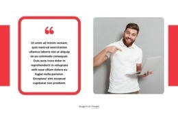
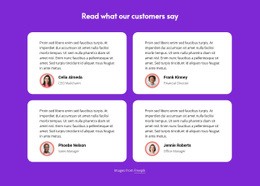
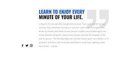
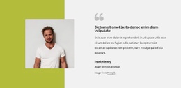
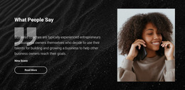
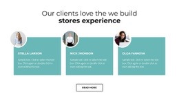
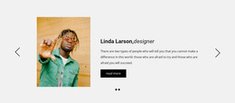
Testimonials Web Page Design presents different compositions for customer feedback on a page: a full-width quotation band, compact cards, portrait-and-text panels, or multiple columns. Their visual weight changes how the review section sits beside other content. The surrounding page gives the design its context.
Several content relationships define that balance:
- Quotation and attribution: Keep the customer's name close enough to identify the source immediately.
- Text and portrait: Use customer images to support the statement rather than dominate it.
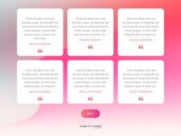
- Individual review cards: Separate different experiences through spacing and alignment.
- Section and surrounding content: Give testimonials a recognizable boundary without creating an abrupt visual break.
The objective is to make authentic customer experiences readable as independent statements while preserving the overall page composition.
Full-Width Quotations and Compact Review Grids
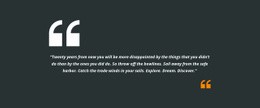
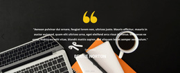
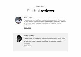
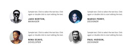
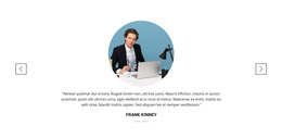
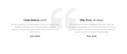
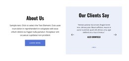
A full-width customer quote can create a pause between two dense content sections, while a narrow two-column arrangement may sit naturally beside the page’s existing imagery. Compare column count, relative card widths, and whether the customer portrait sits beside or beneath the quotation. These visible layout decisions matter more than general page-design theory.
The Nicepage Text Element supports customer quotations and author details within a testimonial block. Their placement within the page’s reading order matters: the quote should be encountered before its attribution, without competing with the next section’s heading.
Three useful composition patterns are:
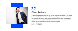
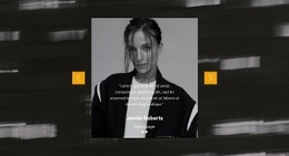
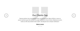
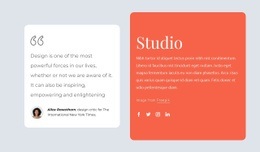
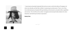
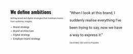
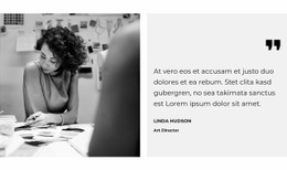
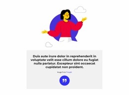
- Featured quotation: A prominent statement with author details beneath it, suitable for a detailed customer experience.
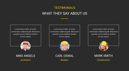
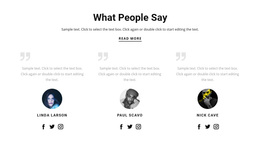
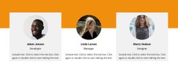
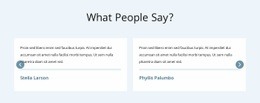
- Balanced review cards: Multiple quotations organized with consistent spacing and recognizable attribution.
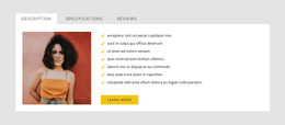
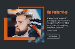
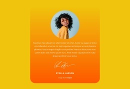
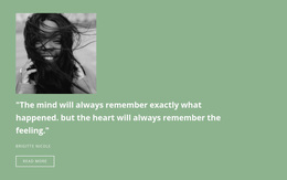
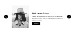
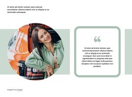
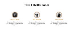
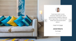
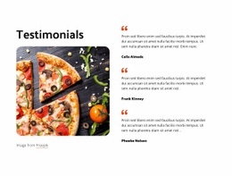
- Portrait-and-text arrangement: A photograph beside the quotation, with enough room for comfortable reading.
Avoid making every review card the same height at the expense of readability. Content length should influence the layout, especially when some customers provide more detailed feedback than others.
Balance Testimonials With Surrounding Page Sections
Testimonials rarely appear in isolation. They may follow a Features section, support a service description, or appear between explanatory content and a contact area.
The placement should reinforce an existing topic rather than introduce unrelated information. For example, feedback describing a specific benefit fits naturally after that benefit has been explained.
When arranging a testimonial web page section, consider:
- Section width: Allow enough room for quotations without stretching short statements excessively.
- Vertical spacing: Separate customer feedback from neighboring content while retaining a connected page rhythm.
- Reading order: Position supporting attribution where it follows the related quotation naturally.
- Visual emphasis: Avoid competing headlines, oversized portraits, or decorative elements that distract from the review.
Nicepage Responsive Modes can help adapt these relationships across screen sizes. A horizontal quotation-and-portrait layout may need a more compact arrangement on a phone, but the customer's words should remain the primary element.
The review block's visual weight should feel balanced against adjacent content. On a dense service page, a full-width quote can create a pause; alongside a feature image, a narrow review column may fit better. This is a question of how testimonials occupy space on one particular web page, not a change to the site's global visual identity.
Testimonials Web Page Design FAQ
Can I customize customer quotation layouts in Nicepage?
Yes. Nicepage provides editable Text Elements and visual layout controls. You can adjust testimonial wording, author details, typography, and spacing to fit the page composition.
How can I maintain readable testimonial sections on mobile screens?
Use Nicepage Responsive Modes to review the quotation width, portrait placement, and card arrangement for different devices. Keep author attribution connected to its quotation when adjusting the layout.
When should I use a featured testimonial instead of multiple cards?
A featured quotation suits one detailed customer experience that deserves emphasis. Multiple cards work better when several shorter statements offer complementary perspectives. Choose the arrangement that supports the content hierarchy of the individual page.
Design a Balanced Testimonial Section With Nicepage
Choose a Testimonials block that matches the amount and length of your customer feedback. Open it in the Nicepage editor, replace sample quotations with authentic statements, and arrange customer names, portraits, and review cards within the page composition.
The finished section should provide clear customer attribution, comfortable reading, and a natural relationship with adjacent content without overwhelming the rest of the page.