Brands Web Page Designs
-

-

-
-
-
-
-
-
-
-
-
-
-
-
-
-
-
-
-
-
-
-
-
-
-
-
-
-
-
-
-
Free Website Builder SoftwareDownload
-
-
-
-
-
-
-
-
-
-
-
-
-
-
-
-
-
-
-
-
-
-
-
-
-
-
-





















































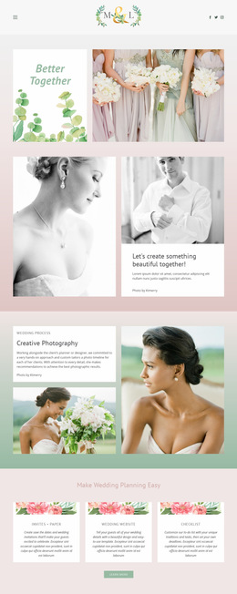
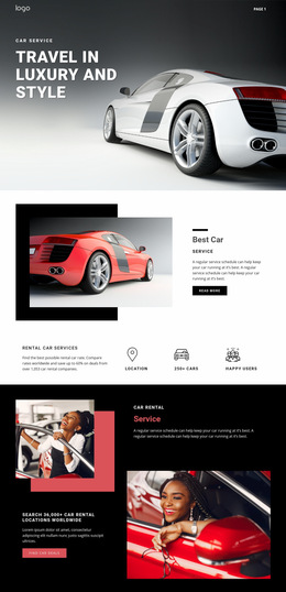
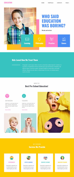
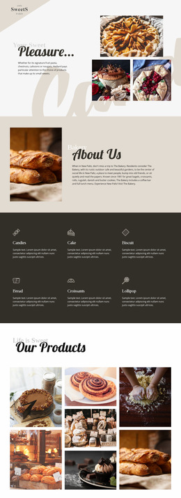
Clean Brands Web Page Design for Stronger Page Composition
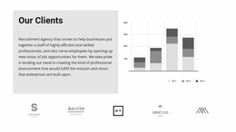
Brands Web Page Design works best when logos are treated as one part of a complete page rather than as an isolated strip. The surrounding hierarchy determines whether client, partner, sponsor, or compatibility marks feel useful: a logo section can reinforce a hero message, support case studies, or provide product proof without interrupting the main reading path.
Place Brand Proof Where It Strengthens the Story
Common placement options include:
- Directly below the hero. A compact trust strip gives visitors an immediate visual signal that the company works with known clients, partners, or platforms.
- Beside or after case studies. The logos support evidence already introduced by the page instead of appearing without explanation.
- Near a product section. Compatibility logos can appear where visitors need to understand which platforms, tools, or systems are supported.
Placement should follow the content sequence rather than a fixed formula.
Use Visual Hierarchy to Control Attention
The Brands section should be visible without competing with the primary headline, key product image, or main call to action. Size, contrast, and spacing can keep the logo area supportive while making the marks easy to scan.
A quieter background can separate a trust strip from the hero without creating a second focal point. A larger partner block can use more spacing when the relationships deserve stronger emphasis.
The Image Element provides the direct visual building block for individual marks. The Image Element can carry each logo while the surrounding layout controls hierarchy and connection to nearby sections.
Sequence Sections With Clear Transitions
Page composition is easier to follow when neighboring sections have distinct roles:
- A hero can establish the offer.
- A Brands strip can add proof.
- A services area can explain capabilities.
- Case studies can provide deeper evidence.
Whitespace between these sections is functional. Too little can make logos feel attached to the previous text, while too much can disconnect them from the content they support. Section height, backgrounds, and alignment can create clearer transitions.
Design for Responsive Behavior, Not Just Desktop Balance
A six-logo row may work on a wide screen and fail on a phone. Responsive planning should consider how many marks fit per row, whether labels remain readable, and whether spacing still feels intentional.
On smaller screens, the section can move from a horizontal strip to a compact grid. The priority is preserving order and legibility rather than forcing a desktop arrangement into a narrow viewport.
Refine Contrast and Whitespace Around Mixed Logo Shapes
Brand marks often arrive in different formats:
- Some are wide wordmarks.
- Some are compact symbols.
- Others include detailed text.
Giving each mark a consistent visual area helps the section feel balanced.
The goal is not to make every logo physically identical. Manage displayed scale, surrounding whitespace, and background contrast so no single asset becomes disproportionately heavy.
Brands Web Page Design FAQ
Where Should a Brands Section Appear on a Page?
It can work below the hero as a trust strip, near case studies as partner proof, or beside a product area where compatibility logos add useful context.
How Can a Logo Section Support the Main Page Hierarchy?
Keep the main headline and primary action dominant, then use logo scale, contrast, spacing, and placement to add proof without creating a competing focal point.
Should the Brands Layout Change on Smaller Screens?
Yes. A horizontal logo row may become a compact grid or multi-row layout so each mark remains readable and well spaced on tablets and phones.
Refine the Section in Real Page Context
Open the page in the Nicepage editor and judge the Brands area together with the sections before and after it. Adjust logo scale, spacing, contrast, and responsive behavior until the proof feels connected to the page story. A strong result should help visitors move naturally from headline to evidence to the next important section.