Sale Web Page Designs
-

-

-
-
-
-
-
-
-
-
-
-
-
-
-
-
-
-
-
-
-
-
-
-
-
-
-
Free Website Builder SoftwareDownload
-
-
-
-
-
-
-
-
-
-
-
-
-
-
-
-
-
-
-
-
-
-
-
-
-
-
-
-
-
-
-
-
-
-
-
-
-
-
-



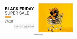





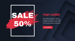



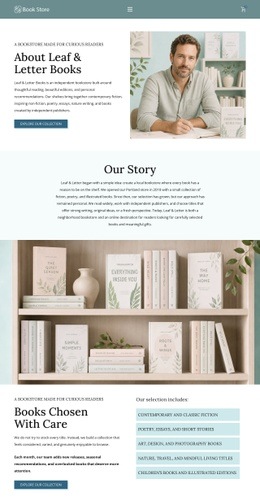
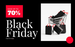
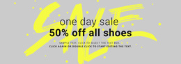



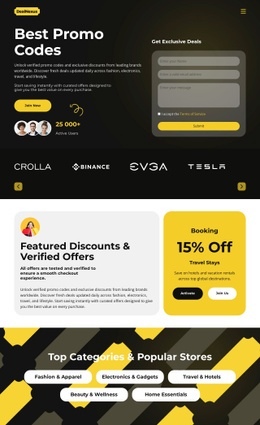

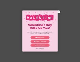
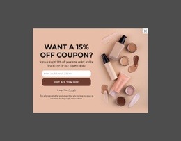


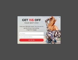





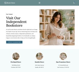
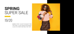


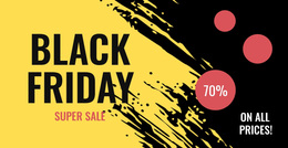
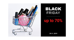




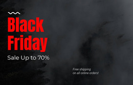






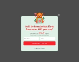


















Clean Sale Web Page Design for Clear Retail Offers
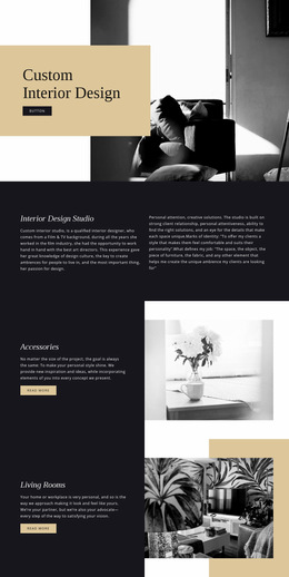
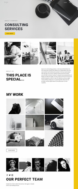
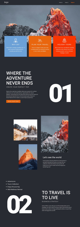
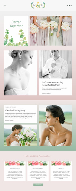
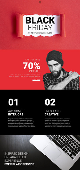
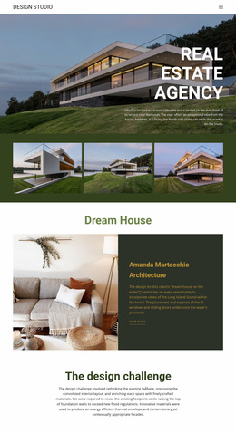
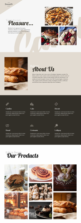
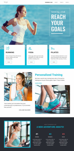
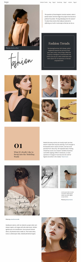
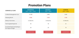
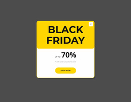
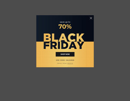
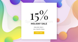
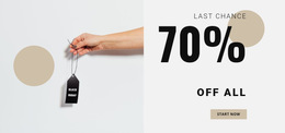
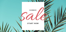
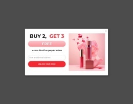
Crowded promotional pages can bury the strongest discount under competing banners, product cards, and buttons. A sale web page design keeps the main offer easy to scan and gives retailers a clearer path from the headline to the product action. Retail teams can maintain a single visual system across short campaigns, clearance pushes, and seasonal deals, while a retail promotion page keeps the offer path easy to follow.
Why Should You Choose Minimal Sale Web Page Design?
Retail offers: need a clear hierarchy between the headline deal, supporting products, and purchase cues. Campaign banners: work best when they reinforce the main message rather than compete with it. Mobile shoppers: need the same priority order on smaller screens, with spacing and typography that keep the promotion easy to follow.
Use sale banner ideas as a reference for hero proportions, message length, and image placement, and then fit those choices into the full-page layout. A sale page layout should progress from the strongest offer to product proof, supporting details, and a direct CTA, without abrupt visual shifts.
Responsive Features for Sale Page Layouts
Grid Columns provide an alignment reference for headlines, images, product groups, and buttons. Nicepage documents how to use Grid Columns for web layout, which helps discount labels and product cards keep consistent edges across sections. The Grid Element adds responsive cells that move one under another on smaller screens, while Change Grid Layout lets you switch presets or add and remove cells as the campaign evolves.
Color Scheme controls the main palette, and Web Typography styles headings, text, hyperlinks, buttons, quotes, and lists. Button Element provides the primary CTA control, while Edit Mobile Views lets you refine Desktops, Laptops, Tablets, and Phones separately. Together, these tools support a UI/UX balance without forcing the retail promotion page into a single fixed composition. The sale page layout can then adapt without losing its visual hierarchy.
Creative Sale Page Composition Tips
Pro Tip: Decide the reading order before you polish individual blocks. Keep the discount promise, product evidence, and CTA visually connected, then use typography to separate priority levels. The Site Fonts controls let you manage Font Scheme and Typography Styles across the project, including adjustments for individual Responsive Modes.
Advanced Sale Web Page Questions
Can I use Google Fonts on a sale web page?
Yes. Nicepage provides access to Google Fonts in the Desktop Applications, WordPress Plugin, and Joomla Extension so that retail teams can match campaign typography to the wider brand system.
Are there ready-made elements to speed up sale page design?
Yes. Nicepage includes pre-designed Elements and Blocks that can be added to the visual canvas, including text, images, sliders, forms, and grids.
How can I keep discount cards aligned without crowding the page?
Use Grid Columns as an alignment reference and place related content inside Grid Elements when a row-and-column layout fits the campaign. This keeps product cards, offer labels, and CTA elements visually related while preserving clear spacing.
No-code Control for a Faster Sale Page Rollout
A promotion should not lose time because every section needs a separate layout rebuild. Choose a design direction, open it in the Online Builder or Desktop App, shape the offer hierarchy and responsive page flow, then publish online or export the supported output when the campaign is approved. Start for free and move from a rough retail concept to a production-ready page with less layout rework.