350 Nature Web Page Designs


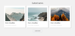

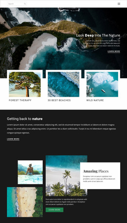
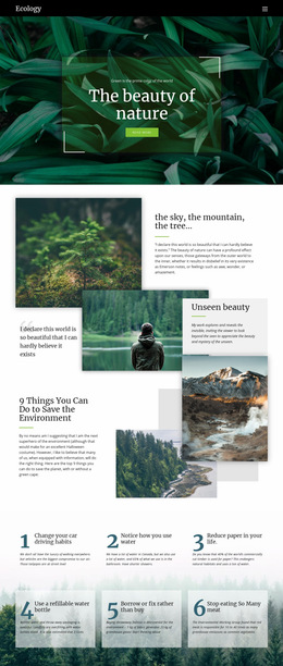
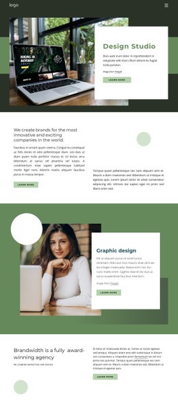


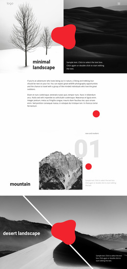
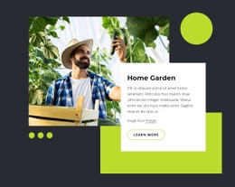
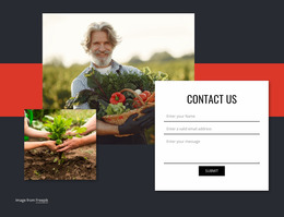



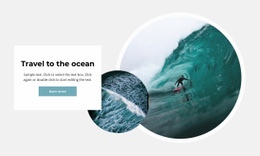
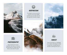
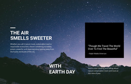
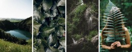







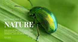
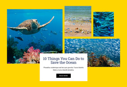
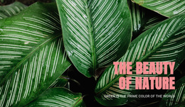
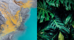

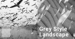
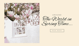
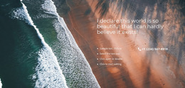
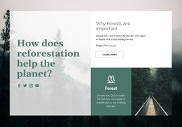
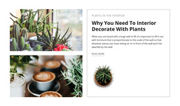
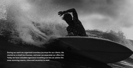
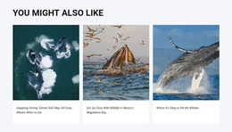
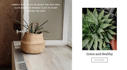


Stunning Nature Web Page Design from First Viewport to Final Section
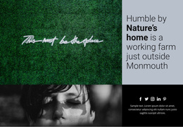
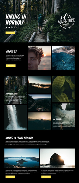
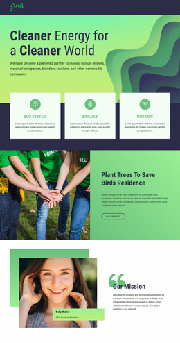
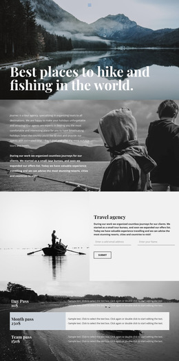
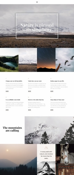
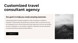
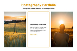
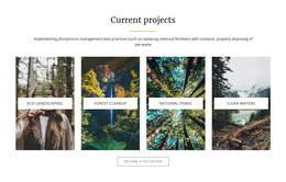
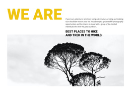
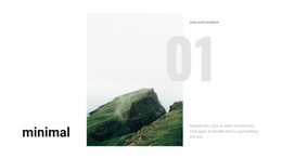
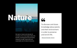
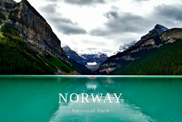
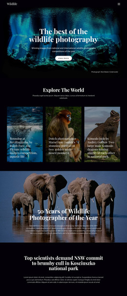
Nature web page design is the composition of a specific page. The task is to decide what the visitor sees in the first viewport, which section comes next, where imagery should dominate, where facts need more space, and how the page moves from its opening focal point to the final section.
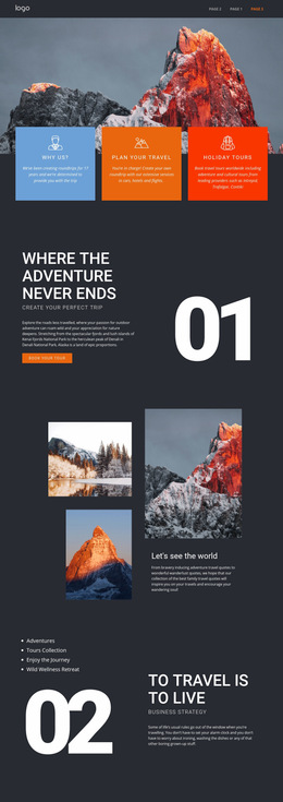
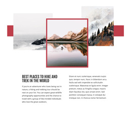
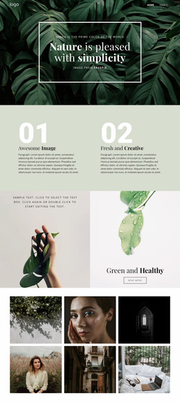
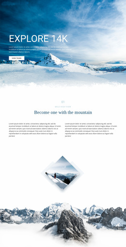
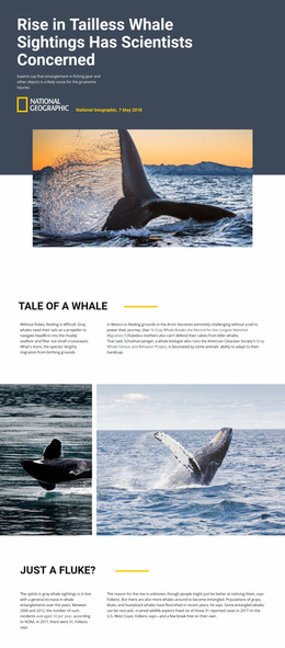
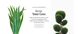
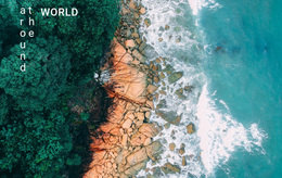
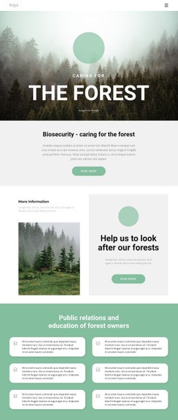
A forest feature page might begin with one strong landscape image, move into context and evidence, then place a habitat map beside the explanation it supports. A botanical service page may lead with the service and specimen imagery, then alternate process, examples, and practical details. The unit of design remains this one page from top to bottom.
Build the Reading Path One Viewport at a Time
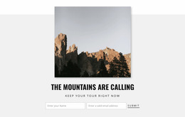
Start with the hero or first viewport. It should make the subject and purpose immediately legible without asking visitors to decode several competing focal points. The next section should answer the most natural follow-up question rather than continue the same visual treatment.
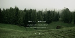
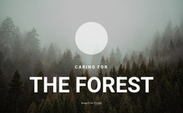
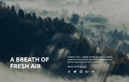
For a woodland story, Forest website ideas can provide references for image scale and mood. The page itself still needs a deliberate sequence: opening context, supporting information, evidence or gallery material, practical details, and a clear final section.
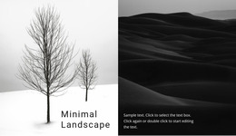
Whitespace helps mark those transitions. Use it to separate ideas, slow down dense factual areas, and give large photography enough breathing room without letting space disconnect related content.
Arrange Nature Content Around Focal Points
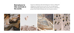
Nature pages often combine powerful photography with detailed information, so the focal point should change intentionally as the visitor moves down the page.
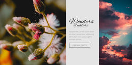
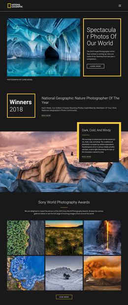
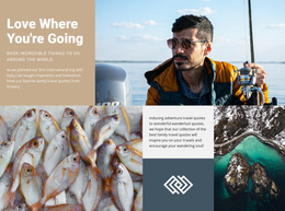
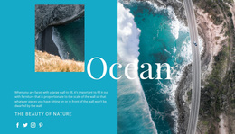
A conservation page can place a habitat map close to the explanation that makes the map useful, then follow it with field evidence. Wildlife photography can alternate with compact fact groups so the page does not become an uninterrupted image wall. A botanical service page can use specimens or finished work as visual anchors while keeping service details readable beside them.
Freehand Drag-And-Drop supports direct placement of text, images, and grids. Smart Magnetic Guides help align nearby elements, while Grid Element can organize image-and-text relationships; the Grid Element documentation explains how cells adapt on smaller screens.
Keep the Page Coherent on Smaller Screens
Responsive design changes the available viewport, so the page sequence should be checked again when columns stack. A side-by-side habitat map and explanation may need to become map-after-text on a phone. A gallery and evidence block may need clearer spacing so they still read as separate parts of the same page.
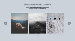
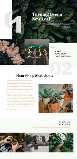
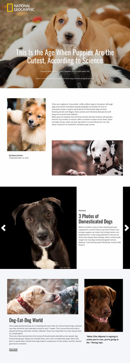
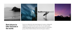
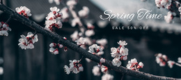
The Gallery Carousel Element can display several habitat, botanical, or field images within a single visual section. plant website references can help when a botanical page needs a careful balance between specimen imagery and explanatory copy.
Typography should also be judged within this page's reading path. The Site Fonts settings provide font controls, but the design question here is local: whether headings, captions, facts, and longer copy create a readable hierarchy from the first viewport to the last section.
Nature Web Page Design Questions
What should the first viewport of a nature page establish?
It should establish the page subject, primary focal point, and enough context for the visitor to understand what comes next without competing messages or excessive visual noise.
Where should a habitat map appear on a conservation page?
Place it close to the explanation or evidence that gives it meaning. On smaller screens, the map can move below the related text while remaining part of the same section sequence.
How can wildlife photography and facts share one page without competing?
Alternate strong image-led moments with compact factual groups, use whitespace to separate roles, and avoid making every section equally dominant. Each viewport should have a clear focal point.
Can one page use a gallery without losing its reading flow?
Yes. Place the gallery where it supports a specific part of the page, such as project evidence or a botanical collection, and make the following section visually distinct so the reading path continues clearly.
Refine One Nature Page from Top to Bottom
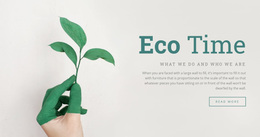
Choose the page subject, define the first viewport, then work through the section order, focal points, whitespace, image scale, and responsive stacking until the whole page reads as one deliberate sequence. A focused leaf website direction can inspire a botanical visual treatment, but every decision should still serve the composition of this individual page.