2020 Shapes Web Page Designs




































































Modern Shapes Web Page Design Ideas for a Single Page
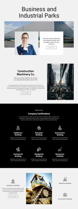
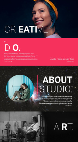
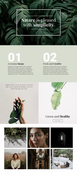
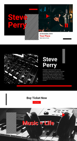
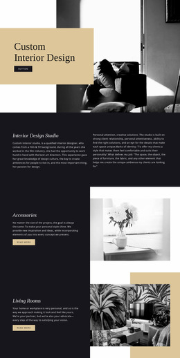
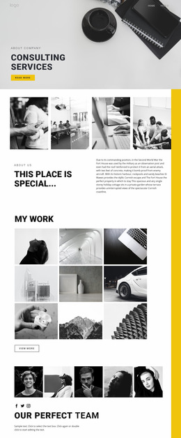
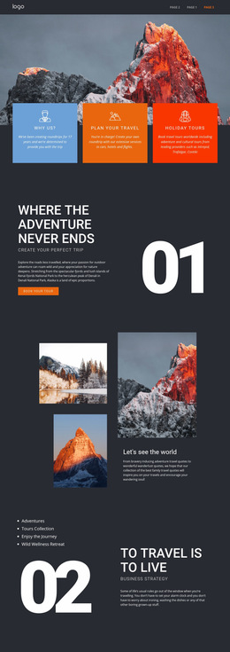
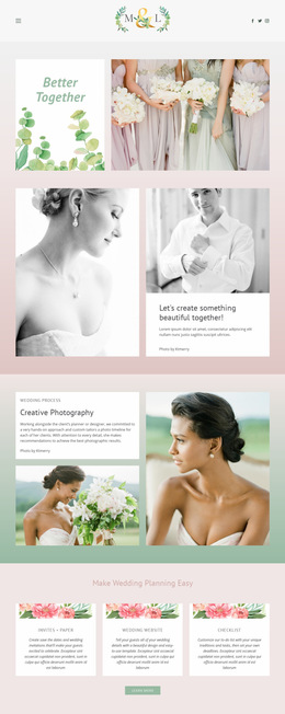
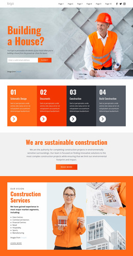
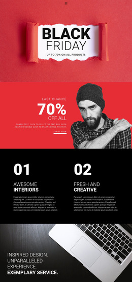
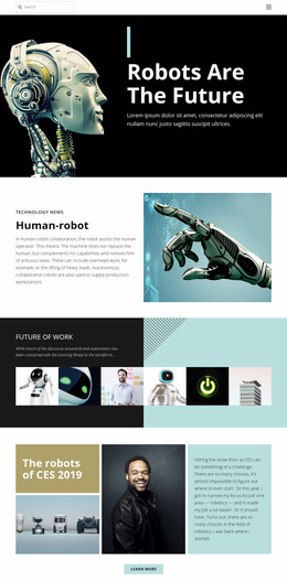
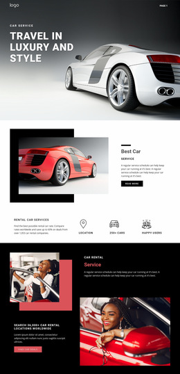
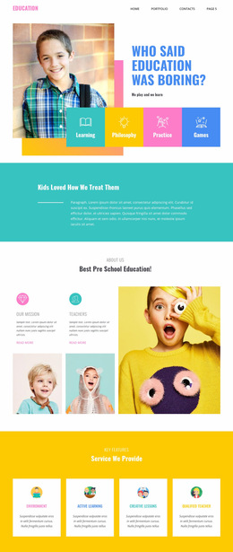
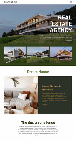
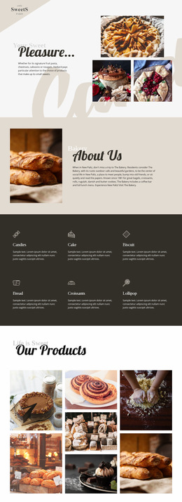
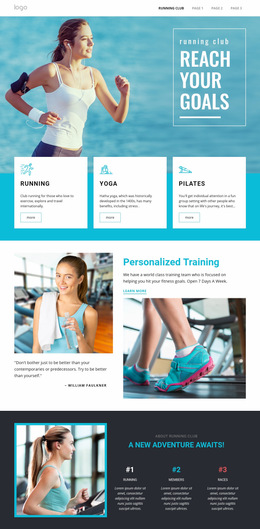
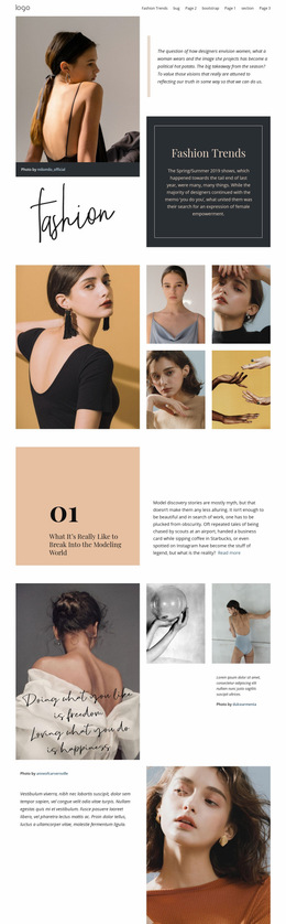
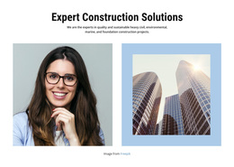
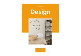
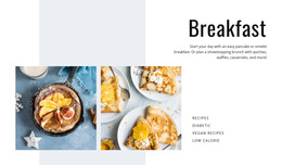
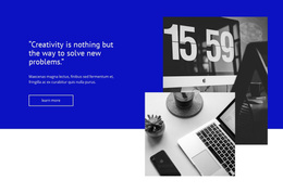
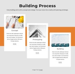
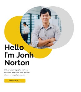
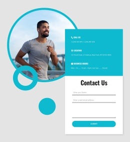
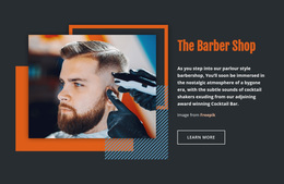
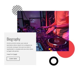
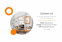
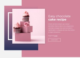
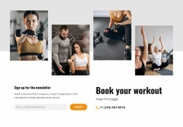
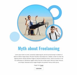
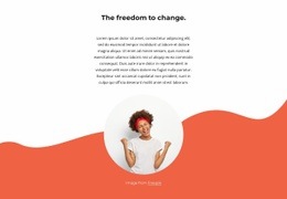
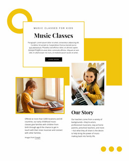
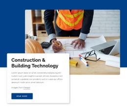
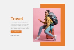
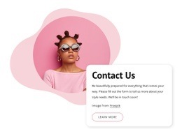
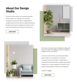
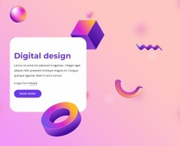
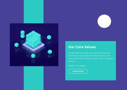
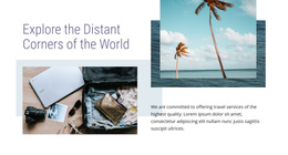
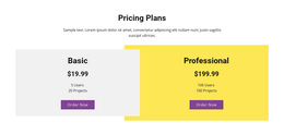
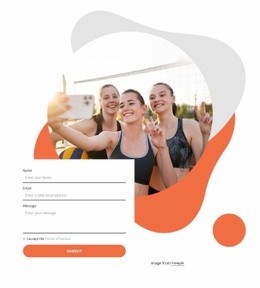
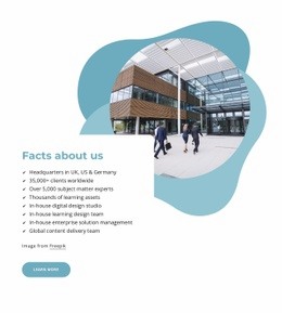
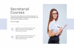
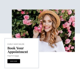
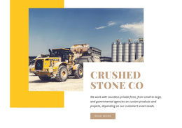
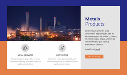
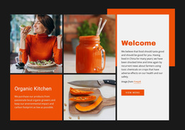
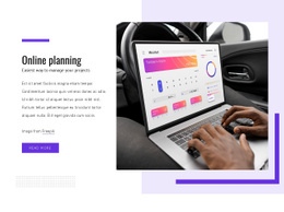
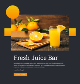
Shapes Web Page Design is about how geometric forms influence the flow of one page from the first screen to the final section. Circles, abstract backgrounds, color fields, and angular accents can make a hero more distinctive, separate content stages, frame imagery, or create a smoother transition between otherwise simple sections.
When choosing a design, compare complete page compositions rather than individual decorative effects. A strong example should feel coherent as you scroll: the hero establishes the visual direction, later sections vary the rhythm, and the geometric style adapts without repeating the same arrangement everywhere.
Compare Single-Page Shape Layouts by Scroll Sequence
Start with the page sequence rather than a general style label. Compare how the design moves through:
- the hero;
- supporting content;
- image-led sections;
- proof;
- the final action. The most useful layout is one whose geometric emphasis changes with that sequence: stronger in the hero, quieter around dense copy, and more directional near transitions or the final CTA.
Compare the balance between text, imagery, and open space at each stage of the page. Large shapes can establish the opening focal point, while smaller accents can support headings or transitions later in the scroll without dominating the content. The Shape Element provides the direct Nicepage element for these geometry-led compositions.
Evaluate Hero, Rhythm, and Section Transitions
The hero should establish a clear focal point. Check whether the headline, image, and primary action remain easy to scan and whether the geometry improves the composition rather than fragmenting it.
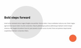
Further down the page, section rhythm becomes important. A dense text area can be followed by a more visual shape-led block to create a pause. A large background field can introduce the next topic, while smaller geometric accents can connect two sections without adding a hard divider.
For a single web page, these transitions matter because visitors experience the design in one continuous flow. The goal is to keep the page visually varied without making each section feel like it came from a different project.
Check the Mobile Composition Before You Choose
A page design that relies on wide horizontal spacing may change significantly on a phone. Review how the hero stacks, whether background forms still frame the intended content, and whether decorative shapes leave enough room for readable text.
Mobile composition matters most when geometry sits partly outside an image or overlaps a colored field. The design should preserve the same hierarchy even when the exact desktop placement changes.
Keep the Focus on the Current Page
Keep the evaluation centered on one complete page: the hero, the order of sections, transitions, imagery, and final action should work as one continuous scroll sequence. Shapes can change scale or placement from section to section, but they should help visitors understand where one content stage ends, and the next begins.
If a visible grid of cells is the defining base and another element sits over or crosses that grid, an Over Grid layout may be a closer choice. Shapes work best when the geometric forms themselves are what give the page its visual identity.
Shapes Web Page Design FAQ
What should I compare when choosing a shape-led web page design?
Compare the hero focal point, section order, text-to-image balance, scroll rhythm, transitions, final action, and how the complete page sequence adapts to smaller screens.
Should visual impact be more important than usability?
No. Decorative geometry can make a page more expressive, but visitors still need to understand the text, imagery, hierarchy, and intended reading order without unnecessary visual confusion.
When should I use Shapes instead of Over Grid?
Use Shapes when circles, rectangles, abstract forms, or color fields give the page its visual identity. Use Over Grid when a visible grid remains the base layout and another element sits over or crosses that structure.
Select a Shape Layout That Fits the Page Flow
Compare complete page designs from the first screen to the last rather than judging isolated sections. Favor the option whose hero, section order, transitions, and final action already suit the scroll sequence you need. After adapting the content, read the page top to bottom on desktop and mobile to confirm that the same sequence still feels coherent.