
Hexagon Website Designs
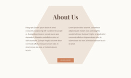
For brands that rely on geometry, hexagons can establish rhythm without making every section look identical. A consistent color system, typography, spacing, and image treatment turn the motif into a recognizable website-wide visual language.


More Website Designs from Shapes Category
-
-

-
-
-
-
-
-
-
-
-
-
-
-
-
-
-
-
-
-
-
-
-
-
-
-
-
-
-
-
-
-
-
-
-
-
-
-
-
Free Website Builder SoftwareDownload
-
-
-
-
-
-
-
-
-
-


































Other Shapes Website Designs
Unique Hexagon Website Design
Six-sided shapes can grab more attention than rectangles. Good hexagon website design rations that energy, placing the motif where it leads the eye and keeping everything around it calm enough to read. Handled with discipline, one shape can carry a whole visual language.
How Dense a Honeycomb Should Get
Density sets the mood faster than color does. A lone oversized polygon feels calm, while a tight honeycomb reads as busy and technical. Most layouts commit to one of three volumes and borrow from the others only for contrast:
- one large hexagon as the focal point, framing a hero photo with plenty of space around it;
- sparse accents, such as a few small cells beside a headline or one angled divider;
- a dense cluster for stats or partner logos, where many small items compete for a glance anyway.
Negative space decides whether that loud option looks deliberate. Surround a dense cluster with generous margins, and it reads as a feature, but push it to the edges, and it becomes wallpaper. A car detailing studio with hexagon light grids over its bays already has the motif in every photo, so the layout around those shots can stay plain.
Photos Cropped by Six Corners
Photography suffers first when geometry gets aggressive. A portrait inside a hexagon loses an ear or the top of the head once the face drifts toward a corner.
A few habits keep images readable inside six-sided frames:
- keep the focal point near the center, since the corners cut away more of the photo than you might expect;
- save detailed scenes for large cells and give small ones photos with plain backgrounds;
- let one accent color mark the cells that matter, because the shape already separates each item from its neighbors.
Typography needs the same restraint. Strong geometry pairs best with a calm, legible typeface, and headlines set in a moderate weight stop arguing with the angles.
Repeated Angles, Subtle Motion
Continuity comes from small, repeating details. The 120-degree angle of a hexagon can return in dividers, image masks, and button tips, so visitors sense the motif even where no full cell appears. An opening screen might carry the whole honeycomb, and a long article deeper in may keep only an angled rule under its title. Motion works in small doses, like a cell lifting on hover or a cluster filling in as you scroll.
A hexagon website design works when you repeat a short list of geometric moves with care. Those moves guide the eye and slowly turn into the visual identity people remember.